All Things New Gopher Uniforms/Helmets Thread: UPDATED 1/20 with New Uniforms!!!

I was very apprehensive but I like the look. The matte finish in maroon looks good. Most of the other matte helmets/colors were ugly.

Other than the matte finish they are quite old school. Basic, clean and simple.

Seems to have satisfied both young and old.:cool03:


Sooooooooo Sick!!!! They look great, I think that the white jerseys are going to look really good with these helmets!

New Uniforms next year so no more of those whit jerseys
 

Nice helmet beside the black facemask. Maroon, gold or gray would've been miles better.

Gray would not have looked better in this combo IMO.

I was apprehensive about the black and it still feels a little weird (just new) but I like it. Excited to see if they add in some neat touches (like Ski-U-Mah) to the uni's in a way that isn't too crazy.


Man, I love these new helmets! Great sleek, tough new design. Love the colors. Outstanding!!!
 

I must have missed the memo....when did our colors change to Brown and Yellow?

You mean from crimson and sunshine? From the 80's on, the darker color we were using had become more crimson. Maroon is a dark color--it's red and black mixed together, with the emphasis on black.

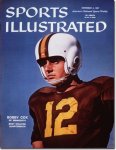
Here's 1957:

1104_large.jpg


By 2000 they looked like this:

carter_medium.bmp


TOO RED!

I like dark. It is truly traditional and modern...
 

Attachments

  • Cox1957.jpg
    Cox1957.jpg
    43.3 KB · Views: 7

Helmet looks great, the black facemask gives it an industrial and tough look while still being understated. I hope the jerseys have the same classic look with subtle modern touches.

The only thing about them that bugs me is why the numbers on the back are on those blocky stickers, why can't they just attach the gold numbers directly like the block M?


I initially didn't like the black facemask, and thought there would be more drastic changes (numbers on one side) than there was.. But overall, I think the helmet looks pretty sharp.

But colored me worried about the new uniforms having too much black in them.
 

As one of the minorities on the board, I really like the black accent. These helmets are the best we've had yet. Well done Nike, looking sharp. :cool:
 

The darker color uni may camouflage the ball and make it harder for the D to know if the QB handed off or kept the ball...cool and strategic!
 

Anyone who thinks these are not awesome is an idiot. How bada$$ will Q look plowing over Wisconsin's secondary next year? #BEASTMODE.


Then call me an idiot, but black is not one of our school colors. If they leave the black to just the face mask (like the gray of old) and cleats, fine. If the black ends up in the jersey a la Casey Hankinson, I'll be pissed.

Also, hasn't anyone else noticed the "M" isn't angled properly? When the mask is on, it won't be straight. I do like the helmets physical design though -- that part is awesome.
 

Love the new helmets. I too hope they don't overdue black on the uniforms. I believe they added a "just right" amount to the helmets. An accent, but not in an amount that detracts from the actual school colors. I'd much rather have black face masks than gray, which is also not a school color. Love the "Ski-u-mah" and hope that between now and next September they can find number decals that aren't on clear block stickers the size of note cards. :)

All in all it updates the helmets, keeps them fresh and "cool" without completely changing the look and losing the tradition and branding offered by the block M being the main feature. Me likey!!
 

like the helmets. wishing they would have gone with a gold or a white & gold stripe on the crown of the helmet though.
 

like the helmets. wishing they would have gone with a gold or a white & gold stripe on the crown of the helmet though.
I'm glad they didn't. The nice thing about the matte helmets is how good they look on their own IMO.
 

That is a crazy cool helmet! Love the ski-u-mah! Great job!
 

Not a big deal.

After all the hype the helmets look fine but not a huge change for me. I dont mind the black facemask or the matte finish but neither is all that exciting either.
A couple of questions for some of you.

A gray facemask? Really do we want those old ugly facemasks back in football period they look horrible on every helmet I have ever seen. It makes the facemasks look like they are made out of cheap plastic.

Old school triple piping on helmets or lines at all? Reminds me of the cheap helmets we used to get for Christmas as kids from the JC Penny Catalog. You could get white with blue and red stripes. Blue with Red and White stripes or the red with blue and white. You could also get the fake lookings jerseys to go with them.

As far as the New uniforms go I am all for Maroon and Gold very little of the white or black. There will be some white and black that is fine but I would prefer as little as possible.

In the end we can wear the ugliest uniforms in football if we win some games they will look great. Oregon gets a ton of talk about their uniforms but what really allows them to wear that ugly garbage is the fact they play an exciting brand of football that has won a ton of games as of late. Win and anything can be worn and liked by kids. Just win baby the rest takes care of itself.
 

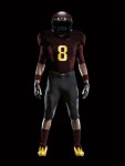
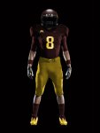
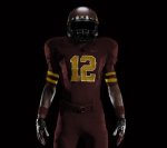
I know all of you old asses will hate some of thes MOCK Pro Combat uniforms, but MVofDT did a great job photoshopping these pics to give us an idea of what the new uni's could look like.

I personally LOVE the first picture with the black pants. I also like the Stanford style at the end. The all maroon is also pretty good, but I'm not a fan of the Maroon jersey and Gold pants.

http://fringebowlteamblog.com/?q=bl...hotoshop-mock-gophers-nike-pro-combat-jerseys

tumblr_lwh2zs14911qc45gp.jpg

tumblr_lwh33k7yHd1qc45gp.jpg

tumblr_lwh34s5cIc1qc45gp.jpg

tumblr_lwh36fwTwR1qc45gp.jpg
 

If that is what they come out looking like I would be thrilled!!!
 

Like them all except for the last one. Don't like those stripes at all. Should be interesting to see how close he is with the images.
 

Have to give a shout out and thumbs up to Josh. Especially for the Ski-U-Mah incorporation.

Josh Iverson is the Nike employee who worked with the Gophers on design (at least he is mentioned in the article from Gophersports.com). He is a former football player and graduate of Kasson-Mantorville HS.
I know he's also done TCU's Uni's as well.

Buck
 

After all the hype the helmets look fine but not a huge change for me. I dont mind the black facemask or the matte finish but neither is all that exciting either.
A couple of questions for some of you.

A gray facemask? Really do we want those old ugly facemasks back in football period they look horrible on every helmet I have ever seen. It makes the facemasks look like they are made out of cheap plastic.

Old school triple piping on helmets or lines at all? Reminds me of the cheap helmets we used to get for Christmas as kids from the JC Penny Catalog. You could get white with blue and red stripes. Blue with Red and White stripes or the red with blue and white. You could also get the fake lookings jerseys to go with them.

As far as the New uniforms go I am all for Maroon and Gold very little of the white or black. There will be some white and black that is fine but I would prefer as little as possible.

In the end we can wear the ugliest uniforms in football if we win some games they will look great. Oregon gets a ton of talk about their uniforms but what really allows them to wear that ugly garbage is the fact they play an exciting brand of football that has won a ton of games as of late. Win and anything can be worn and liked by kids. Just win baby the rest takes care of itself.

you have questions for some? where exactly are they? this whole post read like one big rhetorical question and a bunch of personal statements. am i missing something?
 

I know all of you old asses will hate some of thes MOCK Pro Combat uniforms, but MVofDT did a great job photoshopping these pics to give us an idea of what the new uni's could look like.

I personally LOVE the first picture with the black pants. I also like the Stanford style at the end. The all maroon is also pretty good, but I'm not a fan of the Maroon jersey and Gold pants.

http://fringebowlteamblog.com/?q=bl...hotoshop-mock-gophers-nike-pro-combat-jerseys

Are we still the GOLDEN Gophers, or is that changing? We need more gold, not less, and replacing it with black is disgusting.
 

Are we still the GOLDEN Gophers, or is that changing? We need more gold, not less, and replacing it with black is disgusting.

I'm sorry but that GOLD on the facemask is a lot more like yellow, plus who cares what our preferences are as fans, it's for the players and the recruits. If they like black then give them black. But if they do go GOLD make it a nice color of GOLD not off yellow "sh*t looks like the GOLD the packers use."


Helmets look great but if the rest of the unis look like those mock ups then yuck. Nothing in those mock-ups looks good to me.
 

I especially loved the last of those mock-ups with the stripes. Can't wait, apparently I won the Facebook drawing to go to the unveiling 'ceremony'.


Top Bottom