station19
Moderator
- Joined
- Nov 20, 2008
- Messages
- 22,605
- Reaction score
- 1
- Points
- 36
Explain how Wisc. and Nebraska get recruits then...")
Some like cheese and some like nowledge.
And some like to rationalize.

Explain how Wisc. and Nebraska get recruits then...
Put down the pipe.I may regret this: I'm thinking it might be about time to tweak the Block M, maybe modernize it. I don't say this lightly since I love the band's block m foldout and rotation during pre-game. The Block M has been changed numerous times in the past and maybe it's time to spruce it up a bit.


Yeah, I guess I did. I added the numbers to the post.Nice work Ski U Master. Really like that look. I assume you just forgot to add the number to the back of the jersey.

This isn't a black or white thing. Just because Oregon's unis attracted recruits, doesn't mean that method will work for us. Nor does the fact that Alabama's a top program mean uniforms mean nothing. It's been documented that uniforms are A FACTOR in recruiting. If Kill believes that they're a factor, whether he personally cares or not, then he will likely go the route of something that will appeal to a younger demographic. If we continue to be a Nike school, we'll probably get weird looking ones anyway lol.

My high school's jerseys were better...
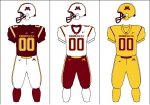
Ski U Master said:This is what I would do (or as close to it as I could get with the UA designer tool)
The stripe isn't exactly perfect on the pants and I would find a better font for the lettering, but I like the classic look to them. I would also like to add a stripe on the hem of the sleeve, but with the stretchy jerseys these days those tend to look stupid on linemen and stuff. I would prefer no name on the back, but that's up to the coach since I think recruits love to see their name on stuff.
Yeah, well, that's just, like, your opinion man.Not to be a hater - but those are ugly!
Yeah, well, that's just, like, your opinion man.
Yea, those basic unis are really hurting Alabama and LSU...

Ski U Master said:Yeah, well, that's just, like, your opinion man.
I actually strongly dislike the Rosemount coaching staff and football program. I dont really care what they do with their uniforms though.Costumes? Sorry, this is about uniforms. I seem to forget from time-to-time that you are the all-knowing Gopherholer. What would you like to talk about Rose? The South Suburban conference? How your favorite team has Michigan Unis but is named the Irish?


Seany said:Can't stand the piping on the current uniforms, and the gold 'saddlebag' looking things on the pants. Makes us look like a bad Arena League team in my opinion. I'd like to see us return to the 1960 era uniform design, and resume a true maroon color, rather than the brownish-maroonish thing that looks a bit like a dried out scab that we're currently sporting. I'd also like to see us go to a true gold color, as in the metal, a metallic gold as opposed to this mustard yellow iteration we call gold.
This is what I would do (or as close to it as I could get with the UA designer tool)
The stripe isn't exactly perfect on the pants and I would find a better font for the lettering, but I like the classic look to them. I would also like to add a stripe on the hem of the sleeve, but with the stretchy jerseys these days those tend to look stupid on linemen and stuff. I would prefer no name on the back, but that's up to the coach since I think recruits love to see their name on stuff.
Yeah, well I'm allowed to express it.
I still think it is kind of sad that someone would list one of the main reasons they chose a school is because of the uni's, but that's just my opinion.
Everyone keeps brining up Oregon started winning when they went to these crazy uni's. However, everyone keeps forgetting to mention the fact Phil Knight has dropped almost a billion into the football program over the last decade which is when they really started becoming an up and coming football power. It is the same thing at Okie State, Picken's dropped how many hundreds of millions into their program and all of a sudden they are the number two team in the country when all they have ever been before that is a fringe bowl team like the Gophers.
Not to be picky but we're a Nike school not an Under Armor school
My high school's jerseys were better...
Many players from your generation, maybe. There's a reason why Oregon has all the flashy jersey's they do, my generation loves them.