All Things New Gopher Uniforms/Helmets Thread: UPDATED 1/20 with New Uniforms!!!

How about an alternative - like all black uniform...white helmet with maroon M.

I love black uniforms but I believe they need to stay true to the school colors.


I just hope whatever changes are made to the uniform are done to the liking of the 18-23 year olds who will actually be wearing them. No uniform change should be made to suit the tastes of older generations of fans.
Yup. Liking a uniform as a fan is a bonus.
 

I quite frankly like our uniform combination's except maroon pants/gold tops and gold pants and maroon tops. The helmets look awesome don't screw with them.


I quite frankly like our uniform combination's except maroon pants/gold tops and gold pants and maroon tops. The helmets look awesome don't screw with them.

Those are actually my 2 favorite combos.
 

It will be interesting to see what happens as Jerry doesn't seem to be someone that cares at all about fashion or how the players look, as long as they are playing hard and intelligently. However, he does wear that all black Jumpman track suit, which is extremely stylish.

But this is a tough battle. You have to keep with tradition to keep the boosters and some fans happy, but also be modern so that the players and younger fans like them. And as a younger fan, I enjoyed the all-white look, including the white helmets, but that doesn't mean that I want to see it on a regular basis.
 

You have to keep with tradition to keep the boosters and some fans happy, but also be modern so that the players and younger fans like them.
What tradition though? We have not had a consistent uniform tradition.
 

I can't stand the USC colors we have been using instead of Maroon. Go back to the maroon Murray used, it is as dark as PSU's blue unis, damn near black it was great.

ding, ding. we have a winner. the unis should be the warmath era unis. including the helmets. i.e. numbers on the side, no "M". we can put a small "M" on the front collar of the jersey and another small one on the front, left upper part of the pants if people just have to have it somewhere.

and i want us to go back to pure black cleats. white socks are fine. but pure black cleats.

see my avatar for an example of them. they are beautiful, classic football uniforms. should have kept them in the first place.


Those uniforms are ugly. I doubt the players would be willing to wear those weekly, I know I wouldn't.

many, many, many would disagree with you. including many players, i would bet.
 

Never going to happen, the maroon has been standardized between all sports. And take another look at USC's maroon it is much lighter and redder than ours.

i believe usc's color is referred to as a dark burgundy as opposed to maroon. see my avatar for the maroon color corcoran1 is referring to. i would like to see that be the shade of maroon the football team uses as well.
 

Glen Mason era unis please (minus the trim).

Issues with current unis:
- maroon is actually now poop brown
- numbers are smaller and have bunch of trim around them, can barely read them
- trendy lines running all over the place that look stupid
- we don't need Minnesota across the chest, less is more
- Brewster picked them out, let's cleanse ourselves of all of that

Keep it simple!!!!!

You know the Mason era unis were selected based on Penn State, right? Glen respected JoePa and liked the clean, classic look of the PSU unis. During the Mason era we had only gold pants and those pants had no stripes, just like PSU has only white pants with no stripes. The jerseys were maroon with gold neck and sleeve trim or white with maroon neck and sleeve trim, just like PSU had blue with white and white with blue. I believe Mason even publically acknowledged the fact that the unis were modled after PSU.

I for one, would like to see more white in our unis. Think about the NDSU game 1960's throwback pants and helmet. Those were awesome. I would remove the numbers from the helmet and replace them with a BLOCK M and add a shoulder or sleeve stripe to those jerseys and be done with it.


I get everyone's opinion on what they should look like. But there was an article, I believe in SI, stating how the Oregon program turned around once they started taking more risks with their uniforms. Additionally, recruits admitted that one of the main reasons why they picked that school was because of the uniforms. I'm not saying that if ours were cooler we would have L. James here right now but I'm just stating that they need to take into account the taste of 18 year old men/kids. I'm not saying we need to do anything extreme like them, but we aren't Penn St or any of those other schools who haven't changed their uni's over the years. Whatever they decide to do, it won't make everyone happy. But if it means we might get a couple kids at least interested in us because we look sharp when we are on the field, I say we do that. Let's be honest, most of the fan base for the Gophers is an older demographic, so chances are when these new uniforms come out, it might annoy the older people or it will not be attracted to the younger people. An 18 year old and a 65 year old have very different fashion tastes. That being said, I agree that Kill doesn't seem like the type of guy who will do something drastic to the uniforms so it'll be interesting to see what he decides to do.
 

Miami Herald: College football teams using flashy uniforms to attract recruits

http://www.miamiherald.com/2011/09/15/v-fullstory/2407685/for-many-programs-being-seen-is.html

From the article:

A “big reason” the former Monsignor Pace High football player chose University of Oregon over a handful of other suitors was the Ducks’ futuristic, neon-trimmed uniforms, with flashy accessories and multiple mix-and-match combinations as unpredictable as the team’s high-octane offense.

Dixon fell in love with the uniform the first time he tried it on during his recruiting visit to the Ducks’ luxurious $3.2 million two-story locker room (resplendent with three 60-inch plasma TVs, Internet ports and private ventilation systems in each wood-paneled locker). The Miami Gardens native never pictured himself living in Eugene, Ore., until he saw himself in the mirror wearing that Ducks ensemble.

“The uniforms definitely played a big part,” Dixon said by phone last week. “Oregon’s uniforms blow every other school’s uniforms away. It’s something new, a surprise every week. I think the younger generation likes cutting edge. Some guys still like tradition, but I like change. Of course, you want to play for a good team, but if you can look good, too, you’ll feel better and play better.”

Tacoi Sumler, a former Gulliver Prep and Columbus High wide receiver from Miami, also chose Oregon. The school’s highly touted sports marketing program and wide-open offense (in that order) were his primary reasons, but the uniforms were an attractive bonus.

“I love the whole concept, the idea that we’re not afraid to try something new,” Sumler said. “The whole tradition thing is outdated in our generation. Kids today want to dress fresh and be trend-setters.”

Go Gophers!!
 

Grantland: How Does Oregon Football Keep Winning?

From the article:

"They've been to the Rose Bowl, the Cotton Bowl, the Fiesta Bowl, and last year's national championship game, and they will start this season Saturday night against Louisiana State in Arlington, Texas, ranked third in the country. How did this happen?

At the top of the list of reasons: their uniforms."

http://www.grantland.com/story/_/id/6909937/how-does-oregon-football-keep-winning

Go Gophers!!


It will be interesting to see what happens as Jerry doesn't seem to be someone that cares at all about fashion or how the players look, as long as they are playing hard and intelligently. However, he does wear that all black Jumpman track suit, which is extremely stylish.

But this is a tough battle. You have to keep with tradition to keep the boosters and some fans happy, but also be modern so that the players and younger fans like them. And as a younger fan, I enjoyed the all-white look, including the white helmets, but that doesn't mean that I want to see it on a regular basis.

Coach Kill is big on tradition and I believe Coach Kill will incorporate that into the design. Not saying he will go with the Rose Bowl look but, if he did, I would be very pleased. Maybe the budget will include a new design but also add in the 60's design.

I enjoy the different looks with our current wardrobe but I prefer a traditional look of a OSU, USC, PSU, etc. When you see the team, you recognize who it is right off the get go by their uniform.

The uni's Kill had at NIU were very basic and mundane. If that was his choosing, then that is what I expect will be the case here.


many, many, many would disagree with you. including many players, i would bet.
Many players from your generation, maybe. There's a reason why Oregon has all the flashy jersey's they do, my generation loves them.
 

I may regret this: I'm thinking it might be about time to tweak the Block M, maybe modernize it. I don't say this lightly since I love the band's block m foldout and rotation during pre-game. The Block M has been changed numerous times in the past and maybe it's time to spruce it up a bit.
 

Think about the NDSU game 1960's throwback pants and helmet.

Ugh, I hated those. They really made the team look like a bunch of AA high school players.

Also, retro doesn't resonate with young kids. Like others have said, I'd like to see them do whatever they can to help recruiting.
 

I think the Mason uniforms were better, but I don't mind the current unis too much. I don't really like the piping, or the little patches of color on the pants on the sides of the knees, but other than that, they don't look all that different than the Mason-era to me. The maroon is fine with me, but the old shade might've been slightly better. The Minnesota on the front is a bit too busy, but it doesn't bother me too much.

The one current uni that I think looks really sharp is the all-white road unis. It just looks really crisp to me. That said, I don't really have a fave home uni - maroon top over gold pants was always the best, but that doesn't look that great with all the piping and multi-color pants.

At least we're not some experimental Nike or UnderArmor school. The Ohio State, Oregon & Okie State unis are hideous - I don't understand how their fan bases aren't in full revolt. I actually the Maryland helmets, with how the flag is in the helmet, but the rest of it got pretty silly.

I actually like what Okie State has done. Multiple color combos, but not a bunch of odd piping and striping on the unis. I also think with Orange and Black as their base colors it is easier for them to work in that matte grey color. They are sharp and not totally off the wall random like Oregon. I prefer a more classic look and would like to see Minnesota go that direction, but of the new school unis for some reason I actually like Okie State because they are "clean". I personally am opposed to odd piping and striping. Think about the Vikings unis...those are horrible. I hate all unis like that. I do not like the current Gopher combos either. Both teams in town look like they are wearing World League Unis.
 

Ugh, I hated those. They really made the team look like a bunch of AA high school players.

Also, retro doesn't resonate with young kids. Like others have said, I'd like to see them do whatever they can to help recruiting.

Yea, those basic unis are really hurting Alabama and LSU...


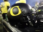
I really liked the flat paint style helmets that oregon has used. I think it would be an interesting look in Maroon and it would be completely the opposite of the glittery helmets of today. Could be cool for a game or two during the year.

football-black-helmet-2009.jpg
 

I was playing NCAA the other day and maroon helmet, gold jersey, and white pants actually looks pretty sharp.


Top Bottom