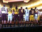
All Things New Gopher Uniforms/Helmets Thread: UPDATED 1/20 with New Uniforms!!!


Quite the build up for something this simple. I really like them however. Way better than our last uniforms. Didn't expect the helmets to be the most slick thing about the changes.
 

I dont know what everybody is complaining about. I think they look good. clean and fresh. Remind me of the Glen Mason jerseys.
 

I want to see some up close high-resolution pictures before I make final judgments. My first impression is I like them tho.
 

I'm pleasantly surprised and I'm not one who gets too excited about uniforms. Sorry to all the punks out there but the classic look is the best look. Good job!

Go Gophers!


Not a fan of the gigantic numbers on the back or the wide maroon neck trim. Otherwise they look pretty normal.


couldn't we have spent this money on a new practice facility? I mean for the hype, I was expecting something way bigger than this.


"Minnesota" is on the back of the gold jerseys only. Special game jerseys.


Not a fan of the shoulder numbers....coupled with the ridiculously huge numbers on the back, its just too much on one jersey when you have them on the shoulder too

I think I will really like this, but with how much they hyped it up this past month, I'm still feeling some disappointment


There are definetely names on the back. I think they are pretty tight! I especially like MarQuies's combo of gold top/Maroon Bottom! Looks legit!

Yea, quite a few initial tweets said no names, then that was obviously proven wrong.

Go Gophers!!
 

The 4 was used from the jerseys on the 1940 National Championship team and a font was developed based on that. Pretty neat


my favorite combo is the one ed olson is wearing. maroon top, numbers on shoulders, front and back. white pants, black shoes, black socks. very reminiscent of the 1960's murray warmath era uniforms. the only difference being no vertical maroon & gold stripe on the pant leg, and no white helmets with maroon & gold stripe and maroon numbers on the side.

really hope the ed olson combo set will be our default and permanent home uniform that we ALWAYS wear at home no matter what.

like them. and like the larger numbers on the front, back and having the numbers on the should.
 

Not quite sure what the grumbling is about. In my opinion, they're pretty much what they should be. Classic, yet modern. They'll be intriguing to recruits AND satisfy the older season ticket holders who like things done the old-fashioned way. Some of you let the build up get your hopes too high. They're just uniforms.
 

Alright, they're actually already growing on me.....they just look straight up clean. Modern, but still clean. Unlike our last uniforms, they won't get outdated for a LONG time.
 

The only thing I'm not a fan of is the "MINNESOTA" as the last name on some of the jerseys. Looks like some have last names & another "combo" has Minnesota. I'd rather have last names or nothing.

Other than that, I have no complaints. I like the black socks & shoes. Seems almost like a Nike Combat combo with the Mason era uniforms, which I tended to like, especially with the switch to black socks & shoes starting with the '03 Sun Bowl on....


After watching the behind the scenes video on them, I like them a lot more. They will look good in Pasadena.
 

For what it's worth, on goldengophergridiron, there's a picture of Brock Vereen in in a yellow #21 with 'Vereen' on the back.
 

I'm not sure if this was ever said, but are they still having another special uniform for a game? I thought I read that somewhere.
 

I'll always love the gold tops with maroon pants, so I'm hoping I get to see those at home at LEAST once a year.


Top Bottom