Taji34
Well-known member
- Joined
- Apr 22, 2015
- Messages
- 3,977
- Reaction score
- 2,914
- Points
- 113
I played a few hours last night and here are my initial thoughts as someone who hasn't played Madden or NCAA14 before:
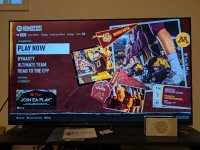
Lastly, I do really like the design of the main menu when you select the Gophers as your favorite team:

The real-life photos from games (that are definitely sourced from our media department), real foam finger and flag, and the tickets from the 2019 victory over Penn State are all really nice touches. They definitely put a lot of thought into the main menu screens (It would be cool to see what other team's menus look like, but I'm not about to spend the time updating my favorite team over 100 times just to see).
- It feels like there is a steep learning curve to playing the game. I have it on the lowest difficulty setting because I'm new, and that means I'm winning games, but it feels like I'm not actually influencing the outcome. I'm unsure how to actually "get better" at the game. There are the mini-games, and the "practice" function, but I wish there was a more structured tutorial you could go through that walks you through the different controls and the different things you can do when playing offense, defense, and special teams.
- There are little quirks with the in-game announcing that I find weird. Like, when you play a conference game, or a rivalry, the announcers will say that in the little "pre-game" cinematic, and then say "A team from the B1G, wisconsin, is playing a team from the B1G, Minnesota" which feels really unnatural and clunky. Like maybe it was so they could cut down on the dialog they needed to record, but it feels like they could have instead recorded variations of "We have a B1G conference matchup, wisconsin vs Minnesota", "We have a non-conference matchup, New Mexico State vs Minnesota", "We have a B1G vs SEC game today, Minnesota vs Auburn", etc. It would feel a lot more natural that way.
- It's clear that they focused more effort on certain "atmosphere" aspects of the game than others. Some praise I have for them is the attention to detail of the rivalry-specific announcer audio. I played partway through an Axe game and there was color commentary about how this was the most played rivalry in FBS, and other things specific to the rivalry. The recording of the rouser is pretty good as well. I can tell it was not a recording from the U, and that the instrumentation is slightly different than our Marching Band, but they seemed to have at least sourced the correct modern arrangement of the rouser (which is more than can be said about most of the other B1G schools, who more often than not seem to use the old arrangement of the rouser from prior to Dr. Ben's stint as the marching band director (1960-1993)). They do, however, omit the spellout at the end of the rouser.
- I have yet to hear any school specific cheers/chants from the crowd, but I may have just missed it.
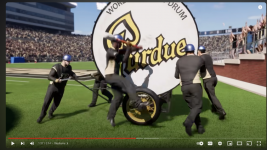
- I am REALLY disappointed at the lack of effort put into the marching bands in this game, especially since they are one of the big atmospheric differences between college and the NFL. They seem to have put the bare-minimum effort into representing the marching bands:
- None of the bands have their proper uniform. They all use the same, generic uniform with a couple of the colors changed to match the school colors. This really confuses me because clearly they put some effort into designing higher-detail/proper marching band uniforms, as seen in this still from the "Sights and Sounds" deep dive:

- While yes, the bands are placed in the "proper" positions when the teams run out onto the field during the opening pregame video, they have the "marching" animation playing during this time and in real-life most bands are not marching in place during team-run outs.
- Further, the marching animations are not in sync with each other, nor match the tempo of a given school song that is played in the background.
- You can really easily see the band during touchdowns in front of the student section in our stadium, and they seem even lower-quality of models than the fans in the stadium.
- None of the bands have their proper uniform. They all use the same, generic uniform with a couple of the colors changed to match the school colors. This really confuses me because clearly they put some effort into designing higher-detail/proper marching band uniforms, as seen in this still from the "Sights and Sounds" deep dive:
- They did seem to include proper themed games for us (stripe out, and gold out are 2 I saw while playing in Road to Glory), but they don't line up with the games they are actually scheduled for in the 2024 season.
- They also seemed to do the bare minimum to represent Goldy. He doesn't seem to switch uniforms to match what the team is wearing, and also he's wearing last year's uniform. His animation for spinning his head is ALL wrong as well (it seems like rather than referencing any of the NUMEROUS videos you can find of him spinning his head, they just took the model, gave it to an animator and said "He spins his head around, animate that" and the animator just guessed at how he did that.
- The flags the Spirit Squad holds when the team runs out were all just the Maroon flag with a gold Block M, rather than the proper: Maroon flag with Gold Block M, Gold "MIN", Gold "NE", Gold "SO" and GOLD "TA" flags.
- I don't like how you can't seem to skip the pre-game cinematic. It would be fine if there was enough variety, but there only seems to be 1 or 2 permutations of the pre-game cinematic per team, so it gets old pretty fast.
- The gear the fans wear in the stands when they to "camera close ups" after big plays all seem pretty generic. I would like to see some more variety/accurate fan gear (Gopheralls were NOWHERE to be seen as far as I could tell, and those + body paint are a staple among students)
- The Ultimate Team mode is interesting, but it took me a second to realize when opening the packs that I had to choose 1 card to keep. If you open a pack, view all the cards, and then navigate back to the menu without choosing a card there is no warning or anything that asks "You haven't chosen are card, are you sure you want to leave?".
- The recruiting mechanic in Dynasty mode is a bit overwhelming. It briefly walks through all the menu options, but then just dumps you into it. I also wish the sorting/filtering was a bit more dynamic. I'm starting as an OC at Rice, so I would like to be able to sort by star rating but also filter to the recruits who are actually interested in Rice. If I sort by star power, I just get shown a bunch of 4 and 5 star players who have already locked me out because Rice doesn't have a high enough "prestige" as a program.
- The likenesses of the players who signed on to be in the game are kinda hit and miss. I get that they intentionally used the player creation system to just get "pretty close" to the players rather than designing custom models for everyone, but some players look more like themselves than others, and some players who don't look similar in real life almost look identical in-game.
- I wish there was a little more ability to customize the looks of your coach in Dynasty mode. I get that there doesn't need to be as much customizability as the player creation, but only getting to pick from a list of generic heads, setting height and weight, and then picking 1 of 2 clothing options seemed like too little customization.
- In the player creation, there were a lot of "incompatible" equipment combinations, and as far as I could tell there was not a "show only compatible selections" option I could turn on. This wouldn't be as annoying if they grouped the compatible options together, but they don't (helmet grill selection was super annoying, because the compatible options were randomly interspersed throughout all the options, so I had to click through every option to find the compatible ones, and then I couldn't easily swap between two options to see them back to back unless they were next to each other in the list).
- I do like that if you select the Gophers as your favorite team, and select quick play, the first option you are presented is the Axe game at home. It's a nice touch that they know what game we'll all want to play over and over again, haha.
Lastly, I do really like the design of the main menu when you select the Gophers as your favorite team:

The real-life photos from games (that are definitely sourced from our media department), real foam finger and flag, and the tickets from the 2019 victory over Penn State are all really nice touches. They definitely put a lot of thought into the main menu screens (It would be cool to see what other team's menus look like, but I'm not about to spend the time updating my favorite team over 100 times just to see).

