gopherguy5
New member
- Joined
- Dec 2, 2010
- Messages
- 8
- Reaction score
- 0
- Points
- 1

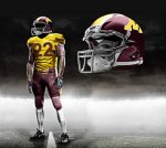
This? I'll play around with some more designs tomorrow...

I would love to see something like this from the U for a big game/alt look...

Lil white -

")
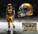
I would love to see something like this from the U for a big game/alt look...
word

Like this one a lot.
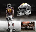
that's basically sconi----right down to the red
except you flipped the "w" upside down
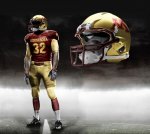
I would like to see a return to metallic gold helmets and the true gold pants (not yellow/orange).
Something close to Boston College (who shares our same school colors).
You must either be too young (not alive yet) or too old (suffering from CRS) for a memory of the metallic gold during the Wacker years.
Your indignant reply is laughable, as your own acknowledgement that there are many shades of both gold and maroon is exactly the point of most of the posts in this thread. We've had metallic gold helmets for a number of seasons in the 70s and 90s that I can remember - perhaps more going further back. No reason we couldn't entertain it again (which would be my preference).
You may have a different opinion (that's what message boards are for)... so state it.
Don't make sh*t up just because you make yourself feel better by belittling the contributions of other posters.
We've seen lots of variety just within our own team over the years
As far as not sharing colors with Boston College, you are wrong - both websites state maroon and gold.
But first, start taking your meds again.
I'm very familiar with brand identity issues and understand the underlying point of dpodoll68's argument. Brand ID specifications change/shift more frequently than people realize, too, however, although I haven't been able to track down any historical info online for the U. The existing standards are clearly spelled out for both spot and process color printing and web communication but offer no specificity when it comes to apparel and uniforms. There has, apparently, been great flexibility granted to the athletic department when it comes to uniforms over the years, as evidenced by the football uniform photo gallery. The unis under Mason were probably a fairly close visual match to the print/web standards, but we were no longer anywhere close with the unis under Brewster. To argue that we can't have metallic gold helmets because it isn't the school color is one opinion, but it seems a little weak when we have a long stretches of history where the team wore metallic gold helmets. Since the entire argument that the unis must match the brand id standards has so many historical counter examples, and since the thread was a fun exercise about what people wanted to see, I didn't have a lot of patience for a self-important poster telling me what was right and wrong. This was a fun off-season diversion, at least for a few pages.
I hate the use of non-school colors (black, white, yuck).
We are Maroon and Gold. Switch to a white away top when you're on the road and that's all I would change. I put a small gold outline of the state of MN on the sleeve, and I'd put a small one on the back of the helmet, as well. I would like to see a return to metallic gold helmets and the true gold pants (not yellow/orange). Something close to Boston College (who shares our same school colors).