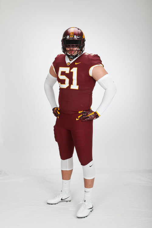
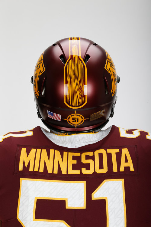
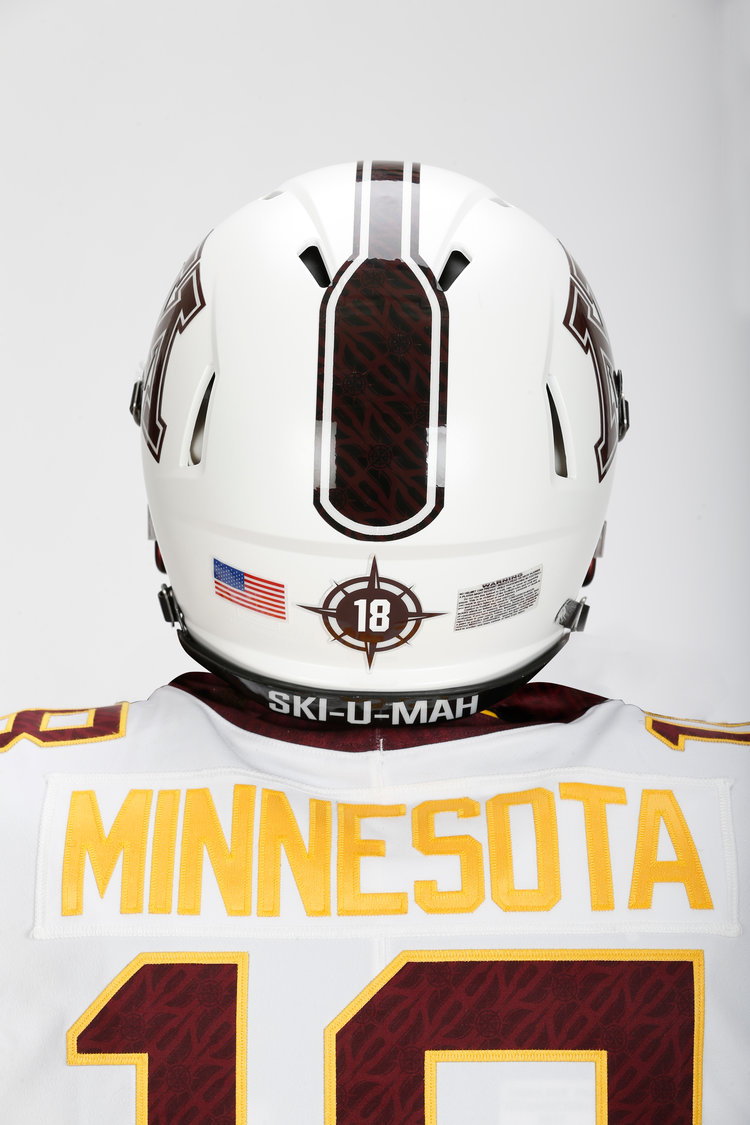
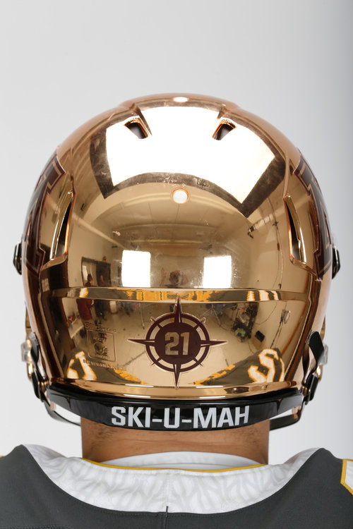
Video and Pictures: Gopher Football 2018 Uniform Unveil: H.Y.P.R.R. ELITE


_86I7664.JPG


Go Gophers!!
 

I can live with all but the anthracite. There is no maroon accents and the gold makes the anthracite look green.

Sent from my SM-N950U using Tapatalk


From the Gopher Sports article:

The new uniforms were unveiled to the team at an early 6 a.m. meeting today with Gopher alums Dom Barber, Marqueis Gray and Maxx Williams donning the new Nike threads.
I'm sure the reactions of those three seeing the uniforms for the first time, and the team seeing them will be in the reactions page: https://hyprrelite.com/reactions/


I can live with all but the anthracite. There is no maroon accents and the gold makes the anthracite look green.

Sent from my SM-N950U using Tapatalk

I like them. They look green I that picture, but not in the video.
 

Not good.

Sent from my RS988 using Tapatalk


Love everything except the Paddle across the top of the helmet.
 

I want to preface my comments with the fact that as long as the kids like the uniforms, I am fine with them and that I reserve the right to change my initial impressions of the uniforms when I see them in a different setting.

Positives: I love the new Gold helmet and I like the white jersey.

Negatives: Where to begin? These just look so incredibly generic...the complete opposite of what I would have expected from a PJ Fleck re-brand. The anthracite and maroon jerseys look really bad with the white numbers and the white collar. I don't like the oars on the helmets. If we are going with a color other than maroon/gold/white, I really wish we'd use black instead of anthracite as it looks really good (IMHO) with maroon and gold as both FSU and ASU have put together some nice looks with similar color schemes. The anthracite jersey/gold pants as modeled is easily the ugliest Gopher uniform combo I can remember...yes I prefer the Wacker uniforms to those. I am very surprised that these are the uniforms we've been hearing about for more than 6 months.
 

Not a fan. When the last uniforms were unveiled I liked them right away and never got sick of them. I didn't like some of the combos with white pants but overall liked them. I especially don't like white numbers on home uniforms and I am already tired of chrome helmets from the bazillions of other teams that are already doing it. They aren't horrible, but to me they are a step backwards from the previous uniforms which in itself "feels" horrible. Also not a fan of elevating Fleck's "row the boat" brand above the University's historical brands. The "oar stripe" is pretty bad. I'll live with them and as others have said, if the recruits like them - great.
 

Bothers me that the gold on jerseys/pants is completely different color than chrome gold on helmet.


jersey.jpg
 

Those are completely hideous, but none of us should be surprised.

PJ isn't about subtlety.
 

I love all the combos. Well done by the staff and design team! :clap:
 

The fact that Gopherhole doesn’t like them is a GREAT sign. Kids are basically the opposite of the man demo here.


Sent from my iPhone using Tapatalk
 

Overall it could be worse. The white accents around the neck/sleeve openings make it look like their under shirts are sticking out. Overall it feels like we're going back to the 80's and the Gold chrome helmets are beyond stupid. At least it's overall a fairly traditional design that isn't full of stripes or anything too bizarre.
 

The fact that Gopherhole doesn’t like them is a GREAT sign. Kids are basically the opposite of the man demo here.


Sent from my iPhone using Tapatalk
If a kid chooses to go to a school based on their uniforms they are probably too stupid to qualify academically.
 

Love everything except the Paddle across the top of the helmet.

The internet has already pointed out that the paddle looks more like a maxi-pad. Caption: Did you know 60% of Gophers are wearing the wrong size of maxi-pad?
 

Already tired of that paddle and compass stuff, but whatever he likes, I guess.


Top Bottom