Video and Pictures: Gopher Football 2018 Uniform Unveil: H.Y.P.R.R. ELITE

I like them, but not a huge fan of the gold helmet, but I love the oar/compass additions to them. The anthracite is sweet with the anthracite pants, but looks dumb in the other combos.
 

I like the uniforms themselves - except I see no need for the anthrax, and it looks green. Gross. HATE the oar on the helmet. How about Goldy's tail? That was more clever. The "subtle boat, oar and compass" design on the numbers look like a floral pattern. Whatevs, at least it is subtle. Dislike the chrome helmet and the compass. I miss being the GOLDEN Gophers from the University of Minnesota rather than RTB/HYPRR at PJ U. But, who cares. If the players, recruits and students like it - great. Can we focus on winning games now?

Anthrax has no place in college sports.


Overall, they get a 'meh'. I really liked the Kill-era unis, so I was expecting to be disappointed.

Like others have said, the white collars and numbers on the maroon unis don't look good. Overly generic; make them gold, and they move from about a '4' to about a '7' in my book.

Chrome gold helmet is cheesy and is played out. I love the all white, however. Not a fan of the oar on the helmet, but if that's the worst of the oar-ness, then I can live with it.

I would assume things like full banana, goldy on the helmet, etc. will be saved for future alternates/special occasions. With how much PJ added to the unis this past year, I bet these are just the 'baseline' and things will be added/changed liberally.

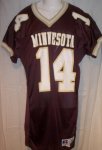
FULL BANANA / GOLDY HELMET 4 LFE!


If a kid chooses to go to a school based on their uniforms they are probably too stupid to qualify academically.

You can't say "stupid" nowadays. The younger generation has some sensitive folks. Get with the program.
 

I like them, but not a huge fan of the gold helmet, but I love the oar/compass additions to them. The anthracite is sweet with the anthracite pants, but looks dumb in the other combos.

None of the new helmets work with the anthracite. I'm not a fan but always have felt you need to just go all gray (helmet included) if you have anthracite in the mix since none of the Gophs colors work with it. I could see a matte finish anthracite colored helmet with the block M and accents in gun metal.
 

Only issues I have with them are the white numbers and gold helmets. Neither goes well with the rest of the color scheme. Why have white numbers but gold letters?. Not a big fan of the oar either but not a deal breaker to me. It's like they had a different designer for the helmets than they did for the rest of the uniform and they worked in two different buildings and didn't have phones or email so they could conme up with a scheme that goes together.


Sent from my iPhone using Tapatalk
 

These are ELITE uniforms. [emoji91][emoji91][emoji91][emoji91][emoji91]


Sent from my iPhone using Tapatalk


If you take out the gray uniforms, they are pretty close to what we had. Most seemed to have like those. I would have preferred a black option over gray.


None of the new helmets work with the anthracite. I'm not a fan but always have felt you need to just go all gray (helmet included) if you have anthracite in the mix since none of the Gophs colors work with it. I could see a matte finish anthracite colored helmet with the block M and accents in gun metal.

I actually wouldn't mind seeing a helmet like that because I do agree that while the Anthracite uniforms look good the helmets have never really gone great with them.


Might as well take the M off the helmet and replace it with PJ
 

They're not as bad as I expected. The white numbers outlined in gold on the maroon look very generic. I probably would've preferred to keep the gold numbers and add the white outline rather than vice-versa. I hate the oar on the helmet.

Having said that, I was frightened of what was coming. While I like the Kill uniforms better, these aren't embarrassing.


I agree with this completely. I do not mind the alternate glimmering helmet or the grey look either and I have decided to stop worrying about he all white helmet, pants ect. but.....

Those Maroon jerseys looks like total crap. I despise that horrible white collar and those white numbers. Unfortunately the "home maroon" jersey used to be the flagship look of the football team and it looks like Shxt now.

How they could come up with those awful white numbers and that wretched white collar I have no idea, when the traditional gold numbers and collar look so great. Oh well, one more crap sandwich to eat.

As far as a am concerned they should wear the anthracite jerseys all the time at home now.
 

I just looked at them again and threw up a little in my mouth.

Jim Wacker lives!

9663591_orig.jpg


Happy to see the uniform number font stayed. Otherwise, I really don't care any more what they wear. After forty some years of following this team I am too beat up and emotionally drained to worry about uniforms designs. Just start winning. And besides, they way things are these days, they'll change in a couple of years again anyway.
 

No gold pants. That’s the only part of the uniform I ever care about. Every combo oooks better with gold pants.
 

No gold pants. That’s the only part of the uniform I ever care about. Every combo oooks better with gold pants.

I don't like the "Minnesota" on the back.
When I go to a game, and seem some unknown player make a special teams play, I like to know who the player is, rather than him just be the 3rd person with #18 on their jersey.
 

Happy to see the uniform number font stayed. Otherwise, I really don't care any more what they wear. After forty some years of following this team I am too beat up and emotionally drained to worry about uniforms designs. Just start winning. And besides, they way things are these days, they'll change in a couple of years again anyway.

The bold has been Gopher football jersey history to a T. Our longest stretch of consistent uni's seemed like it to be the Mason era uni's. Our tradition here, as far as football jerseys, has pretty much been a lack thereof, for the most part.
 

What do the Gophers do when they decide they're not going to use a Jersey anymore?

Can I get one?
 

I think they look fine, and as long as they start winning, I don't care what they wear. I think the metallic gold helmet and white numbers are weird, but don't mind the rest. If they make tweaks in the future, but want to keep the metallic gold, they need to match the other gold a bit better.

On a different note, props to the graphics/video department, I always like the videos they put out around all gopher sports.


I don't like the "Minnesota" on the back.
When I go to a game, and seem some unknown player make a special teams play, I like to know who the player is, rather than him just be the 3rd person with #18 on their jersey.

This Minnesota is a placeholder for a player's name.


Change is always hard, especially radical ones. I think these will be fine once we get use to the changes made. I'm on board with this.
 

The internet has already pointed out that the paddle looks more like a maxi-pad. Caption: Did you know 60% of Gophers are wearing the wrong size of maxi-pad?
They don't even have wings....

Sent from my SM-N950U using Tapatalk
 

We are seeing this uniform craze in all sports these days so its nothing new here.

We had a very good simplistic/traditional yet modern uniform set that came out in 2012. For someone who is a traditionalist, it is hard to top that "Jerry Kill era" uniform that we saw for the last 5-6 years.

I like the fact they kept the number font. Also like the addition of the white numbers trimmed in gold for the maroon jerseys. Get rid of the white "nike collar" on the maroon jersey and you have a pretty good maroon jersey.

The gold chrome helmets are a nice addition. Love the white jerseys and how they added the gold trim to the numbers.

The anthracite seems unnecessary, but it's better than black.

The oars and compass are PJ's stamp on the uniforms and are sort of forced and gimmicky but that's ok.

Overall, the new uniform set is better than I anticipated. Maybe I was just expecting a much more radical re-design. I was happy to see them stick to a lot of the traditional elements while adding some new stuff.


Top Bottom