Uniform refresh?

pharmacygopher

114 Row 11
Joined
Mar 4, 2009
Messages
3,073
Reaction score
2,278
Points
113
Obviously, golds for full banana!

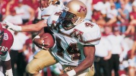
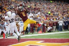
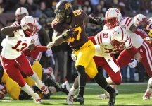
If it's just a tweak versus full new uniforms, my big one would be changing the white collar on the homes to either maroon or gold. That would completely change the look. I'm good with the white numbers.



Bananacite!!!!!
Seriously though, I like Stockers pic. I could get used to that. White pants would take time but I could like em. As said before, get rid of the white collars.

But crop tops have me thinking....


Bananacite!!!!!
Seriously though, I like Stockers pic. I could get used to that. White pants would take time but I could like em. As said before, get rid of the white collars.

But crop tops have me thinking....
I've never understood why crop tops went away. Not so much the ones that went all the way up to the bottom of the shoulder pads, but at least so they don't have to be tucked in. I played in high school in that era and it seems like that was a much more comfortable jersey style.
 

I've never understood why crop tops went away. Not so much the ones that went all the way up to the bottom of the shoulder pads, but at least so they don't have to be tucked in. I played in high school in that era and it seems like that was a much more comfortable jersey style.
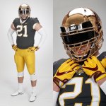
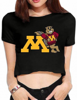
In all honesty, when Slab said crop tops, I thought:

1670293755211.png


The Anthracites are the best looking ones they have. But personally, I hope they go with whatever pisses off the geezers who don't like black, white, or gray...
This geezer would like to see the school colors in some fashion. The metallic look is ugly.


Bananacite!!!!!
Seriously though, I like Stockers pic. I could get used to that. White pants would take time but I could like em. As said before, get rid of the white collars.

But crop tops have me thinking....
DWfJpvYVwAEysil-4258842379.jpg
Yes, the bananacite uniform. Here it is.


Is this just for the bowl game or an actual refresh?
 

Ditch the gray, it's hideous. What are we, Purdue?? More white and gold unis please. Would also love an all-black option with some maroon and white highlights. And for the love of God, can we please get rid of the giant Goldy head on the side of the helmets, it's tacky and the M on both sides is much cleaner. If it were up to me, we would wear the chrome domes every game like we used to, they are beautiful.
 

Ditch the gray, it's hideous. What are we, Purdue?? More white and gold unis please. Would also love an all-black option with some maroon and white highlights. And for the love of God, can we please get rid of the giant Goldy head on the side of the helmets, it's tacky and the M on both sides is much cleaner. If it were up to me, we would wear the chrome domes every game like we used to, they are beautiful.
Purdue has gray as a color?


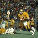
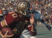
The one thing I think would go a long way is making the numbers gold again. I think it has looked better in the past and the one thing really missing from the current look. When the Gophers wear the maroon jerseys and gold pants, the white make the uniform look off.

I think the gold numbers just look better, even when they've had white trim.
mn11.jpg

MN2.jpg

MN3.jpeg

MN4.jpg


Top Bottom