tikited
Me
- Joined
- Nov 20, 2008
- Messages
- 18,994
- Reaction score
- 6,251
- Points
- 113
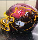
If it were up to me, we would wear the chrome domes every game like we used to, they are beautiful.

If it were up to me, we would wear the chrome domes every game like we used to, they are beautiful.

The last pic is the best.The one thing I think would go a long way is making the numbers gold again. I think it has looked better in the past and the one thing really missing from the current look. When the Gophers wear the maroon jerseys and gold pants, the white make the uniform look off.
I think the gold numbers just look better, even when they've had white trim.
View attachment 22300
View attachment 22301
View attachment 22302
View attachment 22303
Looks like the nebraska defenders are looking at everything except who to tackle.The last pic is the best.
so...normal then?Looks like the nebraska defenders are looking at everything except who to tackle.
I don't believe so. I just remember it from when they first released the new uniforms.Did they actually use that? I must have been shit-faced that day.
Could definitely see Fleck wearing that suit and doing the sockless shoe thing.Gopher uniform for the pinstripe bowl.
View attachment 22306
agree on everything but the Gopher on the side of the helmet, I think its one of the best designs in college football.Ditch the gray, it's hideous. What are we, Purdue?? More white and gold unis please. Would also love an all-black option with some maroon and white highlights. And for the love of God, can we please get rid of the giant Goldy head on the side of the helmets, it's tacky and the M on both sides is much cleaner. If it were up to me, we would wear the chrome domes every game like we used to, they are beautiful.

I love full banana but that shade of gold is hideous. Not sure if that's just the photo or what they actually looked like.
I like the metallic Christmas ornament gold helmets. They’ve become my favorite, I didn’t think I’d be saying that, but they feel like an ode to when they did the metallic gold in the old days, and I really liked that look. They’re the GOLDen Gophers, not the Goldenrod Gophers. Not the Yellow Gophers. I would also love a 60’s Rosebowl throwback uniform like they did in the Metrodome once. I think the cleanest look we had was under Kill with the jerseys being just maroon with gold numbers. No oars. (Granted there were bricks in the numbers occasionally, but that was so subtle it was fine).I remain a fan of "metallic" gold, but I know I'm in the minority.
If they tweak the gold, I would like it just a little less yellow - more of a sunset gold. (which is, by a remarkable coincidence, the color my house is painted....with maroon trim and soffits)
the school colors are maroon and gold. the uniforms should be some variation on maroon and gold.
I don't like white pants or jerseys. I can live with anthracite for one game a year. No black.
