Picture: New turf being installed at TCF Bank Stadium

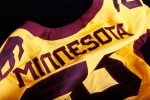
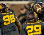
I think there are some aspects of the font that seem fundamentally poor in design. The spacing and width on certain characters is strange, the A, M, W seem much wider than other letters for example, and when an A precedes a letter there is a large gap due to the protruding serif on top of the A. The M and W are the same character just upside-down which gives the W in particular a strange look, and the lowercase "N" being used as an uppercase doesn't fit the overall style of the other characters. Some serifs point to the right and others to the left, the G has an odd diagonal slice taken out of it, the crossbar on the H doesn't follow through to the left to match the B, F, R, etc. It looks hastily put together and inconsistent in design.

I can't argue with any of that.
 

I think there are some aspects of the font that seem fundamentally poor in design. The spacing and width on certain characters is strange, the A, M, W seem much wider than other letters for example, and when an A precedes a letter there is a large gap due to the protruding serif on top of the A. The M and W are the same character just upside-down which gives the W in particular a strange look, and the lowercase "N" being used as an uppercase doesn't fit the overall style of the other characters. Some serifs point to the right and others to the left, the G has an odd diagonal slice taken out of it, the crossbar on the H doesn't follow through to the left to match the B, F, R, etc. It looks hastily put together and inconsistent in design.

Agreed, the font is... weird. It's just a bit off as a whole, doesn't feel completely baked, and unless you're looking right at it is arguably hard to read.
 

After hours of endless effort I am still trying to find something, anything, I care less about than what font we use. I haven't yet.
 

After hours of endless effort I am still trying to find something, anything, I care less about than what font we use. I haven't yet.

Global "Warming"?


hardy har har....anywho, if they're gonna wear it on their jerseys/helmets, why not on the field?

395281_10150547110242943_6129582942_8935818_255105288_n.jpg

gpher font 2.jpg

gophers_helmet_0_1442641377.jpg
 

I actually prefer green end zones, it's more of a classic look than colored.


<script async src="//platform.twitter.com/widgets.js" charset="utf-8"></script>


Ive noticed no more NFL size-wide sidelines. They even had that on the first turf, with maroon
areas at the team sideline area. A lot of other lines to be added still, so interesting to see what
the final product does indeed look like.
 

I actually prefer green end zones, it's more of a classic look than colored.

I do tend to agree, for years I felt the 'filled in' endzones were reserved for big bowl games, as an accomplishment, etc.
 

Ive noticed no more NFL size-wide sidelines. They even had that on the first turf, with maroon
areas at the team sideline area. A lot of other lines to be added still, so interesting to see what
the final product does indeed look like.

That will all need to be painted for all games. Tons of markings missing from photo on and off field.
 

WAY back in the dome days didn't we have an issue where the end zones where filled with color.... and then a play to the end zone took place and our WR was called out and the theory was the color made it hard for the ref to see.... then they added a green border around the end zones along the in and out of bounds lines?


WAY back in the dome days didn't we have an issue where the end zones where filled with color.... and then a play to the end zone took place and our WR was called out and the theory was the color made it hard for the ref to see.... then they added a green border around the end zones along the in and out of bounds lines?

The gold in the end zone didn't go all the way to the boundary at the time. There was a yard or so between the gold and the white line that was still in bounds. We caught a pass in the end zone, planting one foot on the green, but the official thought the green was out of bounds.
 

The gold in the end zone didn't go all the way to the boundary at the time. There was a yard or so between the gold and the white line that was still in bounds. We caught a pass in the end zone, planting one foot on the green, but the official thought the green was out of bounds.

I believe it was in overtime against Purdue.


I do tend to agree, for years I felt the 'filled in' endzones were reserved for big bowl games, as an accomplishment, etc.

I think the plan is to turn on the heating coils every time the Gophers score a TD which will fill in the endzones with color.
 

What we need are all the blades of grass to be light up fiber optics ...... think of the awesome ramifications there..


The whole field is a jumbotron on demand.....


What we need are all the blades of grass to be light up fiber optics ...... think of the awesome ramifications there..


The whole field is a jumbotron on demand.....

I think you may be on to something! You could just light up the appropriate line markings for sport on demand. Rent out the field to different teams who could have their logo in the end zone or 50 yard line. Make the line spacing a bit longer when Iowa has the ball and shorter when the Gophs have it!


Hank Scorpio of Gelos LED Systems? I thought this guy was a finalist for the AD position here?..

char_755.jpg globex.jpg


I think you may be on to something! You could just light up the appropriate line markings for sport on demand. Rent out the field to different teams who could have their logo in the end zone or 50 yard line. Make the line spacing a bit longer when Iowa has the ball and shorter when the Gophs have it!

Hook the ball up to some sort of location triangulation device so when it hits the line on a run the whole field plays the jumbo tron TOUCHDOWN graphic.


Top Bottom