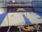
Picture: New turf being installed at TCF Bank Stadium

How can you tell? It looks like a solid base on which the turf is laid.

Keeping the coils, with the maintenance costs would be dumb. Considering the rarity of using them during a college football season.

Maintenance cost? I agree there is a cost to operate the heat transfer fluid system but first of all you have no idea what it is (neither do I). I would not even consider removing a $2 million upgrade.


Sent from my iPhone using Tapatalk
 

They didn't remove the coils. Can we stop this silly discussion.
 

OK, they did not remove the coils but maybe they should move the heating coils to the shady side seats? Have a heated section behind the Gophers bench and charge big money.
 

OK, they did not remove the coils but maybe they should move the heating coils to the shady side seats? Have a heated section behind the Gophers bench and charge a big donation.

I think this is the more preferred option.
 

Crumb rubber and silica sand are not removed from the turf before it is removed. They cut the turf, roll it up, and remove with bobcats or excavating equipment.


Crumb rubber and silica sand are not removed from the turf before it is removed. They cut the turf, roll it up, and remove with bobcats or excavating equipment.

Pretty sure the bobcats were for removing the heating coils and then replacing them with cooling coils.
 

I wonder when the next update photo will be. IIRC when they replaced the turf for the vikings it took about a week.


I heard they replaced the coils with a bunch of those copper armband things....

My source tells me they removed the heating coils for a bunch of slinkies...

<img src= https://s24blogs.files.wordpress.com/2012/05/1137705123_73d2a1ed6b_o.jpg>


My source tells me they removed the heating coils for a bunch of slinkies...

<img src= https://s24blogs.files.wordpress.com/2012/05/1137705123_73d2a1ed6b_o.jpg>

That would be kinda awesome until the field slinkies get in sync, it becomes self aware, and goes on a rampage through the campus...


So they're using the same plain generic endzone they just used? Why?... Not the football font? Block letter font?
Filled in maroon endzone? Puzzling....
 

Like the font, easy to read and bold but wish the endzones were filled with gold or maroon. Oh well.
 

Will the other end zone say Golden Gophers?


Sent from my iPhone using Tapatalk


From all the pics posted of the turf replacement, I think it is safe to say the heating coils were not removed

So look at the picture in the following post:

CgGFaVrUUAEZUBA.jpg

And look at this picture from after the coils were installed:

tcfheatinstallation.jpg

In the first picture it looks like the sand was cleared off a few spots, but I don't see the coils that you see in the second picture before they were covered in sand.

I have no inside knowledge either way. But based on these two pictures I'm wondering if they did remove the coils.


FALSE!

I got a call from the season ticket people about 2017 season tickets. They said they're all out of maroon paint. The open end of the stadium will be filled in with standing room only railings, Pat will be the new PA announcer whenever he decides to come in, they can't expand the upper deck because of Obama, and they're canceling football in favor of equestrian sports.

Hopefully they use the recently removed heating coils for those railings - to save some $.
 

By the time they need to do any work on the heating coils it will be time for new turf again.
 

So they're using the same plain generic endzone they just used? Why?... Not the football font? Block letter font?
Filled in maroon endzone? Puzzling....

Puzzling is right. We can all disagree on whether the end zones should be maroon or gold, but at least we're all on the same page about the two potential colors. But if they created this special font for all their football promotions, why not use it on the field?
 

Puzzling is right. We can all disagree on whether the end zones should be maroon or gold, but at least we're all on the same page about the two potential colors. But if they created this special font for all their football promotions, why not use it on the field?

Rumor has it this is why we only have two commits so far.


Because it looks terrible.

Like all design decisions, beauty is in the eye of the beholder. It doesn't necessarily matter that it's not universally liked, but it should be consistently used. I don't like maroon and gold as colors, but that doesn't mean I think we should start using blue and gray.

The Marketing Department has a special look they use for the football team. From a design and branding standpoint, it's pretty odd that they don't use it.
 

So they're using the same plain generic endzone they just used? Why?... Not the football font? Block letter font? Filled in maroon endzone? Puzzling....


Puzzling is right. We can all disagree on whether the end zones should be maroon or gold, but at least we're all on the same page about the two potential colors. But if they created this special font for all their football promotions, why not use it on the field?

The generic field will be in place for two years to accommodate Minnesota United.


Like all design decisions, beauty is in the eye of the beholder.
I think there are some aspects of the font that seem fundamentally poor in design. The spacing and width on certain characters is strange, the A, M, W seem much wider than other letters for example, and when an A precedes a letter there is a large gap due to the protruding serif on top of the A. The M and W are the same character just upside-down which gives the W in particular a strange look, and the lowercase "N" being used as an uppercase doesn't fit the overall style of the other characters. Some serifs point to the right and others to the left, the G has an odd diagonal slice taken out of it, the crossbar on the H doesn't follow through to the left to match the B, F, R, etc. It looks hastily put together and inconsistent in design.


Top Bottom