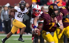
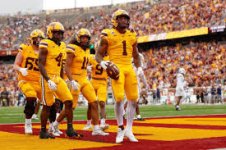
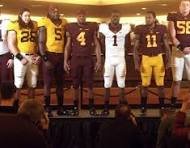
Hot take: are these the best Gopher's unis of all time?

GopherEnEspaña

Well-known member
Joined
Nov 16, 2021
Messages
340
Reaction score
534
Points
93
I don't know about you guys, but watching Saturday's game, I kept catching myself thinking "Damn, our uniforms are sharp"

The white pant stripe, the beautiful maroon and gold (finally got it right) the big numbers. USC has some of the best looking unis in all of CFB and I think we outclassed them there.

Admittedly, I thought Nike's unis were great during the Mason era, less is more. But these current ones are my top pick.

Still not a fan of the full bananas. RTB Ski U Mah Go Gophs


There was a discussion about this after the uniforms for USC were announced last week. Here is what I said in that thread:

I think it will look nice on the field.

I still long for the Kill-era uniforms but these new sets are good.

My Gopher uniform rankings since the turn of the century are…

5. Brewster era - pin striping was weird and school/team name on the chest is always bush league on football jerseys. Outlining of numbers and words too busy/prominent. Positive nod for first Gopher set allowing mixing and matching of Gold, Maroon, and White combos.

4. Fleck era 1 - not bad uniform sets, but war on gold was strange. White collars and numbers just too strange for Golden Gophers. Positive nod for adding Goldy to helmets and the introduction of multi rotating helmet colors.

3. Mason era - clean and collegiate. Block M on helmet too small. Worked well with black socks and cleats.

2. Fleck era 2 - stripes on sleeves and pants look good. Shade of maroon may not officially have changed but looks better regardless. Stripes would probably look better if they were thicker. Happy to have gold back as a featured uniform color.

1. Kill era - perfect in nearly every way. Unique/cool yet not weird number font. Only improvement would have been the helmet color and face mask rotations that came later.


I don't know about you guys, but watching Saturday's game, I kept catching myself thinking "Damn, our uniforms are sharp"

The white pant stripe, the beautiful maroon and gold (finally got it right) the big numbers. USC has some of the best looking unis in all of CFB and I think we outclassed them there.

Admittedly, I thought Nike's unis were great during the Mason era, less is more. But these current ones are my top pick.

Still not a fan of the full bananas. RTB Ski U Mah Go Gophs
resize


.....

1. Kill era - perfect in nearly every way. Unique/cool yet not weird number font. Only improvement would have been the helmet color and face mask rotations that came later.
I don't have a problem with any uniform that they put together (or at least I don't let it bother me anymore), but yeah, the Kill/Claeys era uniforms were my favorite...


gopheruns.jpg


As soon as the ball is kicked I completely forget about uniforms.
Nothing else in the world matters when you get kicked in the balls.

I prefer solid colors and the Block "M" on the helmet. Last week I felt like we borrowed ASU's uniforms.


I think they would look better without some guys in the oversized white t-shirts underneath or the white socks.


Top Bottom