Hot take: are these the best Gopher's unis of all time?

I don't have a problem with any uniform that they put together (or at least I don't let it bother me anymore), but yeah, the Kill/Claeys era uniforms were my favorite...


View attachment 34011
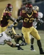
I would tend to agree with you. In my opinion, my favorite uniforms of recent history were:

1) Kill era - Simple, but a mix of classic and modern. The font was really cool in the fact it was unique but not weird.
2) Fleck 2.0 - Similar to above. Pretty basic uniform but nice
3) Fleck 1.0 - I loved some of the combinations and some were ok.
4) Mason/Brewster - Both were fine. I thought I liked Mason's but as time has gone on I really am glad we moved on from them. Brewster's were fine - perfectly aligned with the style at the time.


chris-darkins-of-the-minnesta-golden-gophers-looks-on-during-a-game-against-the-illinois.jpg


If you don't answer this to the best uniforms question you are a Wisconsin Fan! :mad::p
The best!
/s


I really dug the Kill era unis. The current are the best since and maybe second best in my time watching Gopher football. My only complain is that that white stripe on the trousers are too wide.


There was a discussion about this after the uniforms for USC were announced last week. Here is what I said in that thread:

I think it will look nice on the field.

I still long for the Kill-era uniforms but these new sets are good.

My Gopher uniform rankings since the turn of the century are…

5. Brewster era - pin striping was weird and school/team name on the chest is always bush league on football jerseys. Outlining of numbers and words too busy/prominent. Positive nod for first Gopher set allowing mixing and matching of Gold, Maroon, and White combos.

4. Fleck era 1 - not bad uniform sets, but war on gold was strange. White collars and numbers just too strange for Golden Gophers. Positive nod for adding Goldy to helmets and the introduction of multi rotating helmet colors.

3. Mason era - clean and collegiate. Block M on helmet too small. Worked well with black socks and cleats.

2. Fleck era 2 - stripes on sleeves and pants look good. Shade of maroon may not officially have changed but looks better regardless. Stripes would probably look better if they were thicker. Happy to have gold back as a featured uniform color.

1. Kill era - perfect in nearly every way. Unique/cool yet not weird number font. Only improvement would have been the helmet color and face mask rotations that came later.
Completely agree on 1-3.
 

No. This was the best uniform combo. Shiny gold dome, white jerseys, maroon pants, white socks and shoes.

The "Big Away Game" CG-W-M set with Chrome Goldy is my favorite of all time. You have great taste!

I always wanted them to match the shoes to the helmet with a metallic gold look.


The white jerseys always look best when the maroon numbers are trimmed in gold, the only downgrade from Fleck1 to Fleck2.
 

Yes, our uniforms in the USC game were the most attractive I remember. The less gold, the better.
 

No. This was the best uniform combo. Shiny gold dome, white jerseys, maroon pants, white socks and shoes.

Couldn’t agree more. Chrome dome with maroon pants/jerseys is right up there too.
 

I’m only here to say I love our current unis, and Kill era had a great look too.


Yes.....these are the best iteration of the uniforms in my mind.
 

I still love the Mason era. First time in years they looked like an actual Big Ten football team.
 

Attachments

  • IMG_2496.jpeg
    IMG_2496.jpeg
    91.4 KB · Views: 9

I don't know about you guys, but watching Saturday's game, I kept catching myself thinking "Damn, our uniforms are sharp"

The white pant stripe, the beautiful maroon and gold (finally got it right) the big numbers. USC has some of the best looking unis in all of CFB and I think we outclassed them there.

Admittedly, I thought Nike's unis were great during the Mason era, less is more. But these current ones are my top pick.

Still not a fan of the full bananas. RTB Ski U Mah Go Gophs

Agreed. I put them slightly ahead of Kill because of the subtle white added on the home jerseys. It's so toned down from PJ 1.0 (numbers and collar) and tasteful. But the white allows them to mix n match all colors (maroon, gold and white) for helmets, jerseys, pants and make it a cohesive look. Kill had zero white in the jerseys so paired with white pants or helmets, it just looked odd.

The Kill roads jerseys had zero gold on them as well, so when went MWM we had zero gold and GWG looked a bit off. At least these new ones have a gold shoulder stripe to tie everything together. The one minor adjustment for me would be gold outline on the numbers on the away jerseys.

Yes, I spend too much time thinking about uniforms 😂
 

Best of all time is tricky but this year's uniforms are definitely way more popular with Gopherhole than previous iterations have been. Way less complaining this year when the uniform combos are revealed each week.


There was a discussion about this after the uniforms for USC were announced last week. Here is what I said in that thread:

I think it will look nice on the field.

I still long for the Kill-era uniforms but these new sets are good.

My Gopher uniform rankings since the turn of the century are…

5. Brewster era - pin striping was weird and school/team name on the chest is always bush league on football jerseys. Outlining of numbers and words too busy/prominent. Positive nod for first Gopher set allowing mixing and matching of Gold, Maroon, and White combos.

4. Fleck era 1 - not bad uniform sets, but war on gold was strange. White collars and numbers just too strange for Golden Gophers. Positive nod for adding Goldy to helmets and the introduction of multi rotating helmet colors.

3. Mason era - clean and collegiate. Block M on helmet too small. Worked well with black socks and cleats.

2. Fleck era 2 - stripes on sleeves and pants look good. Shade of maroon may not officially have changed but looks better regardless. Stripes would probably look better if they were thicker. Happy to have gold back as a featured uniform color.

1. Kill era - perfect in nearly every way. Unique/cool yet not weird number font. Only improvement would have been the helmet color and face mask rotations that came later.
Colorado, Texas, and Oklahoma are the only jerseys that look cool with the state written across the chest. Ours looked ugly and generic.
 

Kill
Fleck 2
Fleck 1
Brewster
Mason

I really like the gold, white, gold road uni combo. Maybe partial to the Winfield Jr. pick against Fresno State. The chrome, white, maroon is/was great too.


In case anyone hasn't seen these. You can get them for a bunch of current and former players.
1728678614533.png
 
Last edited:

In case anyone hasn't seen these. You can get them for a bunch of current and former players.
View attachment 34055

Sweet looking.

How thoughtful of you to already start shopping for my Christmas 🎁

As a reminder, I need an XL
 

In case anyone hasn't seen these. You can get them for a bunch of current and former players.
View attachment 34055

BTW, here’s your 🎁


Hawkins sweatshirt (hopefully it’ll be marked down soon😉)


I was watching the B10 channel 60-minute version of the game and thought; "These uniforms are just about perfect for home games." Maybe we should see them more often - a classy blend of maroon and gold.
 

Sweet looking.

How thoughtful of you to already start shopping for my Christmas 🎁

As a reminder, I need an XL
I got you an even better gift, framed screenshots of my best posts so you can enjoy them everyday.
 

BTW, here’s your 🎁


Hawkins sweatshirt (hopefully it’ll be marked down soon😉)

I did notice none of the players that transferred away are marked down but I don't think any of the shirts are preprinted because there are a ton of them for each player.
 

This is straight out of the movie Any Given Sunday
This. I have almost no opinion on uniforms except that I do not like these uniforms for that exact reason. They look like they should be worn by the Minnesota Saber-Toothed Tigers of the National Football Alliance.


Top Bottom