You are using an out of date browser. It may not display this or other websites correctly.
You should upgrade or use an alternative browser.
You should upgrade or use an alternative browser.
6 years later, are we still pleased with the uniform redesign?
- Thread starter GophEnEspaña
- Start date
Igor95
Well-known member
- Joined
- Nov 23, 2008
- Messages
- 817
- Reaction score
- 619
- Points
- 93
I still like the current jerseys. I think the white numbers pop. I like that the numbers are outlined in gold at least. Love the chrome helmets. Not a fan of the black. I’d rather see the anthracite brought back.
That said the Kill era jerseys are my favorites. I miss the gold helmets. Please bring those back. I loved that the stripe said Ski U Mah.
That said the Kill era jerseys are my favorites. I miss the gold helmets. Please bring those back. I loved that the stripe said Ski U Mah.
short ornery norwegian
Well-known member
- Joined
- Feb 9, 2011
- Messages
- 21,873
- Reaction score
- 15,872
- Points
- 113
If you go through the history of Gopher football uniforms, the "yellow" version of gold is a more recent development.
the original "Golden Gophers" name dates to the 1930's and Bernie Bierman, when the Gophers wore all-Gold uniforms - with a 'metallic' gold - decidedly not yellow. (the 1st use of "Golden Gophers" is attributed to radio announcer Halsey Hall) apparently other teams in the B1G did not like them because it made it harder for defenses to see the football against the all-gold uniform.
The metallic gold was featured on and off through the following decades, including the 1970's and as recently as the early to mid-1990's. other uniforms had different shades of gold that moved more in the 'yellow' direction.
the use of maroon jerseys did not become common until the late 1940's and 1950's.
I believe the Daily Gopher ran a very good article on this a while back with photos from each era. The 1970's unis are some of my favorite.
disco
Well-known member
- Joined
- Sep 26, 2010
- Messages
- 4,860
- Reaction score
- 3,932
- Points
- 113
As SON mentioned above, the metallic gold has absolutely been used on and off for decades.There wasn't a single solitary thing that was good about that uniform. I mean, where to start?
I've never hated a uniform more than that one. While I have a few small quibbles with our current ones, they're light years better than these abominations.
- The use of gold/khaki instead of yellow, which is our school color. Not sure where the hell this ever came from
- The EKG monitor pattern across the chest with the unfortunate flatline (which happened often during the Wacker years) across the back
- The vertical M on the helmet, when our logo is more horizontally stretched
- The black outlines around the numbers
It wasn't just a Wacker thing. (personally, I liked it, but I like the chrome better). See below for mid-70's version.
I agree 100% on the EKG pattern and the vertical M. The latter really bothers me for some reason.
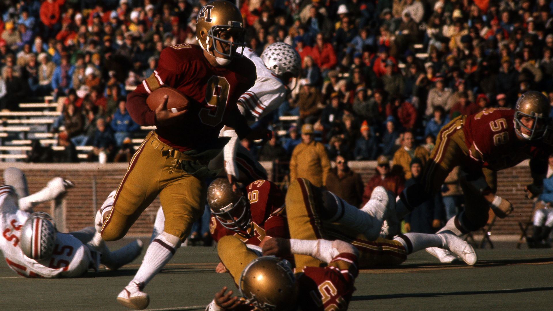
I liked the color scheme of the Wacker era uniforms but as everyone seems to agree, the graphics were bad. I could get behind these 70's era unis.As SON mentioned above, the metallic gold has absolutely been used on and off for decades.
It wasn't just a Wacker thing. (personally, I liked it, but I like the chrome better). See below for mid-70's version.
I agree 100% on the EKG pattern and the vertical M. The latter really bothers me for some reason.

Off-GridTNgopher
Well-known member
- Joined
- Dec 3, 2010
- Messages
- 1,971
- Reaction score
- 1,625
- Points
- 113
Just.. fucking.... Win.... Wear whatever ... Just fucking win
Gold just doesn't work on cloth. No way to make it gold.
On plastic, like a helmet, it's fine. You can get gold.
But not on cloth. It's either calf-shit brown, or yellow.
Stick with maroon or white for uniforms.
On plastic, like a helmet, it's fine. You can get gold.
But not on cloth. It's either calf-shit brown, or yellow.
Stick with maroon or white for uniforms.
IceBoxGopher
Well-known member
- Joined
- Mar 9, 2011
- Messages
- 2,910
- Reaction score
- 2,965
- Points
- 113
I don't mind the yellow gold, works great for the hockey team, too.
NateDawgUM
bored with recruiting talk
- Joined
- Nov 20, 2008
- Messages
- 5,955
- Reaction score
- 1,358
- Points
- 113
I do like what Kill did with the uniforms after he got here and I like where Fleck has taken things. The uniform combinations don't bother me at all.
Throughout the years, the only part of a uniform that I disliked were these jerseys...
View attachment 29562
I also like our current "M" design as compared to the previous one you see on this helmet.
These were, in general, terrible, but to the extent that they're legendary and would be amazing as a one-off in an early season non conference game. Especially if they didn't announce it all over social media first.
FredCoxRocks
Well-known member
- Joined
- Mar 20, 2014
- Messages
- 2,996
- Reaction score
- 4,152
- Points
- 113
College-age kids would probably love it. My daughter saw some guy wearing one of those gawd-awful 90s Gopher Starter jackets this year and said it looked lit*.These were, in general, terrible, but to the extent that they're legendary and would be amazing as a one-off in an early season non conference game. Especially if they didn't announce it all over social media first.
*There was probably a newer word or phrase she could have used, but to go easy on me and mom she keeps some expired slang in her vocabulary just to go easy on us.
pharmacygopher
114 Row 11
- Joined
- Mar 4, 2009
- Messages
- 3,377
- Reaction score
- 3,007
- Points
- 113
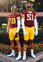
Can you do a maroon collar on 51, leaving the numbers as they are??Improved version on the left. White piping added to center helmet stripe. No different collar color. Gold numbers with white trim. Maroon stripe on pants.View attachment 29620
WilliamsArenaGuy
Well-known member
- Joined
- Nov 20, 2008
- Messages
- 4,179
- Reaction score
- 2,692
- Points
- 113
That left side one is a huge improvement.Improved version on the left. White piping added to center helmet stripe. No different collar color. Gold numbers with white trim. Maroon stripe on pants.View attachment 29620
Out State Gopher
Well-known member
- Joined
- Dec 27, 2023
- Messages
- 546
- Reaction score
- 308
- Points
- 63
I want the uniforms to show mud, blood & grass stains the ones mothers hated to see.
WAGopher
Well-known member
- Joined
- Nov 20, 2008
- Messages
- 5,737
- Reaction score
- 4,050
- Points
- 113
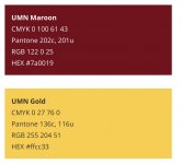
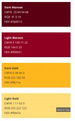
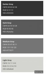
As far back as I can remember, mid 60’s or so, the school colors were maroon and yellow-gold. I’m not sure when those became official. I prefer that all the teams honor those colors. Minnesota has chosen 2 Primary colors and 8 Secondary colors. They are:If you go through the history of Gopher football uniforms, the "yellow" version of gold is a more recent development.
the original "Golden Gophers" name dates to the 1930's and Bernie Bierman, when the Gophers wore all-Gold uniforms - with a 'metallic' gold - decidedly not yellow. (the 1st use of "Golden Gophers" is attributed to radio announcer Halsey Hall) apparently other teams in the B1G did not like them because it made it harder for defenses to see the football against the all-gold uniform.
The metallic gold was featured on and off through the following decades, including the 1970's and as recently as the early to mid-1990's. other uniforms had different shades of gold that moved more in the 'yellow' direction.
the use of maroon jerseys did not become common until the late 1940's and 1950's.
I believe the Daily Gopher ran a very good article on this a while back with photos from each era. The 1970's unis are some of my favorite.
Primary Colors:
Secondary Colors:
Complimentary Gray Colors:
GoldRush
Well-known member
- Joined
- Jun 7, 2009
- Messages
- 15,457
- Reaction score
- 13,968
- Points
- 113
Agree. The hockey team gets it right. Let's leave the metallic gold for Purdue and Notre Dame. If we have to do metallic I prefer the chrome helmets. The Wacker era gold was a monstrosity.As far back as I can remember, mid 60’s or so, the school colors were maroon and yellow-gold. I’m not sure when those became official. I prefer that all the teams honor those colors. Minnesota has chosen 2 Primary colors and 8 Secondary colors. They are:
Primary Colors:
View attachment 29643
Secondary Colors:
View attachment 29644
Complimentary Gray Colors:
View attachment 29645
Great Plains Gopher
Well-known member
- Joined
- Nov 12, 2008
- Messages
- 6,549
- Reaction score
- 1,113
- Points
- 113
They wear a different uniform every week and have played at home with charcoal!Quite frankly, I'd prefer an updated reboot of our classic Mason-era unis. I initially liked the 2018 redesign but after watching the bowl game I'm keen on welcoming a revamp. Thoughts?
View attachment 29547
bleedsmaroonandgold
Well-known member
- Joined
- Oct 5, 2011
- Messages
- 7,389
- Reaction score
- 2,965
- Points
- 113
I am old-fashioned (though probably a little younger than you assume), so I strongly believe in jerseys that are the school colors (or white featuring the school colors in numbers and outlines). I hate any uniform that doesn't prominently feature maroon and gold. Aside from my general aversion to non-school color uniforms, I really dislike the anthracite, because I think they look like grey practice jerseys.
I do enjoy when they put gold on the helmets or use the chrome (though they overdo it with chrome), I think that is a fun way to be a little modern but still have uniforms that look like we are the golden Gophers.
Rant over. Stay off my lawn!
I do enjoy when they put gold on the helmets or use the chrome (though they overdo it with chrome), I think that is a fun way to be a little modern but still have uniforms that look like we are the golden Gophers.
Rant over. Stay off my lawn!
goldengophers
Well-known member
- Joined
- Jul 25, 2009
- Messages
- 3,704
- Reaction score
- 2,227
- Points
- 113
Get rid of the white trim on the numbers and we have a winner.Improved version on the left. White piping added to center helmet stripe. No different collar color. Gold numbers with white trim. Maroon stripe on pants.View attachment 29620
pharmacygopher
114 Row 11
- Joined
- Mar 4, 2009
- Messages
- 3,377
- Reaction score
- 3,007
- Points
- 113
Time to stop drinkingOK,i hate those white numbers so much, please help us.
Can we just get back to the Mason/ Kill era base looks?
Sure the the shiny gold helmets stand up for me at least but Fucx those white numbers. hard
46Gophers
Well-known member
- Joined
- Dec 3, 2010
- Messages
- 1,589
- Reaction score
- 820
- Points
- 113
I would love to see them roll out these throw-backs just once. Back to the Tony Dungy era.As SON mentioned above, the metallic gold has absolutely been used on and off for decades.
It wasn't just a Wacker thing. (personally, I liked it, but I like the chrome better). See below for mid-70's version.
I agree 100% on the EKG pattern and the vertical M. The latter really bothers me for some reason.

disco
Well-known member
- Joined
- Sep 26, 2010
- Messages
- 4,860
- Reaction score
- 3,932
- Points
- 113
Here's the article. You'll notice that the Wacker era uniforms did feature a more metallic gold helmet and pants than in the photo above.I believe the Daily Gopher ran a very good article on this a while back with photos from each era. The 1970's unis are some of my favorite.

The history of Minnesota Football uniforms #TBT
The glorious history of Minnesota’s football uniforms!
 www.thedailygopher.com
I don't have a strong opinion on our uniforms. Not sure I have a favorite era of Gopher football uniforms, though I really like addition of Goldy on the helmet and the frequent different uniform combos that have become common under Fleck.
I found WAGopher's post above very informative about the different colors Minnesota has. I've always disliked that there wasn't a consistent "Gold" in University approved/marketed apparel and occasionally the Maroon's would be different too. From the official colors, I don't care for the light Maroon, light Gold, or any of the Gray's. I realize it's not popular with many but I do like the use of Black with out colors as an alternate option for 1-2 games a season (Doesn't have to be an all Black look)..
I found WAGopher's post above very informative about the different colors Minnesota has. I've always disliked that there wasn't a consistent "Gold" in University approved/marketed apparel and occasionally the Maroon's would be different too. From the official colors, I don't care for the light Maroon, light Gold, or any of the Gray's. I realize it's not popular with many but I do like the use of Black with out colors as an alternate option for 1-2 games a season (Doesn't have to be an all Black look)..

