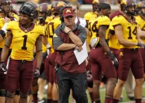
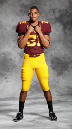
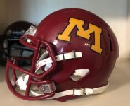
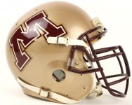
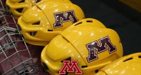
Your thoughts on the new Gophers uniforms?

As somebody that can barely dress himself, I am not the fashion police..... That said, we are Maroon and Gold. White on White is fine once a year or white top with a dark color pants. Not a fan of Maroon or Gold tops and white pants. Doesn't look right..... Also - Too many combinations along with helmet colors.... Stay to the Maroon and Gold. After awhile it becomes a gimmick that you dont see the traditional powerhouses in conference doing.
I agree about white pants with the maroon or gold top, never liked that look.

But as to the comment about alternate uniforms and colors.....everyone is doing that, even some of the more well known schools. There are some that don't mess with their uniforms much but even places like Ohio State have alternate jerseys and helmets.
 

I must be the only Gopher fan who likes the white pants.

In one of the promotional photos, it looked like there was a combination with gold helmet, maroon jersey and white pants... or was that misremembered / wishful thinking by me?

EDIT: Yeah, first photo on this thread — just checked. I love that look, though I can tell I'm in a tiny minority there.

I stand by the rule that wearing white after Labor Day is a fashion faux pas


Modern classics! These are more in tune with the traditional powerhouse programs that stick with school colors and historic looks. I like them a lot. These are the kind of uniforms that get you into a college football playoff.


I'm a big fan of the new look! So happy that the white numbers are gone now. Maybe a bit too much white trim here and there, but the maroon and gold is so prominent that it's fine with me.

I must be the only Gopher fan who likes the white pants.
I agree, I've never had an issue with the white pants, I think they've always looked fine. There's a bit of history there too since the maroon jerseys and white pants was the uniform for the Rose Bowl win, too.
 

I must be the only Gopher fan who likes the white pants.

In one of the promotional photos, it looked like there was a combination with gold helmet, maroon jersey and white pants... or was that misremembered / wishful thinking by me?

EDIT: Yeah, first photo on this thread — just checked. I love that look, though I can tell I'm in a tiny minority there.
I like white pants and helmets as part of the rotation. When they did gold gold white for OSU under Kill I laughed because a couple fans probably had MIs

I prefer M/G mostly but I like white as an option and like the occasional black/anthracite
 

I really like the white helmets and the white uniforms look pretty sharp to me.


We can all agree that gold top / Maroon pants is the best possible outfit. Clearly. Anything that allows that is good with me.


Still have PJ's personal branding on them, which I'm still not a fan of. But it's less of it. (note on the undershirts, I don't care about it. On the Helmets and uniforms, no place for a coaches personal brand.

Very little of the backs have been shown, but like the Minnesota state addition on the back collar and love that Ski-U-Mah is still on the neck guard on the helmets.
 

I am fine with the uniforms as long as they are not black or gray, and have maroon and gold.


Crazy how many comments/complaints the anthracite unis have generated for only being worn 4x in 8 years.
It's gotta be a generational thing, I like the mix in colors even if they're nontraditional at times. Black is as neutral as white, it doesn't go poorly with M&G.


Overall, I really like the uniforms.
Love going back to solid digits and adding shoulder/pant stripes. Really sharp/classic looking.

Ramblings:
-I could do without Gold tops and just use home/away Maroon & White tops and just combine with Gold/Maroon/White pant options.
-Don't like the hue of Maroon on the helmets. (I'd prefer to ditch the Row the boat stuff/oar stripe on the helmet and just have a traditional gloss Maroon helmet & mask with just the M.)
I think that would make our new classic look even better.

What I'd really love is going back to the older helmet style 'M' on the helmets (80s - early 90s). I thought it had more character than the main M logo.

...the hockey helmets looked better with the old helmet style M as well...

Gophers01.jpg
Gophers02.jpgGophers03.jpg


Top Bottom