Breakin' The Plane
Well-known member
- Joined
- Jan 15, 2010
- Messages
- 12,348
- Reaction score
- 5,577
- Points
- 113
"Lots of photos and a press release riddled with embarrassing grammatical errors"
Perfectly fitting for this department.
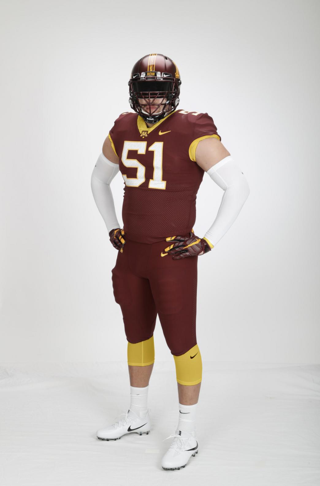
I think the jerseys look quite a bit sharper in that picture. I think the post editing on the video reveal made them look funny. I like the maroon significantly better in the tweet.

Thanks, not sure why the link I provided didn't work.
As long as you move along just the Luminance axis and keep the a and b values at zero you go from pure black through pure grays to pure white. Also, standard pure 18% gray cards are used all the time in photography for color(white) balancing a camera. Even if you use the RGB method to obtain colors, an even balance of all colors gives a pure gray. I also noticed a green tint to the gray, but that could just be coming from picture, screen, etc not being color balanced.

I'm wondering if the Chrome gold actually matches better than we think, it may have just been a lighting issue, check this screen capture from the team reveal video:

It matches 100x better in this video than from the stills on the Hyprr Elite site or in the original uniform reveal video. You can also see in this shot, as confirmed by someone at the Women's Basketball game, that the Maroon Jersey is the same Maroon we know and love from the Kill-era Uniforms.
I just really wish the maroon and Grey jerseys were all one color, instead of having the collar being white. The maroon collar looks good on the white one though.

Agreed.Anthracite is horrible. Hope we see very little of it.
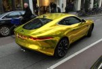
I was at the women's BB game last night, and can thankfully report that the maroon in person is the darker version we are used to. The HOF tweet picture is much more accurate. I really like the matte metallic maroon helmet, as well. The only thing I'm not digging is the chrome helmet. That shade of gold clashes. How about this shade of "gold chrome":
View attachment 5407
I'm wondering if the Chrome gold actually matches better than we think, it may have just been a lighting issue, check this screen capture from the team reveal video:

It matches 100x better in this video than from the stills on the Hyprr Elite site or in the original uniform reveal video. You can also see in this shot, as confirmed by someone at the Women's Basketball game, that the Maroon Jersey is the same Maroon we know and love from the Kill-era Uniforms.
View attachment 5414
This picture, among others, was just posted on the GopherFootball Instagram a few hours ago. The Gold chrome helmet doesn't look perfect, of course, but it looks much much better than it had in the video, and closer to the Dart Gold pants, in my opinion.
It matches... a dingy green bay uniform...
Picture in darker setting makes them look much better.
<script async src="https://platform.twitter.com/widgets.js" charset="utf-8"></script>
<script async src="https://platform.twitter.com/widgets.js" charset="utf-8"></script>
White helmet has gold stripe? Did I miss that picture?
White helmet has gold stripe? Did I miss that picture?
Stickers on helmets are endless. I'm sure we will see the Goldy sticker like last year.
I think someone said these also might just be photo shopped versions of last year's uniform.
