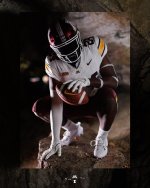
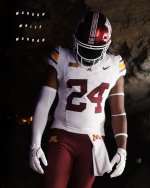
Uniforms for the Illinois game...

This might be one of the first combos this year that has gotten a fair amount of negative comments, most weeks it has been very positive.

For my part, I am a big fan of maroon pants on the road so I like the combo overall though this isn't my favorite version of our helmet.

I don't get the general complaints about the lack of gold in some of the combos though. Yes our name is Golden Gophers but the school colors are maroon and gold so as long as one or both of those colors is featured that is all that really matters.

Plus there is plenty of gold, even in this combo. Gold on pants, jersey and helmet even if not the primary color.
But, but, but….
Anthracite. 😖
 

But, but, but….
Anthracite. 😖
I'm glad that Black has supplanted Anthracite as our non traditional color look. I know some hate the alternate uniforms that aren't school colors but I don't mind them as long as you can still tell who the team is and it is a one off kind of thing.

I don't like alternate uniforms where you can't tell who the team is that is playing because they are so far out there.
 

I liked the Kill-era anthracite uniforms. They actually looked anthracite and the color on the jersey numbers was great.

The Fleck era “anthracite” uniforms looked more simple gray than anthracite and the white numbers made the whole thing “off” to me.


Not my favorite combo, but far from the worst away kit we've seen. I for one don't mind the white facemask with this one though (if they would've had the gold block M it wouldn't work as well).


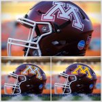
This season’s new uniforms have been good in terms of balancing the use of maroon, gold, and white in both the jerseys and pants. Today was no exception but they dropped the ball with the helmets as they needed inclusion of some gold to balance with the uniform. Thoughts on which alternative version in this picture would have been better?
IMG_2910.jpeg
 

This season’s new uniforms have been good in terms of balancing the use of maroon, gold, and white in both the jerseys and pants. Today was no exception but they dropped the ball with the helmets as they needed inclusion of some gold to balance with the uniform. Thoughts on which alternative version in this picture would have been better?
View attachment 34513
I like both. Maybe try replacing the maroon outline of the M with gold, making the M white-gold-white.


This season’s new uniforms have been good in terms of balancing the use of maroon, gold, and white in both the jerseys and pants. Today was no exception but they dropped the ball with the helmets as they needed inclusion of some gold to balance with the uniform. Thoughts on which alternative version in this picture would have been better?
View attachment 34513
See post #30


Top Bottom