GopherWeatherGuy
Well-known member
- Joined
- Oct 24, 2013
- Messages
- 17,846
- Reaction score
- 18,044
- Points
- 113
One color is ok, but these really suck. Way to much white! All the white should be Gold!! And Maroon on the sleeves!don't like the "one-color" look. would rather see a Gold helmet or Gold pants.
One color is ok, but these really suck. Way to much white! All the white should be Gold!! And Maroon on the sleeves!
Agree!don't like the "one-color" look. would rather see a Gold helmet or Gold pants.
Too much white! Maroon numbers on maroon jerseys, with a maroon M on the maroon helmet!One color is ok, but these really suck. Way to much white! All the white should be Gold!! And Maroon on the sleeves!
Actually this is or would be a very cool look. Lots of Black on black on black suits, shirts and ties..... Just put a little thin gold trim line around the numbers to make them stand outToo much white! Maroon numbers on maroon jerseys, with a maroon M on the maroon helmet!
I feel like the excessive white accessories/undershirt are making it look worse than it is.One color is ok, but these really suck. Way to much white! All the white should be Gold!! And Maroon on the sleeves!
is that right? I swear last year in one game commenting to my son that it was odd that all the players had the same last name. However, wouldn't surprise me if I'm wrong.All of the media stuff says MINNESOTA but names are on the jerseys. It was this way last year too.
For those that don't like this particular look...high probability you won't see it again this year...between helmet, facemask, decal, jersey, pant....we didn't repeat last year at all I don't think.
Iowa? The twitter link said soon? Maybe MSU?Wonder what game they are going to break out the black jerseys for? I don't mind this look but doesn't seem real popular in the early replies.
Can't wear black against Iowa but MSU would be good!Iowa? The twitter link said soon? Maybe MSU?
MSU would have to ok us not wearing white on the road I believe. Guessing we see the black jersey at a home game.Can't wear black against Iowa but MSU would be good!
^ This guy gets it.This uniform choice just makes me mad!
If your going to go unicolor, why the hell is the choice not FULL BANANA!
is that right? I swear last year in one game commenting to my son that it was odd that all the players had the same last name. However, wouldn't surprise me if I'm wrong.
Correct, the golds are the only ones I can remember that said MN on them. That's basically the only thing remaining from the Kill era. But I don't think they wore the gold jerseys last year...could be wrong. The year prior they wore them against Purdue but had END RACISM on the back.unless I'm wrong, the Gold jerseys last year had "Minnesota" on the back in place of the players' names.
or maybe that was 2 years ago - but I do remember that.
unless I forgot to take my medication. in that case, anything is possible.
have to go now. A giant warthog is watching me type and it's freaking me out.
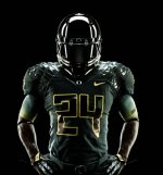
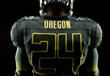
This can be a cool look from an up-close perspective. But if the numbers and jersey are the same color with only a thin line of trim in a different color, the numbers are nearly invisible looking from a distance. So players think the look is cool but fans in the stands or watching on TV struggle to be able to see the numbers and determine who the players are. With the Gophers maroon jerseys, the numbers need to be either white or gold to stand out.Actually this is or would be a very cool look. Lots of Black on black on black suits, shirts and ties..... Just put a little thin gold trim line around the numbers to make them stand out
Disagree. Maroon with a slightly different shade of maroon numbers with gold outline would be slick.This can be a cool look from an up-close perspective. But if the numbers and jersey are the same color with only a thin line of trim in a different color, the numbers are nearly invisible looking from a distance. So players think the look is cool but fans in the stands or watching on TV struggle to be able to see the numbers and determine who the players are. With the Gophers maroon jerseys, the numbers need to be either white or gold to stand out.


Agree....looks very cool and badass. Just saying the numbers are difficult to see from the average viewer's distance perspective. If you are on the field or sideline, they look great. TV and radio announcers dislike such color combos.Disagree. Maroon with a slightly different shade of maroon numbers with gold outline would be slick.
Oregon has done a few versions of this. I remember watching it and thinking how badass it was.
View attachment 20102
View attachment 20103
