The Minnesota State Flag

KD6-3.7

credulous skeptic
Joined
Nov 20, 2008
Messages
2,960
Reaction score
244
Points
63
i don't know if this video has been shared here before or if we've had this conversation before, and this guy is sort of a self parody (no way his real name is Roman Mars):

He says that keys to good flag design are:

  1. Keep It Simple. The flag should be so simple that a child can draw it from memory.
  2. Use Meaningful Symbolism. The flag's images, colors, or patterns should relate to what it symbolizes.
  3. Use 2 or 3 Basic Colors. Limit the number of colors on the flag to three which contrast well and come from the standard color set.
  4. No Lettering or Seals. Never use writing of any kind or an organization's seal.
  5. Be Distinctive or Be Related. Avoid duplicating other flags, but use similarities to show connections.
Here is the Minnesota state flag:

iu


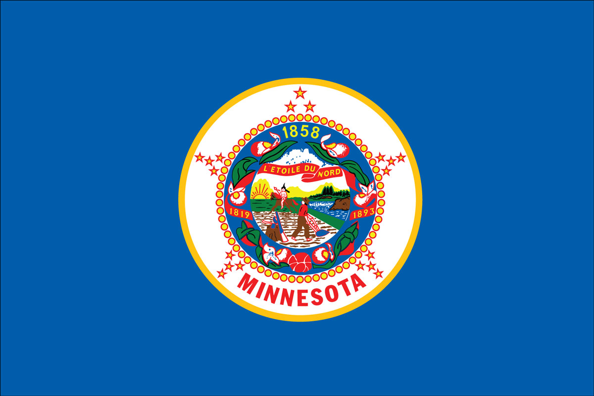
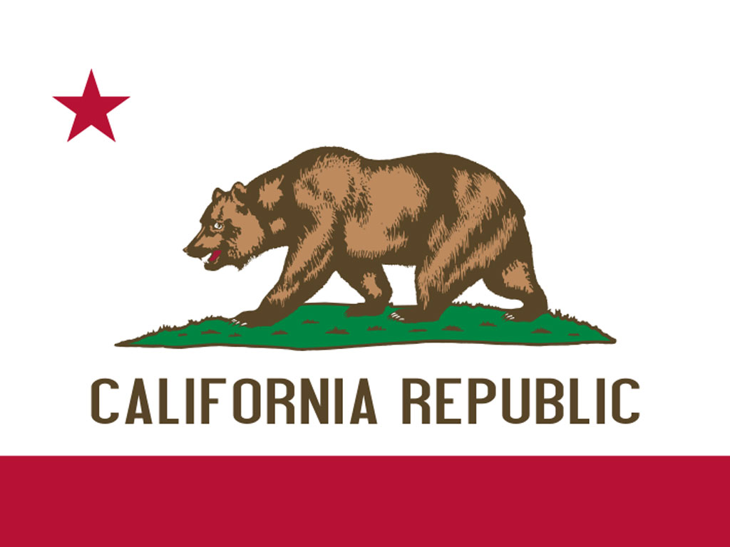
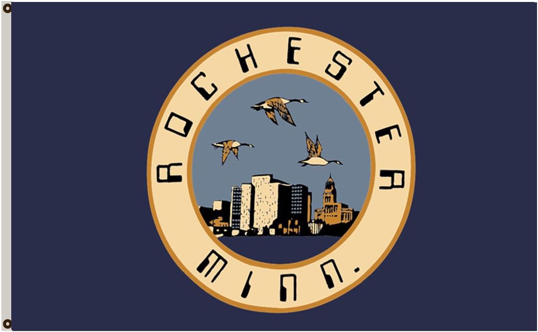
as far as i can tell, this flag breaks all the "rules". now, i'm not saying that i agree with all the rules and they are pretty subjective. for example, the california flag is pretty iconic

iu


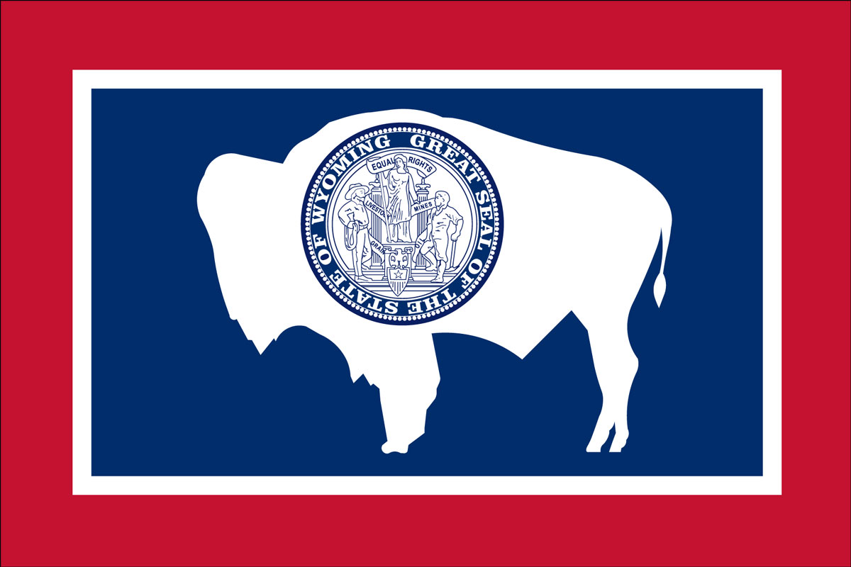
and i personally really like the wyoming flag:

iu


so how would you change the minnesota flag to make it better? do you like the minnesota flag the way it is? what is your favorite state flag? any other flags you think are iconic?
 

of course the most iconic and distinctive flag ever is the stars and stripes:

iu
 

The MN flag can't be easily drawn or even remembered. I don't know what should be put on it, but it could and should be simplified.

Maybe something like the lottery logo. A nice loon.


My wife and I randomly had a similar conversation a few months ago, and listed all the state flags I know by memory. The only ones I could come up with are California, MN, Colorado, South Carolina, Alaska, Ohio, Texas, Maryland. Mostly because those are the simplest ones where you see it a few times and know it by memory. Look at them all- most of the state flags are just terrible.

https://en.m.wikipedia.org/wiki/Flags_of_the_U.S._states_and_territories

edit: Forgot Maryland...anybody that's ever seen a University of Maryland game of any kind knows their flag. Seriously, who likes their flag more, Maryland or Texas? They both plaster it everywhere. Although I suppose Texas has some sort of argument, in that they are the only state flag that can be flown at the same height as the US flag.
 
Last edited:


The MN flag can't be easily drawn or even remembered. I don't know what should be put on it, but it could and should be simplified.

Maybe something like the lottery logo. A nice loon.
So it's important for the state flag to be able to be drawn for some reason? What practical situation requires someone to draw a state flag? Maryland's state flag is very recognizable. Have fun drawing that one.
 

My wife and I randomly had a similar conversation a few months ago, and listed all the state flags I know by memory. The only ones I could come up with are California, MN, Colorado, South Carolina, Alaska, Ohio, Texas. Mostly because those are the simplest ones where you see it a few times and know it by memory. Look at them all- most of the state flags are just terrible.

https://en.m.wikipedia.org/wiki/Flags_of_the_U.S._states_and_territories
Lot of "solid blue of some tone background, with complicated circle thingy in the middle, and maybe some additional words in some alignment" style.
 

Rochester recently changed its city flag from this

61x0a0kHMhL._AC_SL1180_.jpg


to this

RochesterFlag.png


Both are atrocious in my mind. The typex font on the old one is laughable. But at least you know its Rochester. The new flag is completely indistinguishable.
 

The MN flag may be a hot mess. But it's our hot mess. I can immediately recognize it from afar. I say keep it!


i don't know if this video has been shared here before or if we've had this conversation before, and this guy is sort of a self parody (no way his real name is Roman Mars):

He says that keys to good flag design are:

  1. Keep It Simple. The flag should be so simple that a child can draw it from memory.
  2. Use Meaningful Symbolism. The flag's images, colors, or patterns should relate to what it symbolizes.
  3. Use 2 or 3 Basic Colors. Limit the number of colors on the flag to three which contrast well and come from the standard color set.
  4. No Lettering or Seals. Never use writing of any kind or an organization's seal.
  5. Be Distinctive or Be Related. Avoid duplicating other flags, but use similarities to show connections.
That video is informative. But I prefer this one.


the MN state flag looks like it was designed by someone on drugs.

and a French phrase for a state that was settled by Scandinavian and German immigrants?


the MN state flag looks like it was designed by someone on drugs.

and a French phrase for a state that was settled by Scandinavian and German immigrants?
8th grade geography/civics was a long time ago, but perhaps the phrase has something to do with Minnesota being part of the Louisiana Purchase? Early French explorers/fur traders?

If we were starting with a clean slate, I would feature a Juicy Lucy and/or walleye on the state flag.


Here's mine - a flag showing a tator tot hotdish = pure minnesota.

There's one tator tot for every county in the state, plus that topping of ketchup that just goes with any Minnesota dish, surrounded by white (for snow) and blue (for lakes), or something poetic like that. Raise it high on the flag pole, and may it never fly at half-mast.

1650662275780.png


The MN flag may be a hot mess. But it's our hot mess. I can immediately recognize it from afar. I say keep it!
I suppose it does have one of the more faded tones of blue for the background, compared to the teens of other states that use some tone of solid blue background.

But in practice, the ones I've actually seen flying have a darker tone that makes them appear similar to those others.
 

after a little research: the motto goes back to 1861.

L’etoile du Nord – that’s interpreted as the Star of the North,” says Brian Pease, the State Capitol’s Historic Site Manager for the Minnesota Historical Society.

In 1861, then-Governor Henry Sibley thought the saying would make a good state motto. Not only was Minnesota the most northern state at the time, Sibley appreciated the symbolism of the star.

“That’s always a light or a star that explorers would use to navigate,” said Pease. “He was looking to the future, to follow Minnesota’s lead, we’re a state to be followed.”

Legislators approved the motto in French as a nod to the early French-Canadian settlers and Voyageurs in Minnesota.
 

My wife and I randomly had a similar conversation a few months ago, and listed all the state flags I know by memory. The only ones I could come up with are California, MN, Colorado, South Carolina, Alaska, Ohio, Texas, Maryland. Mostly because those are the simplest ones where you see it a few times and know it by memory. Look at them all- most of the state flags are just terrible.

https://en.m.wikipedia.org/wiki/Flags_of_the_U.S._states_and_territories

edit: Forgot Maryland...anybody that's ever seen a University of Maryland game of any kind knows their flag. Seriously, who likes their flag more, Maryland or Texas? They both plaster it everywhere. Although I suppose Texas has some sort of argument, in that they are the only state flag that can be flown at the same height as the US flag.
Just my opinion, but I think the colorado flag is ugly. I think it does well by these standards, but I think it is aging poorly. The Arizona flag is much better in my opinion.
 

Rochester recently changed its city flag from this

61x0a0kHMhL._AC_SL1180_.jpg


to this

RochesterFlag.png


Both are atrocious in my mind. The typex font on the old one is laughable. But at least you know its Rochester. The new flag is completely indistinguishable.
To be honest I really like that font. Maybe simplify the picture and I could see it being hype.
 

That video is informative. But I prefer this one.


There is another Leslie knope appearance in Pawnee public radio, but I can’t find it on YouTube. Probably cuz it is more politically incorrect. But this is the vibe I get from the dude in op
 

So it's important for the state flag to be able to be drawn for some reason? What practical situation requires someone to draw a state flag? Maryland's state flag is very recognizable. Have fun drawing that one.
Kids do it a lot in elementary school. Or maybe your Alamo is under siege and you need a banner under which to rally or know who’s on your side.
 

The MN flag may be a hot mess. But it's our hot mess. I can immediately recognize it from afar. I say keep it!
I say rules are meant to be broken, but it should still be interesting. The mn state flag is as far from interesting as can be.


Top Bottom