
You are using an out of date browser. It may not display this or other websites correctly.
You should upgrade or use an alternative browser.
You should upgrade or use an alternative browser.
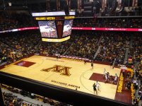
the Court has been redone
- Thread starter nooram
- Start date
Thank God! The white court was just awful on TV. My retinas are thankful.
UpAndUnder43
Well-known member
- Joined
- Jan 3, 2017
- Messages
- 14,794
- Reaction score
- 13,672
- Points
- 113
That’s the worst looking sheet of ice I’ve ever seen
mnsportsgeek
Well-known member
- Joined
- Dec 24, 2010
- Messages
- 14,312
- Reaction score
- 3,022
- Points
- 113
thankful this nightmare has passed.
Bob_Loblaw
Well-known member
- Joined
- Oct 23, 2009
- Messages
- 22,697
- Reaction score
- 19,502
- Points
- 113
God I'm glad we didn't dig in. I rarely have an opinion on things like uniforms/etc., but that court was rough.thankful this nightmare has passed.
Bad Gopher
A Loner, A Rebel
- Joined
- Nov 20, 2008
- Messages
- 25,069
- Reaction score
- 15,043
- Points
- 113
Yes, the long national nightmare is over. If the video is representative, they might have color corrected the maroon as well. Thank goodness.thankful this nightmare has passed.
Roland Brooks
Well-known member
- Joined
- Jan 5, 2010
- Messages
- 4,347
- Reaction score
- 3,826
- Points
- 113
Terrible on TV
GopherBlood777
Well-known member
- Joined
- May 17, 2019
- Messages
- 4,176
- Reaction score
- 5,457
- Points
- 113
This settles it now, no excuses this year, we must play as good as the new court looks : )
BballJones
Active member
- Joined
- Feb 5, 2010
- Messages
- 991
- Reaction score
- 157
- Points
- 43
Looks so much better.
golden_girl
Banned
- Joined
- Sep 11, 2022
- Messages
- 169
- Reaction score
- 214
- Points
- 43
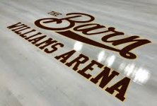
Could have done without the massive Cambria logos.
I stopped watching. Couldn’t stand it. And I wasn’t being proud, I wanted to watch, but it was physically difficult.God I'm glad we didn't dig in. I rarely have an opinion on things like uniforms/etc., but that court was rough.
Gopherfan.in.fergus
Active member
- Joined
- Feb 24, 2017
- Messages
- 109
- Reaction score
- 144
- Points
- 43
Looks great!!
HitMeAgainIAmStillMoving
Well-known member
- Joined
- Sep 13, 2019
- Messages
- 2,211
- Reaction score
- 3,228
- Points
- 113
Hated the old floor, new one looks great, but I wanted to give you props for the quote.Yes, the long national nightmare is over. If the video is representative, they might have color corrected the maroon as well. Thank goodness.
goldengophers
Well-known member
- Joined
- Jul 25, 2009
- Messages
- 3,710
- Reaction score
- 2,239
- Points
- 113
Huge improvement, just missing dribbling Goldy.
golden_girl
Banned
- Joined
- Sep 11, 2022
- Messages
- 169
- Reaction score
- 214
- Points
- 43
“Williams Arena” used to be printed there, not “Cambria Court.”

golden_girl
Banned
- Joined
- Sep 11, 2022
- Messages
- 169
- Reaction score
- 214
- Points
- 43
leftyslefty
Well-known member
- Joined
- Nov 20, 2008
- Messages
- 1,851
- Reaction score
- 245
- Points
- 63
Glad the bleached court is history. Changing our best!
forever a gopher
Well-known member
- Joined
- Nov 20, 2008
- Messages
- 3,505
- Reaction score
- 3,613
- Points
- 113
Personally, I didn't mind the "white" court color in person. But as others have said, on TV, it really washed out and was distracting. Not nearly as distracting as Oregon's court, but few things are.


Bad Gopher
A Loner, A Rebel
- Joined
- Nov 20, 2008
- Messages
- 25,069
- Reaction score
- 15,043
- Points
- 113
I suppose.So it will be referred to as "Cambria Court at Williams Arena?"
Cambria is evil.
row19gopher
FB Sec109 R5-BK Sec104 R20
- Joined
- Jan 1, 2009
- Messages
- 528
- Reaction score
- 68
- Points
- 28
They may be evil, but obviously their sponsorship has helped Gopher Athletics - the new floor looks very nice. I didn't mind the "white floor" in person, but it was tough to watch on tv.
Full Speed Ahead
Well-known member
- Joined
- Jan 9, 2021
- Messages
- 6,017
- Reaction score
- 6,122
- Points
- 113
How much did we get from Cambria for those logos? I'm thinking we could all chip in on Kickstarter and outbid them for a "Hey Dennis Evans, Come to Minnesota" logo...
... actually, if Cambria did something like that, a "Hey Dennis..." with the footer "from your friends at Cambria", it'd get them far more positive spin than the logo they're using.
... actually, if Cambria did something like that, a "Hey Dennis..." with the footer "from your friends at Cambria", it'd get them far more positive spin than the logo they're using.
Unregistered User
Wild animal with a keyboard
- Joined
- Jan 17, 2010
- Messages
- 17,855
- Reaction score
- 9,719
- Points
- 113
Love the stuff the marketing/media department have been putting out more recently, but FOR THE LOVE OF DOG! Never fly over the Block “M” upside down so it looks like a w.
Seen it a couple of times and it makes me irrationally angry.
Seen it a couple of times and it makes me irrationally angry.