16FeetUnder
Section 238
- Joined
- Nov 20, 2008
- Messages
- 307
- Reaction score
- 0
- Points
- 16

I'm sure it is first class just like everything has been with this stadium, and not like the lettering will matter much when the seats are filled!
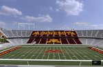
Looks nice, but I'm not happy that it appears to be inconsistent with our block M. All the other arenas have the right configuration (Mariucci, Williams, etc).
According to the renderings there will be a block M on the lower level in the center of the seats, the top deck will say "Minnesota". Of course the M in Minnesota was a block M in the renderings too.
If you look closely, the M is not finished
Personally, I think the block M by itself means "The University of Minnesota". Using the bock M in a word seems a little redundant. When I drove by, it definitely did not look like it was going to be the block M.
Agreed. I actually always found it to be odd that the MINNESOTA on the upper deck would have the M in the block format. Either way, its going to look nice.
I'm curious to see what final form that spelled out M takes.
I would prefer the block M too.
As it looks in this pic...
If you look at Minnesota in the plaza area of the rendering it has a regular M rather than the blocked M. Maybe they decided to be consistent and use the block when it's just the M and a regular M when spelling Minnesota. Either way I can't wait for September!
Looks like they are not incorporating the block M into "Minnesota". I think this actually follows the graphic standards put forward by the university. You can see them HERE. They don't have any examples of the block M being used in that manner.
I guess I never noticed it before this conversation, but looking at all the logo gear available on the Goldies Locker Room on-line store, I can't find any that use a block M as part of a word.
Looks like from the pictures the maroon seats are the darker shade of maroon like the new jerseys/helmets last year. Brewster appears to like the darker shade better. To me it looks almost brown but I like it better too. I don't like Gopher gear that has the redish shade of maroon. The hockey team has used the darker shade for quite a while also.
On a similar vein to the graphic standards doc you linked to...I've always found it maddening that MN gear does not have one shade of maroon. Some maroon's are more red (my least fave), some shades are more purple, some more brown. Does anyone know if the U has tried to lock this down over time, or at least considered it? We have the same problem with gold.
I think starting in the last couple years when we went to being an all Nike school there was a standardization among shades of maroon. Before that each team could sign a uni contract with any company and therefore there were lots of shades being sold.
I actually applaud the AD for standardizing alot of stuff like logos and uniforms and such recently, it really makes PR much better and gives the U an instantly recognizable image.

")