pharmacygopher
114 Row 11
- Joined
- Mar 4, 2009
- Messages
- 3,371
- Reaction score
- 2,997
- Points
- 113
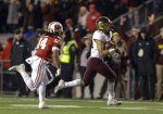
Looks like we know what the helmets will be. Chrome gold with maroon facemasks. Block M on one side and Goldy face on the other. Solid
I'm a traditionalist but I love the chrome helmets. Best in school history imo.I am a big fan of the big Goldy face on the helmet. However, I am in the minority in that I am not a big fan of the chrome gold helmets. It seems like a Johnny-come-lately thing that has been phased out by many of the teams that once had chrome helmets.
Looks like we know what the helmets will be. Chrome gold with maroon facemasks. Block M on one side and Goldy face on the other. Solid
Yeah I think back to the weird "dirty maroon" days ... bleh.Are Uniform combinations right now are the best all time
I agree with some of this. The stripe, or oar, or whatever it is, is terrible. The black Nike parts are bad. Goldys face is good. I like the chrome helmets they wore last season against Wisc. the best. Why they wouldn't want to continue with those is beyond me.I don't like the business of those helmets, especially the cartoonish Gopher which is interrupted by chin strap attachments and etc. Way too much going on.
Pretty sure the helmets are identical except for the 1) Goldy face, 2) the stripe lost the paddle part, 3) the M has a different outline.I agree with some of this. The stripe, or oar, or whatever it is, is terrible. The black Nike parts are bad. Goldys face is good. I like the chrome helmets they wore last season against Wisc. the best. Why they wouldn't want to continue with those is beyond me.

The stripe ain’t great, but 1000x better by losing the wide paddle at the end.I agree with some of this. The stripe, or oar, or whatever it is, is terrible. The black Nike parts are bad. Goldys face is good. I like the chrome helmets they wore last season against Wisc. the best. Why they wouldn't want to continue with those is beyond me.
Are Uniform combinations right now are the best all time
Well your name is oldbob.... you probably yell at young people when they stand up on third down too..I don't like the business of those helmets, especially the cartoonish Gopher which is interrupted by chin strap attachments and etc. Way too much going on.
The stripe ain’t great, but 1000x better by losing the wide paddle at the end.
Offend? Nope.Did the oars on the helmet last year offend you? Are you one of those people that cry about Minnesota on the back of the jerseys ?
Also, glad you are finally posting on the board - not just sending childish PMs to me insulting my family. JA22Did the oars on the helmet last year offend you? Are you one of those people that cry about Minnesota on the back of the jerseys ?
Embarrassed by the oars? ????Offend? Nope.
Embarrass? Yep.
Minnesota? I like it. Wish they did initials and number (like JA22).
You have always been pathetic, but Yourwhathurts and Yourwhathurts2 both got banned before the rest of the board could see your brilliance. Everyone is seeing it tonight. JA22.Embarrassed by the oars? ????
Are you a low class idiot?Did the oars on the helmet last year offend you? Are you one of those people that cry about Minnesota on the back of the jerseys ?
I banged his wifeWait...what?
