You are using an out of date browser. It may not display this or other websites correctly.
You should upgrade or use an alternative browser.
You should upgrade or use an alternative browser.
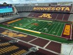
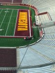
New Truf View - Maroon Endzones
- Thread starter A_Slab_of_Bacon
- Start date
GSUsTALON
Well-known member
- Joined
- Apr 1, 2019
- Messages
- 2,942
- Reaction score
- 799
- Points
- 113
I looked at you gi-gan-toe big screen in your end zone. Massive for a 50,000-seat stadium I'd rather have 4 medium screens located around the stadium so all have a good view.
Here is the problem. Why don't all of you Gopher fans buy an 80 inch + screen TV for your home. The distance you sit from your big screen will make the images much larger than the one that you see at your stadium. In the winter invite your friends over, open your windows and pretend you're at your stadium. If you’re going to watch your big screen instead of watching the actual game on the field than just buy an 80-100-inch TV with surround sound.
Here is the problem. Why don't all of you Gopher fans buy an 80 inch + screen TV for your home. The distance you sit from your big screen will make the images much larger than the one that you see at your stadium. In the winter invite your friends over, open your windows and pretend you're at your stadium. If you’re going to watch your big screen instead of watching the actual game on the field than just buy an 80-100-inch TV with surround sound.
Last edited:
THE SAVAGE GOPHER
Member
- Joined
- Apr 19, 2016
- Messages
- 74
- Reaction score
- 59
- Points
- 18
Hey GSUsTALON - how is Calvin Wishart looking on your Bball team? He was my favorite in high school. Will he be a starter next year?
alchemy2u
Well-known member
- Joined
- Nov 13, 2009
- Messages
- 5,782
- Reaction score
- 2,422
- Points
- 113
I dont remember the Gophers playing Georgia Southern in 2019.
Did you play Georgia State? please give me the score.
Obviously, we don’t mix it up with GSU very often.
On 12/09/2016: Gophers 86 - Georgia Southern 49.
Sent from my iPad using Tapatalk
A_Slab_of_Bacon
Well-known member
- Joined
- Sep 21, 2015
- Messages
- 25,829
- Reaction score
- 17,613
- Points
- 113
That's a lot of empty space between the letters and the sides of the endzone...
highwayman
Knows Less Than PJ Fleck
- Joined
- Jan 4, 2009
- Messages
- 8,290
- Reaction score
- 2,101
- Points
- 113
A_Slab_of_Bacon
Well-known member
- Joined
- Sep 21, 2015
- Messages
- 25,829
- Reaction score
- 17,613
- Points
- 113
I know those feels, do web development.
We want it to do X
You don't have enough letters and your font doesn't do that...
Granted Minnesota could just fill that space with emojis �� �� �� �� �������������������� .
I do that for customers... then they usually say Ok the other way was fine.
I looked at you gi-gan-toe big screen in your end zone. Massive for a 50,000-seat stadium I'd rather have 4 medium screens located around the stadium so all have a good view.
Here is the problem. Why don't all of you Gopher fans buy an 80 inch + screen TV for your home. The distance you sit from your big screen will make the images much larger than the one that you see at your stadium. In the winter invite your friends over, open your windows and pretend you're at your stadium. If you’re going to watch your big screen instead of watching the actual game on the field than just buy an 80-100-inch TV with surround sound.
Nice try! We will be there and we will be loud!!! Hopefully loud enough for your QB to burn a time out.
Expect us to let our inner John Randle out...
Nice try! We will be there and we will be loud!!! Hopefully loud enough for your QB to burn a time out.I think we need to make sure that the fans on the visitors side are well oiled!
Expect us to let our inner John Randle out...
NSFW due to language
Last edited:
theTurning
Well-known member
- Joined
- Dec 30, 2008
- Messages
- 1,451
- Reaction score
- 677
- Points
- 113
That's a lot of empty space between the letters and the sides of the endzone...
Saving room for future on-field ads.
GoldRush
Well-known member
- Joined
- Jun 7, 2009
- Messages
- 15,450
- Reaction score
- 13,949
- Points
- 113
That's a lot of empty space between the letters and the sides of the endzone...
Yeah - I wondered the same thing - why such a narrow font?
Spoofin
Well-known member
- Joined
- Aug 11, 2013
- Messages
- 49,252
- Reaction score
- 25,914
- Points
- 113
Yeah - I wondered the same thing - why such a narrow font?
It’s what the kids like.
Sent from my iPhone using Tapatalk
A_Slab_of_Bacon
Well-known member
- Joined
- Sep 21, 2015
- Messages
- 25,829
- Reaction score
- 17,613
- Points
- 113
Yeah - I wondered the same thing - why such a narrow font?
Generally your branding has a limited set of type faces, usage, etc. It might not fit every box with a specific aspect ratio.
You could have a bazillion different fonts and layouts but then you're not so much branding anymore.
Yeah - I wondered the same thing - why such a narrow font?
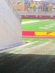
Almost looks like the start/end of the text might line up with the numbers on the field. I wonder if it isn't some type of visual aid to the receivers, a peripheral vision type deal, letting them know roughly how much room they have until they hit the sidelines???
A_Slab_of_Bacon
Well-known member
- Joined
- Sep 21, 2015
- Messages
- 25,829
- Reaction score
- 17,613
- Points
- 113
Almost looks like the start/end of the text might line up with the numbers on the field. I wonder if it isn't some type of visual aid to the receivers, a peripheral vision type deal, letting them know roughly how much room they have until they hit the sidelines???
We should totally install fiber optic grass ... move the logo when the other team is down there...
fmlizard
Well-known member
- Joined
- Jan 19, 2012
- Messages
- 7,439
- Reaction score
- 9,595
- Points
- 113
Yeah - I wondered the same thing - why such a narrow font?
It looks like Arial Bold Narrow or something like that. I’m a design pro who works for a company that uses a condensed/narrow typeface by default and it’s magnificent to work with.
zman
Well-known member
- Joined
- Apr 24, 2009
- Messages
- 2,790
- Reaction score
- 727
- Points
- 113
Generally your branding has a limited set of type faces, usage, etc. It might not fit every box with a specific aspect ratio.
You could have a bazillion different fonts and layouts but then you're not so much branding anymore.
Like 50 different shades of maroon?
A_Slab_of_Bacon
Well-known member
- Joined
- Sep 21, 2015
- Messages
- 25,829
- Reaction score
- 17,613
- Points
- 113
Like 50 different shades of maroon?
FOLLOW THE RULES DAMN IT!
/s
https://university-relations.umn.edu/resources/brand-resources
alchemy2u
Well-known member
- Joined
- Nov 13, 2009
- Messages
- 5,782
- Reaction score
- 2,422
- Points
- 113
Generally your branding has a limited set of type faces, usage, etc. It might not fit every box with a specific aspect ratio.
You could have a bazillion different fonts and layouts but then you're not so much branding anymore.
Ok, so that is why they use the Michigan font!
Sent from my iPad using Tapatalk
A_Slab_of_Bacon
Well-known member
- Joined
- Sep 21, 2015
- Messages
- 25,829
- Reaction score
- 17,613
- Points
- 113
Ok, so that is why they use the Michigan font!
Sent from my iPad using Tapatalk
College brands are weird, there is a lot of crossover in weird places.
Some logos are straight up... that other guy's logo... but with a nub on one letter or an outline.
Almost looks like the start/end of the text might line up with the numbers on the field. I wonder if it isn't some type of visual aid to the receivers, a peripheral vision type deal, letting them know roughly how much room they have until they hit the sidelines???
Taken from an angle from inside the tunnel - the edge of the letters lines up just inside the bottom of the numbers.
PMWinSTP
Well-known member
- Joined
- Oct 11, 2015
- Messages
- 17,745
- Reaction score
- 7,238
- Points
- 113
That's a lot of empty space between the letters and the sides of the endzone...
Looks close to the same as opening night against AF to me... The picture angle might be exaggerating it somewhat.
PMWinSTP
Well-known member
- Joined
- Oct 11, 2015
- Messages
- 17,745
- Reaction score
- 7,238
- Points
- 113
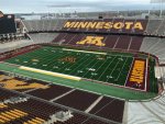
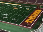
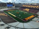
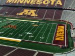
Turf is complete. They are now starting to lay down the layer of sand before they start with the rubber. Stadium manager says install company is hoping to have everything done by Saturday.
View attachment 6130View attachment 6131View attachment 6132View attachment 6133
Many thanks for all the great pics!
Livingat45north
Well-known member
- Joined
- Mar 27, 2013
- Messages
- 5,254
- Reaction score
- 1,969
- Points
- 113
We should totally install fiber optic grass ... move the logo when the other team is down there...
About 15 years ago I was going to file a patent on including fiber optic lights in artificial turf, but some firm beat me to it by about 3 months. Still think it'd be elite to have the MINNESOTA logo light up when we score a TD.
A_Slab_of_Bacon
Well-known member
- Joined
- Sep 21, 2015
- Messages
- 25,829
- Reaction score
- 17,613
- Points
- 113
About 15 years ago I was going to file a patent on including fiber optic lights in artificial turf, but some firm beat me to it by about 3 months. Still think it'd be elite to have the MINNESOTA logo light up when we score a TD.
Heck the whole field and grid should be purely a function of the optics.
Put a sensor in the ball and show it on the field like the NHL pick Halo thing.... with live first down lines....
GSUsTALON
Well-known member
- Joined
- Apr 1, 2019
- Messages
- 2,942
- Reaction score
- 799
- Points
- 113
Hey GSUsTALON - how is Calvin Wishart looking on your Bball team? He was my favorite in high school. Will he be a starter next year?
What?
https://gseagles.com/roster.aspx?path=baseball

