You are using an out of date browser. It may not display this or other websites correctly.
You should upgrade or use an alternative browser.
You should upgrade or use an alternative browser.
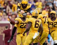
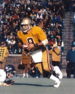
It’s been a while, let’s talk uniforms
- Thread starter Schnauzer
- Start date
UpAndUnder43
Well-known member
- Joined
- Jan 3, 2017
- Messages
- 14,725
- Reaction score
- 13,539
- Points
- 113
GoldRush
Well-known member
- Joined
- Jun 7, 2009
- Messages
- 15,461
- Reaction score
- 13,971
- Points
- 113
That gold color is why I said in a previous post that those unis should be incinerated.I kinda like these actually. The double M is sorta weird but looks sorta cool. I don’t mind that gold color either.
GoldRush
Well-known member
- Joined
- Jun 7, 2009
- Messages
- 15,461
- Reaction score
- 13,971
- Points
- 113
This is the correct answer!!!!
MNfootballfan
Well-known member
- Joined
- Nov 20, 2008
- Messages
- 2,654
- Reaction score
- 1,442
- Points
- 113
I like...
1a/1b - Kill/Fleck uniforms - both are simple and classic. I love how Fleck has played with the helmet decals.
(big gap)
3. Mason era
4. Brewster era - Probably because the product on the field was so bad.
I would love to see the Darkins M_____M jerseys make a comeback for one game. They were so terrible and ugly that they have become almost cool because of it.
GraniteCityGopher
Drive-By Member
- Joined
- Nov 20, 2008
- Messages
- 144
- Reaction score
- 18
- Points
- 18
Like S.O.N.'s thoughts.
But also, commercial brands spend dearly creating and policing their brand image. Yet, MN lets each new coach (or vendor) redefine our look. Maroon and gold with white and black accents are sufficient. Dark cherry, mustard yellow and coal cheapen the brand.
But also, commercial brands spend dearly creating and policing their brand image. Yet, MN lets each new coach (or vendor) redefine our look. Maroon and gold with white and black accents are sufficient. Dark cherry, mustard yellow and coal cheapen the brand.
IceBoxGopher
Well-known member
- Joined
- Mar 9, 2011
- Messages
- 2,913
- Reaction score
- 2,971
- Points
- 113
pinky mingo
Active member
- Joined
- Dec 17, 2019
- Messages
- 133
- Reaction score
- 83
- Points
- 28
Plain white pants look like practice scrubs. Ditch the white numbers & trim for gold. And, never put Minnesota on the jersey backs--either players names or leave blank.
BleedGopher
Well-known member
- Joined
- Nov 11, 2008
- Messages
- 64,183
- Reaction score
- 23,146
- Points
- 113
Go Gophers!!
stocker08
Well-known member
- Joined
- Feb 2, 2009
- Messages
- 41,292
- Reaction score
- 26,695
- Points
- 113
I don't think there's any question that the Fleck era uniforms are the best. With the helmet options they roll out on a weekly basis.....I really don't think there's a team in the nation with better uniforms.
Of the more classic uniform looks....I've always really liked Auburn.
Of the more classic uniform looks....I've always really liked Auburn.
Last edited:
BigGopher69
Well-known member
- Joined
- Nov 26, 2019
- Messages
- 765
- Reaction score
- 977
- Points
- 93
Hot Take i actually liked the tim brewster era jerseys, had me a decker jersey it was sick
Looks like he has an irregular heartbeatChris Darkins and his shoulder pads chime in to remind us the progress we’ve made.
View attachment 19850
Go Gophers!!
Dances With Gophers
Well-known member
- Joined
- Mar 5, 2009
- Messages
- 117
- Reaction score
- 285
- Points
- 63
Now I hope Oregon joins the B1G so we can start a uniform arms race.
Go Gophers!!
short ornery norwegian
Well-known member
- Joined
- Feb 9, 2011
- Messages
- 21,873
- Reaction score
- 15,872
- Points
- 113
just don't ever go to an "Oregon" or "Maryland" style helmet design.
IceBoxGopher
Well-known member
- Joined
- Mar 9, 2011
- Messages
- 2,913
- Reaction score
- 2,971
- Points
- 113
While we're on the subject of uniforms, what are thoughts on home vs home uniforms for rivalry games like how USC and UCLA do in their match-ups. Like, the Gophers could wear gold and Wisconsin could keep on their reds. Michigan could wear blue and maize while Ohio State is still in their scarlet and grey.
disco
Well-known member
- Joined
- Sep 26, 2010
- Messages
- 4,863
- Reaction score
- 3,935
- Points
- 113
I loved those helmets and pants. Among my favorite looks ever. The double-M is hideous though.Anyway--they hinted we may be seeing them this year. I actually think the 90s nostalgia would play well for 1 game only. I'd be into it. It would get a lot of attention locally and nationally. Especially if they won wearing them. I think current fashion trends on a college campus would go well with these. Retro is in.
View attachment 19874
I think the more metallic gold always looks better than the more yellowish. I coach youth football, and about two years ago, we changed from a yellow gold to a metallic gold for our numbers and it just looks so much nicer.
UpAndUnder43
Well-known member
- Joined
- Jan 3, 2017
- Messages
- 14,725
- Reaction score
- 13,539
- Points
- 113
I think for one game, the awful double M is cool.I loved those helmets and pants. Among my favorite looks ever. The double-M is hideous though.
I think the more metallic gold always looks better than the more yellowish. I coach youth football, and about two years ago, we changed from a yellow gold to a metallic gold for our numbers and it just looks so much nicer.
My coworker had a bunch of his uncles old wrestling gear in the office yesterday. 70s era. Love that look and nostalgia
A_Slab_of_Bacon
Well-known member
- Joined
- Sep 21, 2015
- Messages
- 25,840
- Reaction score
- 17,642
- Points
- 113
Someone goes to games wearing the double M jersey.I think for one game, the awful double M is cool.
My coworker had a bunch of his uncles old wrestling gear in the office yesterday. 70s era. Love that look and nostalgia
I saw him at least once last year.
fmlizard
Well-known member
- Joined
- Jan 19, 2012
- Messages
- 7,439
- Reaction score
- 9,597
- Points
- 113
Never forget that PJ Fleck's first QB at the U was Conor Rhoda Boat
Maryland helmets are the Maryland state flag essentially. It’s actually a pretty cool helmet IMOjust don't ever go to an "Oregon" or "Maryland" style helmet design.
UpAndUnder43
Well-known member
- Joined
- Jan 3, 2017
- Messages
- 14,725
- Reaction score
- 13,539
- Points
- 113
AmazingSomeone goes to games wearing the double M jersey.
I saw him at least once last year.
A_Slab_of_Bacon
Well-known member
- Joined
- Sep 21, 2015
- Messages
- 25,840
- Reaction score
- 17,642
- Points
- 113


