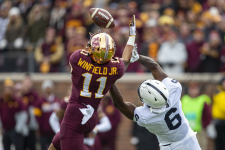
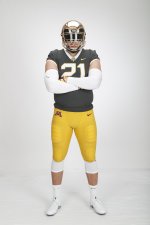
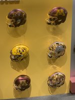
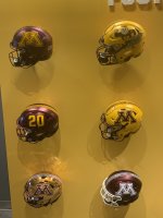
It’s been a while, let’s talk uniforms

Schnauzer

Pretty Sure You are Wrong
Joined
Jun 4, 2009
Messages
6,699
Reaction score
3,708
Points
113
The biggest thread I recall ever on GH was a uniform thread. It even surpassed the “oops wrong topic” thread.

Anyway, wondering if there are any new tweaks or helmet combos coming up for this season? The White helmets seem to be left in 2018.

Editorial/taste comments:

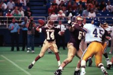
I liked the old Mason era uniforms. The last simple uniforms where one knew what to expect every week. Black shoes/socks complimented it well. But they were a little more “red” than I prefer.

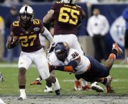
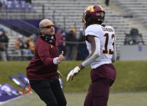
The Brewster era uniforms were worn 2008-2011 and they introduced jersey/pants in three colors that could be mixed/matched. They were my least favorite in recent history. I’m not a fan of the piping or putting the team name on the front of the jersey. I was fine with white shoes.

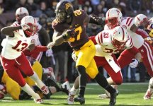
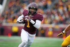
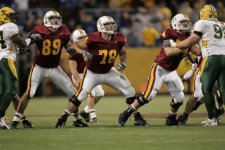
The Kill era uniforms (worn 2012-2017) were my favorite overall. Back to black shoes. The anthracite was a better shade of gray than the current example. Helmets were “okay”. The font on the bold numbers was really nice and I loved the bold numbers, not trimmed with a third color.

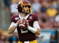
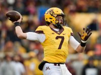
That leaves the Fleck era uniforms (2018-present) as my second favorite Gopher football uniform in recent history. Love the helmet combos. Fine with the swing back to white shoes. My problem is with the white numbers (No likey) and the lighter gray anthracite edition, that looks like color was lost in the wash. With 2022 being the 5th season with these uniforms and this “look”, is something new on the horizon?

For me, talking strictly uniforms, my ranking recap:
1. Kill
2. Fleck
3. Mason
4. Brewster

And special note: if you are one of those guys that feels a need to say “I don’t care if they wear rags, as long as they finally beat Iowa” or something similar to that, please, just move on without comment. You saw the thread title, you are here. You cared. Admit it.
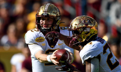
I'd go Kill, Fleck, Brewster, Mason. I'd put Wacker era unis in the "please incinerate" category.


The white numbers bothered me at first but I've learned to like it. I do wish they'd get rid of the white collar and white sleeve trim and go gold or maroon. It's just a touch too much white.

Otherwise I love the current set. The roads unis are awesome and helmet choices are sweet. I am over the white M decal with the white facemask though (@ Maryland and @ iowa).

I think we'll probably see the black unis from the Ohio State game worn. I saw some photos of recruits wearing those with maroon pants and they were sharp.
 

Fleck era has been best unis by a mile. Especially the black against Ohio St. I realize they aren’t school colors but just about every team does it anyways.


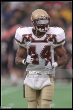
Chris Darkins and his shoulder pads chime in to remind us the progress we’ve made.

1661105434423.jpeg

Go Gophers!!


Hey, I know I am in a VERY small minority here - but I liked the "metallic" gold uniforms as opposed to the more "yellow" or "sunset" gold on the more recent uniforms.

maybe it's because they used that shade of gold when I was in HS, but I just like them.

the name is Golden Gophers - not Yellow Gophers.

to each their own.
 

Don't really have a strong preference on uniform styles from one coach to another. But I love what Fleck has been doing with the helmets. Been fun to see all the different colors and designs they have used over the past few years.

I would like to see them pick just one alternate color and honestly after last year I would love to see Black win out over Anthracite.

For those who want to check out all the different helmets teams are using I would recommend this site.


Hey, I know I am in a VERY small minority here - but I liked the "metallic" gold uniforms as opposed to the more "yellow" or "sunset" gold on the more recent uniforms.

maybe it's because they used that shade of gold when I was in HS, but I just like them.

the name is Golden Gophers - not Yellow Gophers.

to each their own.
The number of different shades of gold we have gone with over the years is pretty impressive. Maroon has varied some as well but not to the same degree that gold has.


I like all of those helmets with the exception of the white M and white face mask. I love the uniform number on one side of the helmet coupled with anything else on the other side. Might be my favorite.

For kicks and giggles, I think I’d like to see what an outline of the State of Minnesota looks like on one side of the helmet rather than just a small decal on the back. I love Hawaii’s helmet with the island chain on one side.
 

Overall, the Kill era unis are by far my favorite. I love the number font they introduced and hope they always keep it. The unis we have now are fine, except for the following:

* No to the black alts
* No to the anthracite alts
* Get rid of the wood grain on the helmet stripe, or just get rid of the stripe entirely
* Get rid of the white numbers/collar on the maroon unis. S/b gold numbers/maroon collar
* They've made the M on the helmet comically large.
* Not a fan of giant Goldy head on the helmet.
I was with you til the last 2.

Also, I love the non-metallic gold helmets.
 

Overall, the Kill era unis are by far my favorite. I love the number font they introduced and hope they always keep it. The unis we have now are fine, except for the following:

* No to the black alts
* No to the anthracite alts

* Get rid of the wood grain on the helmet stripe, or just get rid of the stripe entirely
* Get rid of the white numbers/collar on the maroon unis. S/b gold numbers/maroon collar
* They've made the M on the helmet comically large.
* Not a fan of giant Goldy head on the helmet.
Abolutely YES to both, they're HOT
 

The white numbers bothered me at first but I've learned to like it. I do wish they'd get rid of the white collar and white sleeve trim and go gold or maroon. It's just a touch too much white.

Otherwise I love the current set. The roads unis are awesome and helmet choices are sweet. I am over the white M decal with the white facemask though (@ Maryland and @ iowa).

I think we'll probably see the black unis from the Ohio State game worn. I saw some photos of recruits wearing those with maroon pants and they were sharp.
Agree. The white trim can go.
 

I'm old school. MMG at home, MWG away. Loved the Kill/Claeys uniforms. Classic but modern.
 

Hey, I know I am in a VERY small minority here - but I liked the "metallic" gold uniforms as opposed to the more "yellow" or "sunset" gold on the more recent uniforms.

maybe it's because they used that shade of gold when I was in HS, but I just like them.

the name is Golden Gophers - not Yellow Gophers.

to each their own.
The gold ore color, or Old Gold can look nice, but that isn’t our color. That’s used by Purdue, Colorado and Washington. Our gold is more lIke 24kt Pure Gold. Iowa, USC and AZ State use a similar gold.

I think the uniforms can vary because color matching on material can be a challenge. I would be happy if all our teams stayed close to our official colors.

Our colors:
F27C2357-D274-4AED-BE16-7093C9B6CB8D.png
Iowa’s Gold:
3C184FB1-3D5E-42FF-BC67-A22AA1CCEDAF.jpg

Pure 24kt Gold:
9A730C80-0EC3-493F-97D8-11A1630919BF.png
 

I like the metallic gold. The original Minnesota “gold” was not yellow, so I think it is far closer to the Minnesota roots than any yellow-gold. Modern, yet classic.
 

If we're looking over the last two decades, my favorite by far were the Kill-era uniforms. I liked how dark the maroon was, the intimidating factor of the black facemask, how big the M was and how the gold blended.
Minnvsneb.jpg


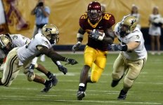
Second favorite would have to be the Mason era uniforms. Maroon was a little too red, but overall it was a really sharp look. M could have been bigger, but still, not bad at all.
Maroney.jpg

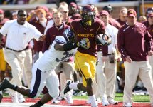
Next would be the Brewster era. I liked the shade of maroon better than Mason's, but there was too much going on with the trim on around the arms and on the pants. Wasn't a fan of the glittery helmets, either. They still looked alright, though.
Dajon (1).jpeg

OK, so I like the PJ Fleck era and some of the biggest wins recently have come in these, but they just don't work for me. The white numbers stand out in a bad way, as does the white collar. Also, the stripe on the helmet should just be a stripe and not the paddle look. Plus, the shade of maroon, I've noticed, has looked rather purple at times. More so than others shown here
morgant.jpg
One thing I've been happy about, though, is the gold Minnesota has used recently. I think it works better than the metallic gold which seemed to be heavily featured in the 90s. The metallic gold has been fine as a different option for the helmet recently, but overall, I'd rather have the normal gold.
minn90s.jpg

Also, unpopular opinion, but I love the white pants look and think we should do it more. It's a throwback look, one Minnesota used to have back in the 60s. All of the following combinations, in my opinion, really looked sharp.
minbowl13.jpg

Iowa14.jpg

NWestern16 (1).jpg


My all-time fav.
That's why these threads are fun. I think these are hideous. I thought so when they wore them initially (2006?) and still think so.

I think the WMW could be a good look with the PJ style unis. That's where the white letters are nice as they tie everything together for combinations.


If we're looking over the last two decades, my favorite by far were the Kill-era uniforms. I liked how dark the maroon was, the intimidating factor of the black facemask, how big the M was and how the gold blended.
View attachment 19862


Second favorite would have to be the Mason era uniforms. Maroon was a little too red, but overall it was a really sharp look. M could have been bigger, but still, not bad at all.
View attachment 19863

Next would be the Brewster era. I liked the shade of maroon better than Mason's, but there was too much going on with the trim on around the arms and on the pants. Wasn't a fan of the glittery helmets, either. They still looked alright, though.
View attachment 19864

OK, so I like the PJ Fleck era and some of the biggest wins recently have come in these, but they just don't work for me. The white numbers stand out in a bad way, as does the white collar. Also, the stripe on the helmet should just be a stripe and not the paddle look. Plus, the shade of maroon, I've noticed, has looked rather purple at times. More so than others shown here
View attachment 19865
One thing I've been happy about, though, is the gold Minnesota has used recently. I think it works better than the metallic gold which seemed to be heavily featured in the 90s. The metallic gold has been fine as a different option for the helmet recently, but overall, I'd rather have the normal gold.
View attachment 19866

Also, unpopular opinion, but I love the white pants look and think we should do it more. It's a throwback look, one Minnesota used to have back in the 60s. All of the following combinations, in my opinion, really looked sharp.
View attachment 19867

View attachment 19868

View attachment 19869
Nice breakdown of some of the more recent looks. Unfortunately we do differ in opinion about the white pants.....I just don't like them with the possible exception of when we go MWW on the road.

But my all time favorite road combo is still MWM, have always liked that combo for whatever reason.Road Uni 2.jpeg
 
Last edited:

Greder in the past couple weeks tweeted @ Gophersports or Gopherfootball about the Darkins uniform when they posted it. Maybe it was 44 days from the season starting?

Anyway--they hinted we may be seeing them this year. I actually think the 90s nostalgia would play well for 1 game only. I'd be into it. It would get a lot of attention locally and nationally. Especially if they won wearing them. I think current fashion trends on a college campus would go well with these. Retro is in.

1661133059753.png
 

I like some blue in it. I think we’re missing some blue. 🤷🏻‍♂️
 

Greder in the past couple weeks tweeted @ Gophersports or Gopherfootball about the Darkins uniform when they posted it. Maybe it was 44 days from the season starting?

Anyway--they hinted we may be seeing them this year. I actually think the 90s nostalgia would play well for 1 game only. I'd be into it. It would get a lot of attention locally and nationally. Especially if they won wearing them. I think current fashion trends on a college campus would go well with these. Retro is in.

View attachment 19874
I kinda like these actually. The double M is sorta weird but looks sorta cool. I don’t mind that gold color either.


Top Bottom