A_Slab_of_Bacon
Well-known member
- Joined
- Sep 21, 2015
- Messages
- 25,829
- Reaction score
- 17,613
- Points
- 113
Very nice. Thank you.View attachment 24951
View attachment 24952
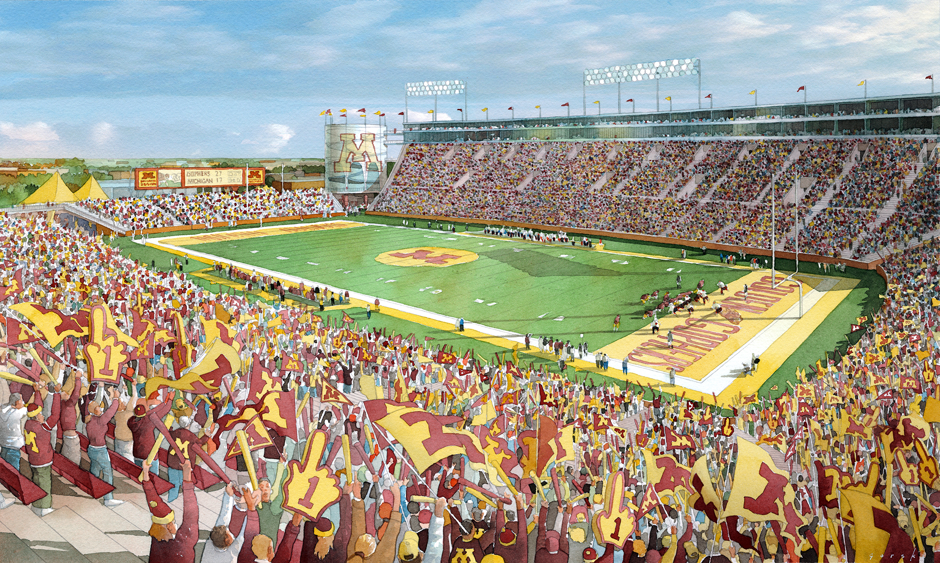
View attachment 24953
The dates on the files say 2007, so I assume these were concept photos.... maybe from earlier.
I like the instructions on dressing accordingly. Amusingly we only got instructions on what that meant starting last year
There are no balconies in the actual stadium. Just windows (or faux windows) in those spaces right up to the exterior.I remember these and the excitement that came from looking at them. I notice people on balconies in the third picture. I guess I've never looked close enough, but is that really a thing?
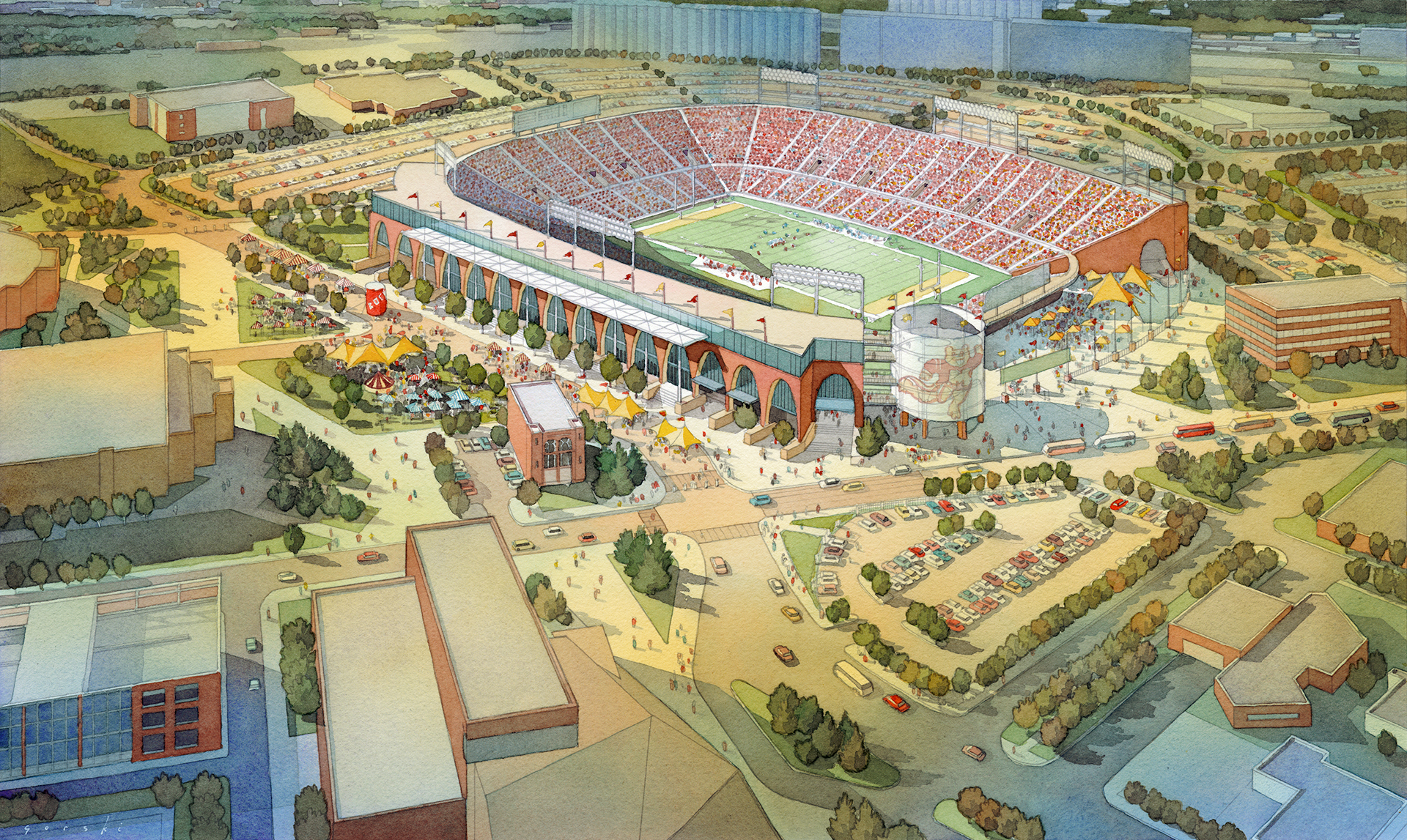
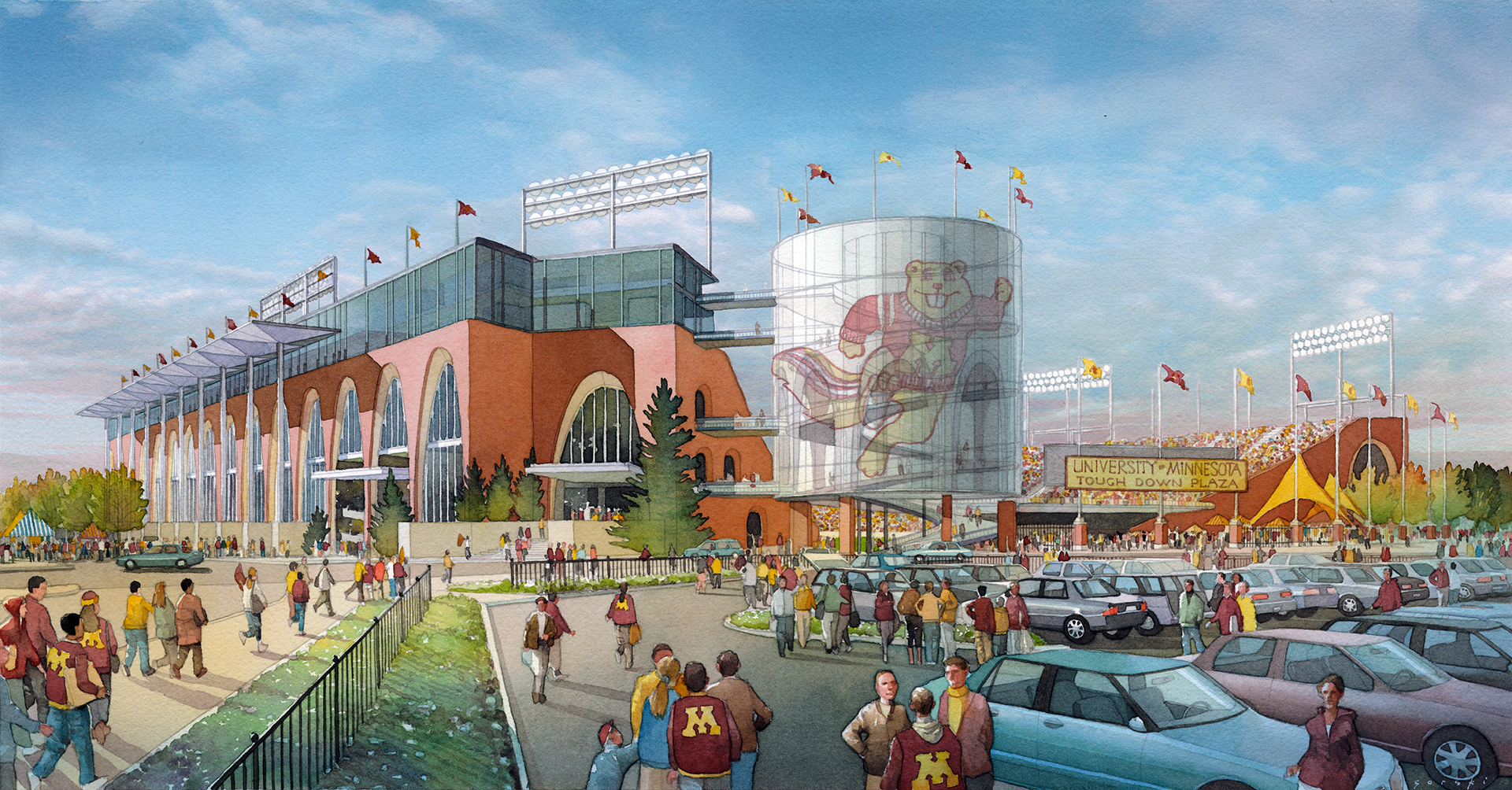
Very cool! Thank you!View attachment 24951
View attachment 24952
View attachment 24953
The dates on the files say 2007, so I assume these were concept photos.... maybe from earlier.
I like the instructions on dressing accordingly. Amusingly we only got instructions on what that meant starting last year
For some reason, these seem familiar. I can't recall for sure, but I think I may have seen these?Here's some art from a concept/design that was not chosen:


They really tried to bring in the old stadium layout there… well with the exception of the one with the roof.Here's some art from a concept/design that was not chosen:


Here's some art from a concept/design that was not chosen:

I like those too.I like the Gold End Zone look. I wonder if they could do it for the Nebraska game.
Here's some art from a concept/design that was not chosen:


That would make sense.I think these were the materials that were used to get the bill passed for the funding. Then after they had the funding, they went out and hired HOK Sport/Populous and got the renderings that OP started with.
Yeah that's probably it. These are from a company called Crawford ArchitectsI think these were the materials that were used to get the bill passed for the funding. Then after they had the funding, they went out and hired HOK Sport/Populous and got the renderings that OP started with.
I have one somewhere packed away in my garage, but it's also the most foam #1 fingers I have seen at a game since the 80s.I like those too.
The volume of fans with flags there though…. who can even see the game?!?!
As for the paint I thought the new turf is largely permanently painted.
Worst scoreboard ever.Here's some art from a concept/design that was not chosen:


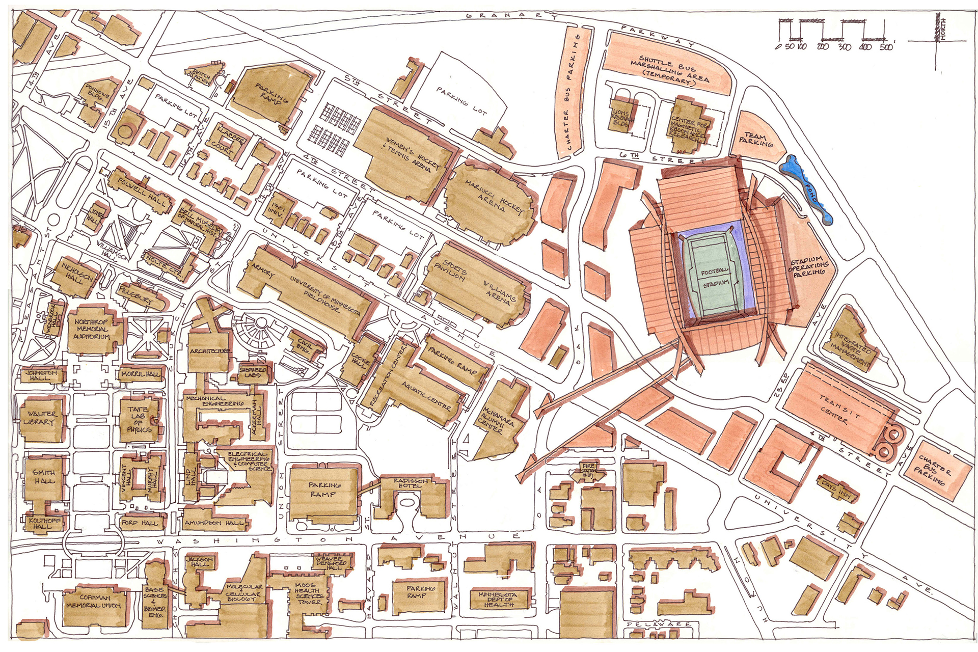
I think for the view of the Williams, downtown.Does anyone know why they made it and East-West stadium versus a North-South? I always get blinded by the sun during the first half, and I cant imagine the players have it much better
Guessing it was to directly align with the Minneapolis skyline?Does anyone know why they made it and East-West stadium versus a North-South? I always get blinded by the sun during the first half, and I cant imagine the players have it much better

Same, it feels so right seeing campus and the city. The open end pointed to traffic looks great too.I love the alignment, I know it's not the traditional "right way" to align a stadium, but the connection to campus is great and the skyline view is excellent. Imagine how closed off the stadium would feel if the side facing Williams/Mariucci was a big brick wall.
It was also the the same direction as the open end of Memorial Stadium.Same, it feels so right seeing campus and the city. The open end pointed to traffic looks great too.
Generally, however Memorial Stadium opened up to the northwest, and Huntington straight west. This made a difference where players in the old stadium never looked downfield directly into the sun, unlike early season evening games in the new stadium.It was also the the same direction as the open end of Memorial Stadium.
True, and without lights there never were any early evening games at Memorial.Generally, however Memorial Stadium opened up to the northwest, and Huntington straight west. This made a difference where players in the old stadium never looked downfield directly into the sun, unlike early season evening games in the new stadium.
