You are using an out of date browser. It may not display this or other websites correctly.
You should upgrade or use an alternative browser.
You should upgrade or use an alternative browser.
Concept Football Helmets. Every Team. Every Sport.
- Thread starter rzyne
- Start date
tikited
Me
- Joined
- Nov 20, 2008
- Messages
- 18,993
- Reaction score
- 6,250
- Points
- 113
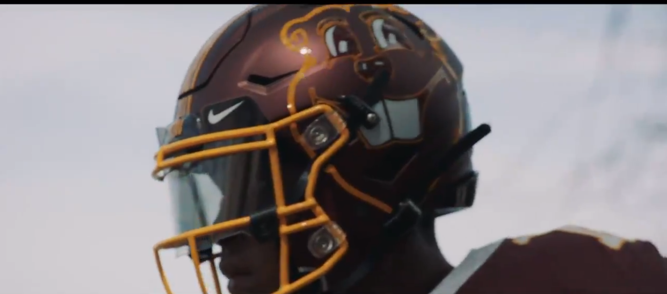
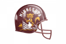
This one was the best by far. The others were beyond bad.Pretty terrible helmets, but I do want this guy on a T shirt:
View attachment 12686
IceBoxGopher
Well-known member
- Joined
- Mar 9, 2011
- Messages
- 2,910
- Reaction score
- 2,965
- Points
- 113
Oof, that website isn't fun to navigate. As for the concepts, I looked at most of them and it just looks like they tried slapping fanmade logos on most of the helmets.
Although I did see one for the Vikings that was an all gold helmet. Off topic, but I do think it would be interesting to see a color-swapped gold vikings uniform with purple trim.
As for our helmets, I like where we're at. The Block M is such a unique design and maroon and gold complement each other so well that it's pretty much always looked good on our helmets.
fmlizard
Well-known member
- Joined
- Jan 19, 2012
- Messages
- 7,431
- Reaction score
- 9,581
- Points
- 113
It's a giant chumbox ad full of clickbait. Helmet and uniform designs are up there with weird tips to lose belly fat and the 27 craziest laws in YOUR STATE to pile up the ad impressionsOof, that website isn't fun to navigate.
A_Slab_of_Bacon
Well-known member
- Joined
- Sep 21, 2015
- Messages
- 25,817
- Reaction score
- 17,592
- Points
- 113
That's like .... 'ok on a cheap t-shirt' quality ... like not bad but sorta rando / silly / wouldn't spend a lot on it.Pretty terrible helmets, but I do want this guy on a T shirt:
View attachment 12686
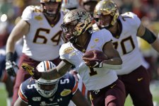
This exact uniform was the absolute high point of Gopher football and athletics aesthetics. Perfection.
I slightly preferred what I like to call the "Evil Goldy" lids from the Georgia Southern* game.

*Paging Talon--you still out there buddy?
tikited
Me
- Joined
- Nov 20, 2008
- Messages
- 18,993
- Reaction score
- 6,250
- Points
- 113
Chrome domes all the way. Best style (all the chrome helmets) in program historyThis exact uniform was the absolute high point of Gopher football and athletics aesthetics. Perfection.
View attachment 12705
SanDiegoGopherFan
Well-known member
- Joined
- Jan 13, 2018
- Messages
- 1,913
- Reaction score
- 1,537
- Points
- 113
Pretty terrible helmets, but I do want this guy on a T shirt:
View attachment 12686
that is ugly. i get the row the boat thing, but no. thank you, next.


