Ranking B1G Home Uniforms

Otis

Well-known member
Joined
Aug 13, 2014
Messages
5,636
Reaction score
2,685
Points
113
Saw the rankings for the top 25 uniforms. Much like the rankings it’s top loaded with blue-bloods. But what are the best uniforms in the B1G?

Here’s my rankings
14. Rutgers
13. Indiana
12. Nebraska
11. Wisconsin
And that’s the end of the red and white change a letter and a stripe or two and you couldn’t tell them apart group. Wisconsin wins for side stripes on the pants and the upside down “M”.
10. Penn State - substitute blue for red and deprive designers of any creativity and you get what national writers consider one of the best uniforms in the B1G. Honestly, it’s boring as hell.
9. Maryland - try going out of the house with 4 colors in your get-up with your wife and see how quickly she tells you to change. With patterns only the English could rival for UGLY and you have Maryland.
8. Illinois - Can’t think of a blue and orange combo that looks good, anywhere!
7. Purdue - The Boilermakers start out the black and gold section of the B1G with a faded gold that somehow reminds me of the Metrodome”s urine troughs.
6. Iowa - A complete and utter rip-off of the Pittsburgh Steelers Totally unimaginative. If you’re going to copy you could pick better.
5. Michigan State - The only team with green in its mix. (Green is a favorite of Minnesotans you know.) still a little boring as they stick to two colors. But are brave enough to go green green with jerseys and pants.
4. Northwestern - Maybe I’m favoring the purple because of my Viking love but their purple jersey with black pant combo is pretty fly! Copying the Ravens a little is how you get some cred.
3. the Ohio State - breaking free of the red and white crowd with silver pants a black stripe outlines gets you a pretty fine look. Just not quite good enough though.

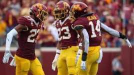
2. Minnesota - The lone maroon & gold team in the B1G looks pretty damn good when not wearing black at home! The maroon jerseys with either the maroon or gold pants look very GQ. Especially with the bright maroon and gold helmets. The Gophers can’t go wrong when they stick to their primary colors. The ONLY thing keeping them out of the top spot is the lack of balls to go FULL BANANA!!!

1.
Michigan - The maize and blue combo just looks like football. Even with the fucked up looking helmet design that makes very little sense (I mean, what in God’s name is that supposed to be?) like some things in life it doesn’t need to be explained. You know when you see it, who it represents. Blue over maize pants looks like fall.
 
Last edited:

Saw the rankings for the top 25 uniforms. Much like the rankings it’s top loaded with blue-bloods. But what are the best uniforms in the B1G?

Here’s my rankings
14. Rutgers
13. Indiana
12. Nebraska
11. Wisconsin
And that’s the end of the red and white change a letter and a stripe or two and you couldn’t tell them apart group. Wisconsin wins for side stripes on the pants and the upside down “M”.
10. Penn State - substitute blue for red and deprive designers of any creativity and you get what national writers consider one of the best uniforms in the B1G. Honestly, it’s boring as hell.
9. Maryland - try going out of the house with 4 colors in your get-up with your wife and see how quickly she tells you to change. With patterns only the English could rival for UGLY and you have Maryland.
8. Illinois - Can’t think of a blue and orange combo that looks good, anywhere!
7. Purdue - The Boilermakers start out the black and gold section of the B1G with a faded gold that somehow reminds me of the Metrodome”s urine troughs.
6. Iowa - A complete and utter rip-off of the Pittsburgh Steelers Totally unimaginative. If you’re going to copy you could pick better.
5. Michigan State - The only team with green in its mix. (Green is a favorite of Minnesotans you know.) still a little boring as they stick to two colors. But are brave enough to go green green with jerseys and pants.
4. Northwestern - Maybe I’m favoring the purple because of my Viking love but their purple jersey with black pant combo is pretty fly! Copying the Ravens a little is how you get some cred.
3. the Ohio State - breaking free of the red and white crowd with silver pants a black stripe outlines gets you a pretty fine look. Just not quite good enough though.

2. Minnesota - The lone maroon & gold team in the B1G looks pretty damn good when not wearing black at home! The maroon jerseys with either the maroon or gold pants look very GQ. Especially with the bright maroon and gold helmets. The Gophers can’t go wrong when they stick to their primary colors. The ONLY thing keeping them out of the top spot is the lack of balls to go FULL BANANA!!!

1.
Michigan - The maize and blue combo just looks like football. Even with the fucked up looking helmet design that makes very little sense (I mean, what in God’s name is that supposed to be?) like some things in life it doesn’t need to be explained. You know when you see it, who it represents. Blue over maize pants looks like fall.
They are wings. They have made the helmets iconic. https://mgoblue.com/news/2009/7/20/Michigan_Winged_Helmet.aspx


I'd say we have different tastes.
1. Penn State. Clean. No "look at me, look at me" adornments.
2. Wisconsin. Again, pretty clean. Sharp red and white.
3 Ohio State. Sharp red and gray. The stickers on the helmets detract a little.
4. Minnesota. Maroon is good and rare. Would be better with maroon and tan. Gold is too much like a gold front tooth. And the shiny gold helmets are way too loud.
5. Michigan State. The green and white is clean and classic.
6. In no order: Indiana, Maryland, Purdue, Rutgers, Northwestern, and Nebraska.
12. Iowa. Canary and black -- ick.
13. Michigan. Helmets are hideous.
14. Illinois. There's only one thing that looks good orange, and that's an orange.
 
Last edited:

I'd say we have different tastes.
1. Penn State. Clean. No "look at me, look at me" adornments.
2. Wisconsin. Again, pretty clean. Sharp red and white.
3 Ohio State. Sharp red and gray. The stickers on the helmets detract a little.
4. Minnesota. Maroon is good and rare. Would be better with Maroon and Gray. Gold is too much like a gold front tooth. And the shiny gold helmets are way too loud.
5. Michigan State. The green and white is clean and classic.
6. In no order: Indiana, Maryland, Purdue, Rutgers, Michigan State, Northwestern, and Nebraska.
12. Iowa. Canary and black -- ick.
13. Michigan. Helmets are hideous.
14. Illinois. There's only one thing that looks good orange, and that's an orange.
Everyone has their own taste, but I cannot stand Penn States approach. It”s like they are too cheap to order a color or add a stripe. I’m surprised they don’t just go wire on white with white numbers like old school practice uniforms.

They also kind of remind me of prison uniforms from the 60’s.


14 Maryland
Way too busy. The flag helmet has too much going on and looks messy. Simplify the helmet and put the turtle mascot on there. Shoulder stripes can still have the flag elements on the uniform.

13. Rutgers
I feel like this is a big missed opportunity. Rutgers has the scarlet knights for its mascot and you would never know it. Put a knight helmet or the full on knight logo on the football helmet. Have a sword on the helmet in the middle for a stripe. Use some Gothic, medieval looking font on the front of the jersey. Instead it’s just a red jersey with an R on the helmet, lame.

12. Wisconsin
Pretty standard red uniform but it at least has some stripes to set itself apart from Rutgers.

11. Nebraska
Close to how Wisconsin looks, but the patch on the jerseys give it more identity and the block N feels simple but strong.

10. Ohio State
These lists often have Ohio State near the top and I think the only reason is because of the success on the field. The red and grey mix well enough together but it’s not the best look in the conference. The Buckeye stickers have always been lame to me, too.

9. Michigan State
They make the most of only having two colors. The cool Spartans helmet logo does some heavy lifting for sure, but the shade of green is good, too.

8. Penn State
Classic look. Yes, it’s a bit boring, but the shade of blue helps out a lot. It’s a dark, almost royal blue that kind of says “we don’t need flashy uniforms, we’ll let our play do the talking.”

7. Indiana
My favorite red team, the dark crimson looks fantastic and I’ve always thought the IU logo looked unique and very identifiable.

6. Northwestern
The text on the front of the jerseys looks good and the N logo is unique. What really helps Northwestern though are the great combinations of purple and black. It’s a tough look, reminiscent of the Ravens. Coach Fitzgerald has had some good, physical teams and they just looked right in those uniforms.

5. Illinois
I’m happy that Illinois has really embraced its colors. They boldly wear the orange and blue, and the two colors compliment each other fairly well.

4. Minnesota
I hate that I don’t have this higher but I just haven’t liked the uniforms during the Fleck era. The shade of maroon looks purplish on TV sometimes and I can’t stand the white numbers. I think the Kill and Mason era uniforms looked much better. I still love the colors and the Block M, but I hope the look gets updated sometime soon.

3. Purdue
It’s hard to mess up black and gold. Purdue looks really good often, the black and metallic gold going really well together. The only thing holding these uniforms back are the train aspects. Lose the cowcatcher on the shoulders and ditch the helmets with the track down the middle instead of a stripe.

2. Iowa
I hate putting Iowa this high, but, after the Vikings, my second favorite team is the Pittsburgh Steelers. Iowa wears those same uniforms, and they simply look really damn good. As I said before, black and gold is hard to screw up.

1. Michigan
The maize and blue go so well together, can’t deny that. The winged helmets give the Wolverines a distinct look, and the colors are so strong that the uniforms don’t even require a lot of trim or stripes. If you flip on a TV during fall and Michigan is playing in these at home, it just looks right.


Which home uniform are we looking at to rank the Gophs? Asking for a friend...


Everyone has their own taste, but I cannot stand Penn States approach. It”s like they are too cheap to order a color or add a stripe. I’m surprised they don’t just go wire on white with white numbers like old school practice uniforms.

They also kind of remind me of prison uniforms from the 60’s.
It's interesting to see the variety of viewpoints. I like PSU's because they look like they were designed for football, not Project Runway like some Western schools' ensembles.
 

It's interesting to see the variety of viewpoints. I like PSU's because they look like they were designed for football, not Project Runway like some Western schools' ensembles.
As correctly said by Robert Downey Jr. in Tropic Thunder, “You never go full Oregon!”

At least, that’s what I heard him say.
 

Saw the rankings for the top 25 uniforms. Much like the rankings it’s top loaded with blue-bloods. But what are the best uniforms in the B1G?

Here’s my rankings
14. Rutgers
13. Indiana
12. Nebraska
11. Wisconsin
And that’s the end of the red and white change a letter and a stripe or two and you couldn’t tell them apart group. Wisconsin wins for side stripes on the pants and the upside down “M”.
10. Penn State - substitute blue for red and deprive designers of any creativity and you get what national writers consider one of the best uniforms in the B1G. Honestly, it’s boring as hell.
9. Maryland - try going out of the house with 4 colors in your get-up with your wife and see how quickly she tells you to change. With patterns only the English could rival for UGLY and you have Maryland.
8. Illinois - Can’t think of a blue and orange combo that looks good, anywhere!
7. Purdue - The Boilermakers start out the black and gold section of the B1G with a faded gold that somehow reminds me of the Metrodome”s urine troughs.
6. Iowa - A complete and utter rip-off of the Pittsburgh Steelers Totally unimaginative. If you’re going to copy you could pick better.
5. Michigan State - The only team with green in its mix. (Green is a favorite of Minnesotans you know.) still a little boring as they stick to two colors. But are brave enough to go green green with jerseys and pants.
4. Northwestern - Maybe I’m favoring the purple because of my Viking love but their purple jersey with black pant combo is pretty fly! Copying the Ravens a little is how you get some cred.
3. the Ohio State - breaking free of the red and white crowd with silver pants a black stripe outlines gets you a pretty fine look. Just not quite good enough though.

2. Minnesota - The lone maroon & gold team in the B1G looks pretty damn good when not wearing black at home! The maroon jerseys with either the maroon or gold pants look very GQ. Especially with the bright maroon and gold helmets. The Gophers can’t go wrong when they stick to their primary colors. The ONLY thing keeping them out of the top spot is the lack of balls to go FULL BANANA!!!

1.
Michigan - The maize and blue combo just looks like football. Even with the fucked up looking helmet design that makes very little sense (I mean, what in God’s name is that supposed to be?) like some things in life it doesn’t need to be explained. You know when you see it, who it represents. Blue over maize pants looks like fall.
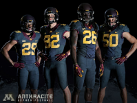
Black or Anthracite >>> Full banana


nike uniforms > adidas uniforms > UA uniforms
 

Minnesota is anywhere from low to upper tier for a home uniform depending on the combo. Best home kit is Chrome Gold, Maroon, Maroon. I like Ohio State, Purdue, and Iowa for home uniforms and the worst are all the Red/White sets.

Minnesota has the best away uniform in the Big Ten, when they go Chrome Gold, White, Maroon.


Ohio State’s gray/scarlet/gray is the best looking uniform in college football, and they get bonus points for the buckeye helmet stickers. Just gorgeous top to bottom.

1 Ohio State
2 Michigan
3 Minnesota
4 Northwestern
5 Penn State
6 Iowa
7 Nebraska
8 Maryland
9 Purdue
10 Michigan State
11 Illinois
12 Wisconsin
13 Indiana
14 Rutgers

Note: When UCLA and USC join the conference in 2024 UCLA will go into the third spot behind Michigan and USC will slide in right after us.
 
Last edited:

Schools with the best color combos.

Minnesota
Minnesota Duluth
Central Michigan
Boston College
Bates
Louisiana Monroe
Loyola
Arizona State
USC
FSU
Armstrong Atlantic State
Kennesaw State
Elon
Rhode Island College
Texas State
Bridgewater College
University of Charleston

There may be a theme here.
 

I think most everyone agrees the Gophers uniforms are one of the best in the conference and I would also agree putting Maryland last as they are just too busy, loud and obnoxious.

You like to have something a little different from the rest. There are way too many teams with red and white!!

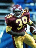
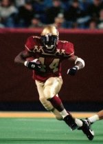
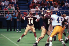
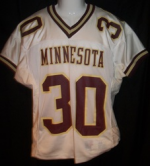
With all that said though -- the M and M jerseys with Wacker were my LEAST favorite!!! I did not like those at all!!
 

With all that said though -- the M and M jerseys with Wacker were my LEAST favorite!!! I did not like those at all!!
Did anybody? 😝

Funny thing is they probably would have looked halfway decent if not for the M___M on the jerseys:
90sUniforms.jpg


Hate to say it.....throwing up a little in my mouth.....but I like OSU's helmet stickers. Always have for some reason. SMH
 

The teams that have a good or great home uniform don't have to change it year to year or game to game. They have an identity. So the rankings are pretty easy to come up with.

When teams don't have a good home uniform they make up for by constantly switching it around.

It's the same way across the country. You don't see iconic brands like USC, ND, Alabama, LSU, Texas, or Clemson switching their uniform all the time.
 

Minnesota is anywhere from low to upper tier for a home uniform depending on the combo. Best home kit is Chrome Gold, Maroon, Maroon. I like Ohio State, Purdue, and Iowa for home uniforms and the worst are all the Red/White sets.

Minnesota has the best away uniform in the Big Ten, when they go Chrome Gold, White, Maroon.
Which decal combo on the helmet, though?

Goldy Face-M
Goldy Face-Number
M-Number
M-M


Top Bottom