Your thoughts on the new Gophers uniforms?


They are … ok.

There is something that feels “under designed” / homogenized about them. As if there’s not really a design concept behind them, or not much of one.

Arguably you could say they’re just shoulder stripes…

Still, not bad either.


As somebody that can barely dress himself, I am not the fashion police..... That said, we are Maroon and Gold. White on White is fine once a year or white top with a dark color pants. Not a fan of Maroon or Gold tops and white pants. Doesn't look right..... Also - Too many combinations along with helmet colors.... Stay to the Maroon and Gold. After awhile it becomes a gimmick that you dont see the traditional powerhouses in conference doing.


They're pretty slick. Clean, uncluttered, and simple. I'm okay with that. The piping on the pants looks cool too. Gimme more of the M/G/M combo! We've been slacking too much on that lately.


My early take is they are a full step above the most recent uniforms, 2 steps beyond the Brewster era uniforms, and perhaps a half step behind the Kill era uniforms. I reserve my final judgement for when I finally see them on the field.

It seems timely to retire the chrome helmets in my opinion. If I do have a complaint, it is perhaps with the white stripes on the pants and lingering white in general (but far better than the overdone white numbers and collars from the previous uniforms).


Overall, I like them.

The one combo I would stay away from is: Color A-Helmet, Color B-Jersey & Color C-Pants. Stick to just 2 colors, whatever they are.
 

a reminder from the unofficial uniform chronicler:

in the Fleck era, in 84 games the Gophers have worn 25 different combinations.

these combinations have been worn most often (Helmet-jersey-pants)
Maroon-Maroon-Maroon -- 16 times
Chrome-White-Maroon -- 9 times
Maroon-White-Maroon -- 8 times
Chrome-Maroon-Maroon -- 6 times
White-White-White -- 5 times
Maroon-Maroon-Gold -- 5 times
Gold-White-Gold -- 5 times

(before you ask, All Banana has been worn once.....)

breakdown by each component
Helmet: Maroon 41x - Chrome 19x - Gold 12x - White 10x - Black 2x

Jersey: White 37x - Maroon 34x - Black 5x - Gold 4x- Anthracite 4x

Pants: Maroon 46x - Gold 16x - White 12x - Black 5x - Anthracite 5x
 

It feels like they're done a job of aligning uniforms across the sports (football, men's basketball, men's hockey most notably). The colors, and subtle use of white on stripes is consistent. I like the uniform branding.


I've always said (and by always I mean at least the past five years or so) that after the Gophers uniforms (helmets included).....that Auburn has had my favorite uniforms. We more or less went with an almost identical template. Perfect. Awesome uniforms to go with the best helmet selection in college football. Couldn't have done much better.
 

1) Like the traditional look with modern materials.
2) Glad they are going away from the white numbers on the maroon jerseys.
3) Like that they are going away from the big different colored jersey collars.
4) New jersey shoulder stripes are an upgrade.
5) Really like that stripes have been added back to the pants.
6) Glad they have incorporated some white trim with the home dark uniforms. As they must have a white away jersey, seems appropriate to make white part of all their uniforms.
7) Wish they would make sure they have some white color in all their helmets to match and balance the jerseys and pants.
8) Hope at times that they will go M/M/G and not just G/M/G.
 

My early take is they are a full step above the most recent uniforms, 2 steps beyond the Brewster era uniforms, and perhaps a half step behind the Kill era uniforms. I reserve my final judgement for when I finally see them on the field.

It seems timely to retire the chrome helmets in my opinion. If I do have a complaint, it is perhaps with the white stripes on the pants and lingering white in general (but far better than the overdone white numbers and collars from the previous uniforms).
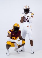
Spot on although I'm not sure the Brewster Era and PJ first editions were a full step apart. Judge Judy collars are gone and the maroon is not as eggplant. Definately an upgrade.


when they make their decisions for what to wear on gameday, I just hope they will correct the imbalance between Maroon and Gold.

as I noted above:
Maroon Helmet 41x - Gold 12x
Maroon Jersey 34x - Gold 4x
Maroon Pants 46x - Gold 16x

the Team is the Golden Gophers. have to wear Gold to be the Golden Gophers, dammit.

We must return Gopher Football to the Gold Standard. (but not the economy.....)


Overall, very good, but I hate the stripes on the sleeves. Those on the white jersey scream Iowa Hawkeyes to me. Not a fan of this aspect. Ugly and unnecessary.


Overall, very good, but I hate the stripes on the sleeves. Those on the white jersey scream Iowa Hawkeyes to me. Not a fan of this aspect. Ugly and unnecessary.
Thought the same thing, but I like the stripes over what they had previously.


My early take is they are a full step above the most recent uniforms, 2 steps beyond the Brewster era uniforms, and perhaps a half step behind the Kill era uniforms. I reserve my final judgement for when I finally see them on the field.

It seems timely to retire the chrome helmets in my opinion.
I agree with the first paragraph. I disagree with the chrome part. Love chrome domes.
 

They are … ok.

There is something that feels “under designed” / homogenized about them. As if there’s not really a design concept behind them, or not much of one.

Arguably you could say they’re just shoulder stripes…

Still, not bad either.
Exactly. They feel like a generic maroon, gold, white set any other team with those colors could wear.

They are clean and traditional and on brand with the U's current interpretation of M&G. But they are boring in my opinion. I already miss the Goldy head helmets and chrome gold. We'll see if there are any alt looks like that not shown here. But my guess is this whole redesign was about standardization and not variety.

In my view, schools like Minnesota should err on the side of audacity over tradition. We need the hype.
 

I love names and numbers without outlines, but wish we had an ‘M’ like that for the helmet as well. Right now my favorite is GMG.


Exactly. They feel like a generic maroon, gold, white set any other team with those colors could wear.

They are clean and traditional and on brand with the U's current interpretation of M&G. But they are boring in my opinion. I already miss the Goldy head helmets and chrome gold. We'll see if there are any alt looks like that not shown here. But my guess is this whole redesign was about standardization and not variety.

In my view, schools like Minnesota should err on the side of audacity over tradition. We need the hype.
I'll bet you a beer at the last home game that we see variants of the helmets beyond what we've seen already.

I almost guarantee that there's going to be different color facemasks and helmet decals.


Top Bottom