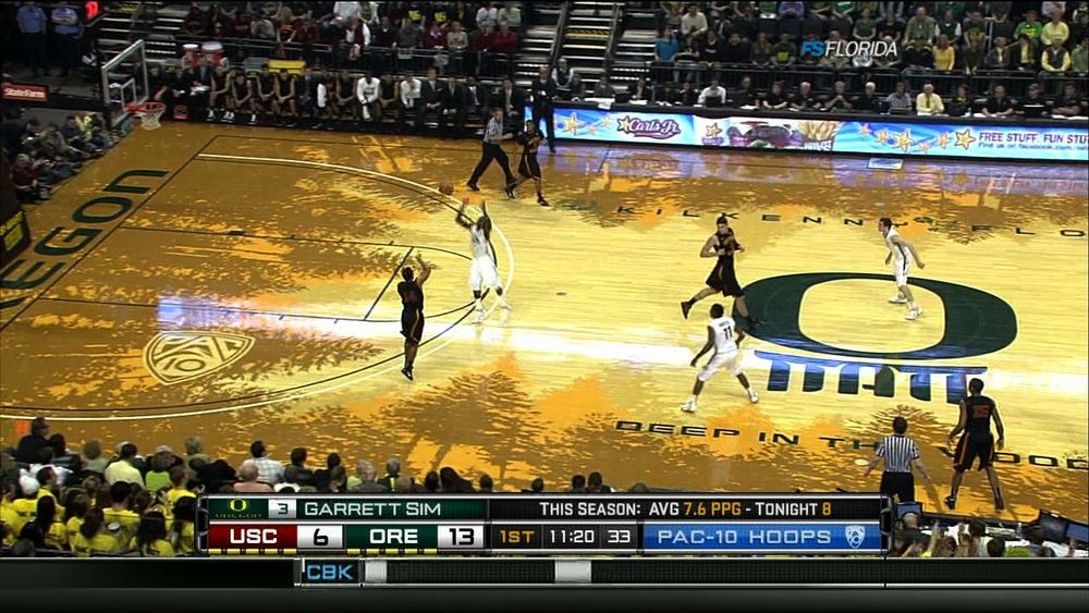
Opening of Matthew Knight Arena

gopherfan3

Member
Joined
Nov 28, 2009
Messages
129
Reaction score
0
Points
16
Flipping through stations I happened come across the Oregon/USC game on FSN. The money Phil Knight dished out definitely helped build a nice arena there in Eugene. I still just can't get over how ridiculous that court looks. but what should i expect after seeing the Ducks unis in the National Championship game on Monday/


What a terrible court design, it kind of hurts my eyes to look at it. Is that Devoe at the end of the bench daydreaming about his breakout Senior year that lands him in the NBA??..;)


Oregon is a joke.

Another reason im grateful to be a gopher fan. This is hard to watch at times. There seems to be a huge disparity in the level of talent compared to what we see night in and night out in the B1G.
 

The court is hideous, distracting, and a black eye on an otherwise beautiful facility.
 

The only thing uglier than Oregon's new court, is PAC10 basketball.


What in the heck is under the "O"

at mid court?


2011-january-13-23-26-46.jpeg.pagespeed.ce.pid5sazvmr.jpg


Hid E ous

Are there no NCAA rules or guidelines?

It is the worst thing I have ever seen on a basketball court. Next they will engineer an lcd screen and project commercials on the floor!

RE DICK U LOUS !!

:(
 

After looking at about 5 pictures of this abomination I finally realized the thing that looks like a vomit smear are actually trees.

Doesn't make it look any better, but at least I have an idea of what they were trying to accomplish.
 

Are there no NCAA rules or guidelines?

It is the worst thing I have ever seen on a basketball court. Next they will engineer an lcd screen and project commercials on the floor!

RE DICK U LOUS !!

:(

Haha, that'd be awesome. The whole floor is just an LCD, so you can customize it each game to look different LOL.
 

This is going to force Boise State to paint their BB court blue.
 

Haha, that'd be awesome. The whole floor is just an LCD, so you can customize it each game to look different LOL.

It's actually not as far fetched as you think.

I believe they're currently building technology to allow this to happen on football fields. So during every timeout, advertisements will litter the field
 

I don't understand how it's legal to have a floor without a halfcourt line?


Yeah but they have 2 dots.

We're supposed to be able to pick 2 dots out of all that crap on the floor?! This is tied for the worst arena I have ever seen. The other one was a high school gym that made you feel like you played in a popcorn popper because everything was kind of a orangish yellow.
 

Let the boo-birds sing...

...but I kinda like it! It just adds to that "sexy" quotient that Oregon seems to have the corner-market on these days; if I were a high school kid (which I am not, though I am qualified to comment because I work in a HS) I would look at that court and marvel at how cool and odd it is.

If I were a Duck fan (which I am not, so I am not qualified to comment, but hey, it's a free country and message board) I would probably be proud of my sparkling new innovative arena with unique characteristics.

We can all relate to having pride in something that is done beautifully because TCF is an example of such excellence. The court is unique. Ain't nothing like it anywhere in America. Oregon gets their kicks out of that kind of thing.

Good for them. Devoe, good luck there.

But at the end of the day, if we see you in the woods, Devoe, we're goin duck hunting, cuz Gophers don't fear woods OR ducks!

Go Go Go Gophers!
 

Didn't realize the floor was rimmed by trees while watching on TV. Ugly. Hard to watch. Apparently the fashionistas who run the athletic dept. didn't get a look at that thing on TV. Maybe it looks great in person. Devoe is a tool.
 

You're right, it's very hard to watch. Thank God the Gophers (or anyone else in the Big Ten) has a floor like that. Very distracting. But I guess that may be good to distract viewers from their horrible team.


The blue turf is worse.
I think it would actually look good if the middle was a little darker than it is. I'm sure it looks better in person than on tv… the camera picks up a ton of glare.


Top Bottom