Black Jerseys


Not sure whether or not I like them -- maybe they need to wear maroon pants instead of black -- but at least its not anthracite again.
 

Like the black, but Gold would have been better than white. Reminds me too much those unis for the Whyowa game 2 years ago. Nightmares still.
 

They are okay in my opinion but the video and photos on Instagram didn’t provide a good enough view for me to offer my final judgement.


Look like South Carolina jerseys. Players seem to be excited, though, so that's good enough for me.
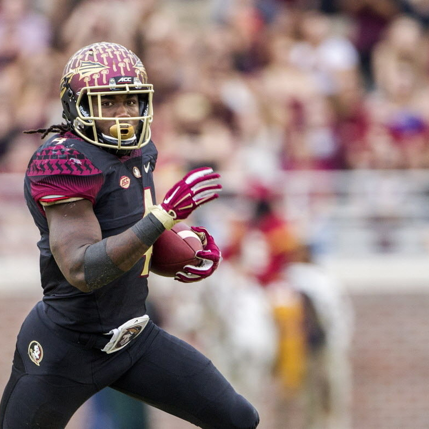
That's what I thought as well. Maybe they are hoping some of their Thursday night opening success rubs off on the Gophers (who also do well in Thursday openers).

From 2005-2016 South Carolina opened most seasons on a Thursday night. In those games they were 9-1 including a bunch of solid conference wins. The only team to beat them was 2014 Texas A&M.

I believe that Minnesota is the only P5 school with a Thursday night opening tradition dating back to the opening of TCF.
 

The helmets are sweet. I like them better than the anthracite with GOLDEN GOPHERS on the back. The fonts are off brand and in my opinion clash.


The kids seem psyched, so that's good enough for me. I remember when I used to cover Georgia back in the Stafford and Moreno days and they wore black jerseys for the first time. They were playing Auburn and the crowd went absolutely bonkers when they ran out of the tunnel. It was a special environment. The Dawgs went on to totally roll Auburn that night.

Let's hope we have the same fortunes against the Bucks with our black kits!
 

image.png


Eh, I don't like them (or the new number font), but they're no worse than the anthracite. They remind me of these.


I’ve always liked what we’ve done with our helmet/decal combos, and this is right up there with one of my favorites. Also agree that black is better than anthracite.


I like them. Would have loved to see maroon numbers with gold trim. Might not be a lot of contrast between maroon and black but Oregon pulled it off.

Not complaining though, they're solid. Especially with that helmet!
BCS_Ducks_0649_hd_1600.jpg
 

Pretty sure this is the kids' Like-O-Meter reading...

1629569630015.png
Agree better than Anthracite...now if "anthracite" was called "taconite" I might have a different opinion. Minnesota is not "Coal Country."


image.png


Eh, I don't like them (or the new number font), but they're no worse than the anthracite. They remind me of these.

That's a very busy looking uniform including a belt large enough to make the WWE champ jealous. Perhaps if Dalvin Cook sucked more it would be a cleaner look. Also it's a minor miracle that PJF doesn't put oar stickers on the helmets.


Not a fan of them.
there’s a point of going too far with uniform looks and we passed it.


Not a fan of them.
there’s a point of going too far with uniform looks and we passed it.

Along with 75% of the other D1 programs in the country. Gotta stay on trend with the players wearing the uniforms
 

I am for any new color schemes if they beat tOSU. If not, I will hate them.


Fun fact, the last two Big Ten teams to beat Ohio State did so in all black uniforms at home. Purdue in 2018 and Iowa in 2017, both by several touchdowns.
That is an interesting little factoid.

As for the uniforms....Players seem excited so that is all that really matters. Tough to really have an opinion on them until we see the team decked out in them and on the field against OSU. But they look pretty cool in the video reveal that was posted.


Top Bottom