
You are using an out of date browser. It may not display this or other websites correctly.
You should upgrade or use an alternative browser.
You should upgrade or use an alternative browser.
check this out!!!!
- Thread starter 1983
- Start date

Gold Vision
Well-known member
- Joined
- Nov 20, 2008
- Messages
- 6,805
- Reaction score
- 2,746
- Points
- 113
Great photo! Thanks for the nice shot.
pharmacygopher
114 Row 11
- Joined
- Mar 4, 2009
- Messages
- 3,470
- Reaction score
- 3,220
- Points
- 113
Now that got me pumped for the fall!! That is my new desktop.
Bronko Nagurski Gopher
Banned
- Joined
- Nov 17, 2008
- Messages
- 2,478
- Reaction score
- 1
- Points
- 36
is it just me, but why is the turf on the visitor sideline so much darker than it is anywhere else on the field? anyone else seeing that?
pharmacygopher
114 Row 11
- Joined
- Mar 4, 2009
- Messages
- 3,470
- Reaction score
- 3,220
- Points
- 113
I was just going to post that. The green and the maroon on the visiting sideline seem to 'pop' more. I hope the entire field ends up looking that way. Someone mentioned the rock or something that gets put down as well still. 
gophermartin
Active member
- Joined
- Nov 13, 2008
- Messages
- 2,133
- Reaction score
- 4
- Points
- 38
Maybe they didn't put all of the "grass" down yet.
Note the strip on the home side line.
Great picture!
I agree that the Maroon is very close to the seats.
I guess I need to see a person in uniform standing in the endzone to see if they match.
That gold could be brighter to match the uniforms I think. Unless this year they will be a little darker gold.

GM
Note the strip on the home side line.
Great picture!
I agree that the Maroon is very close to the seats.
I guess I need to see a person in uniform standing in the endzone to see if they match.
That gold could be brighter to match the uniforms I think. Unless this year they will be a little darker gold.
GM
Bronko Nagurski Gopher
Banned
- Joined
- Nov 17, 2008
- Messages
- 2,478
- Reaction score
- 1
- Points
- 36
I was just going to post that. The green and the maroon on the visiting sideline seem to 'pop' more. I hope the entire field ends up looking that way. Someone mentioned the rock or something that gets put down as well still.
that seems plausible and probably the reason why it looks that way right now. gophermartin's note seems like a possibility as well. i can't think of any logical reason why that one area wouldn't just be the same color as everywhere else on the field. highly doubt if that was the "finished" product that someone from the U wouldn't easily notice and say something about it needing to be "fixed" asap. maybe the turf installer ran out of matching turf (f-ed up his calculations) and had to get some off another job site to try and cover his tracks! gotcha mr. contractor!
UptownMaroon&Gold
longtime gopher sufferer
- Joined
- Feb 20, 2009
- Messages
- 504
- Reaction score
- 0
- Points
- 16
I remember bringing it up only half seriously, on a previous thread....but I after seeing this picture I am more concerned. I really hope that endzone shade of maroon darkens a little bit. I am sorry, I know our maroon is tough to duplicate with different materials, but that looks a lot more like USC red, than U of M maroon, that is showcased by the seats, and the picture of our jersey possibilities.
The men of troy will probably feel right at home next year.
The men of troy will probably feel right at home next year.
GoAUpher
Section 246
- Joined
- Nov 12, 2008
- Messages
- 6,256
- Reaction score
- 1
- Points
- 36
I remember bringing it up only half seriously, on a previous thread....but I after seeing this picture I am more concerned. I really hope that endzone shade of maroon darkens a little bit. I am sorry, I know our maroon is tough to duplicate with different materials, but that looks a lot more like USC red, than U of M maroon, that is showcased by the seats, and the picture of our jersey possibilities.
The men of troy will probably feel right at home next year.
Look at the M on the field or the TCF logo on the scoreboard and then look at the seats. Which do you think is closer to the endzone? If anything, it is the seats that aren't quite the right shade.
Bronko Nagurski Gopher
Banned
- Joined
- Nov 17, 2008
- Messages
- 2,478
- Reaction score
- 1
- Points
- 36
It might be that the visitor side has had the black rubber pellets put in and the home side hasn't. Or does turf come with that stuff already in?
no. they put it down with a special spreading machine.
FiveStarFan
Active member
- Joined
- Dec 15, 2008
- Messages
- 1,060
- Reaction score
- 0
- Points
- 36
Could it be that the sun is being blocked by the visitors bleachers?? Looks to me like the sun is beating down on the home side. (making it lighter)
gophers&guns
Active member
- Joined
- May 11, 2009
- Messages
- 285
- Reaction score
- 110
- Points
- 43
my guess is its probably a shadow, if you look at the top of the bleachers on the home side it matches up with the visitor sides turf. But who knows.
Zales04
From the Land of Mesabi
- Joined
- Nov 13, 2008
- Messages
- 2,535
- Reaction score
- 0
- Points
- 36
Unless the sun now shines on us from the north, that is not a shadow - besides, you can see the shadow from the press box on the upper deck. If you look closely at the edge of the out of bounds line near the end zone you can see the difference. My guess would be they are spreading the rubber.
GoAUpher
Section 246
- Joined
- Nov 12, 2008
- Messages
- 6,256
- Reaction score
- 1
- Points
- 36
Are the bleacher seats aluminum? I am rememebering a certain Nov game in Kinnick that had me on the aluminum bleachers. Not good times.
Yes, they are aluminum.
at the bar
Member
- Joined
- Nov 21, 2008
- Messages
- 291
- Reaction score
- 0
- Points
- 16
I'm sure some will get on me for complaining but I wish one end zone said "Golden Gophers". I also prefer the block font and could do without the white outlines but I can live with it. At least we didn't alternate the shade of green every 5 yards.
MrGopher
The Anti-Sioux
- Joined
- Feb 9, 2009
- Messages
- 2,641
- Reaction score
- 0
- Points
- 36
How can you guys judge the shades of maroon just from this picture. Look at the picture again. Now, see how the visitor side seats look brighter than the home side seats? Which one of those is the correct maroon?
Point is.... dont judge all this stuff until you see it completed, and in-person. Relax.
Point is.... dont judge all this stuff until you see it completed, and in-person. Relax.
pharmacygopher
114 Row 11
- Joined
- Mar 4, 2009
- Messages
- 3,470
- Reaction score
- 3,220
- Points
- 113
How can you guys judge the shades of maroon just from this picture. Look at the picture again. Now, see how the visitor side seats look brighter than the home side seats? Which one of those is the correct maroon?
Point is.... dont judge all this stuff until you see it completed, and in-person. Relax.
I agree. I remember reading that the field would take ~ 1 month to complete. It's been around a week or two. This isn't a finished product yet. My guess is the visitor sideline is indicative of what the entire field will looks like.
Maverick
Well-known member
- Joined
- Nov 20, 2008
- Messages
- 1,994
- Reaction score
- 101
- Points
- 63
How can you guys judge the shades of maroon just from this picture. Look at the picture again. Now, see how the visitor side seats look brighter than the home side seats? Which one of those is the correct maroon?
Point is.... dont judge all this stuff until you see it completed, and in-person. Relax.
OMG!!!
Our school colors are 35 shades of Maroon and 17.8 shades of Gold and 4.3 shades of black and 80 shades of white????
What are we going to do???
The sky is 93 shades of blue in that picture too....
GoAUpher
Section 246
- Joined
- Nov 12, 2008
- Messages
- 6,256
- Reaction score
- 1
- Points
- 36
I agree. I remember reading that the field would take ~ 1 month to complete. It's been around a week or two. This isn't a finished product yet. My guess is the visitor sideline is indicative of what the entire field will looks like.
As long as we're all over analyzing a photo...
Pharmacy makes a good point about the visitor sideline I think. If you look at the photo again, you can see that the white sideline is a darker shade then the endzone line or Gopher sideline. In fact, you can actually see a distinct line between the 2 shades in the lower right corner of the endzone in front of the student section. Also, the maroon section marking the bench area on the visitors side is darker then the same block on the home side. I looks to me that at the time of this photo they'd spread the rubber pellets out on the visitor sideline area only. Its either that or the camera that took the photo has a weird lens issue that just happens to line up perfectly with the visitor sideline.
Schnauzer
Well-known member
- Joined
- Jun 4, 2009
- Messages
- 7,339
- Reaction score
- 5,455
- Points
- 113
Great picture. Thanks for sharing. I knew the field was nearing completion and I was really hoping to see some pictures like this. I too am worried about the "red" looking maroon. I am no expert on the subject but I remember a similar color confusion when the new field was put in at Gustavus (viewing it on the webcam at the time). Eventually everything did look correct and it all looked fine in person. I'm assuming this will be the case for the TCF field as well but for now I am a bit worried (like many of you) that the maroon looks too red and does not match the uniforms or seats. I'll reserve final judgement until the whole thing is deemed complete.
gophermartin
Active member
- Joined
- Nov 13, 2008
- Messages
- 2,133
- Reaction score
- 4
- Points
- 38
Very good observation.
I looked closer...I can see what you are referring to. Dang it...I want to see the whole thing done.
That is a really deep/rich shade of green...I can't tell if I like that more than the existing color.
Brian S did say he expected the field color to deepen when the rubber gets put in.
Keep those photos coming people!!
Now for them to just fix that crooked M on the visitor side seats.
It's looking great.
GM
As long as we're all over analyzing a photo...
Pharmacy makes a good point about the visitor sideline I think. If you look at the photo again, you can see that the white sideline is a darker shade then the endzone line or Gopher sideline. In fact, you can actually see a distinct line between the 2 shades in the lower right corner of the endzone in front of the student section. Also, the maroon section marking the bench area on the visitors side is darker then the same block on the home side. I looks to me that at the time of this photo they'd spread the rubber pellets out on the visitor sideline area only. Its either that or the camera that took the photo has a weird lens issue that just happens to line up perfectly with the visitor sideline.
I looked closer...I can see what you are referring to. Dang it...I want to see the whole thing done.
That is a really deep/rich shade of green...I can't tell if I like that more than the existing color.
Brian S did say he expected the field color to deepen when the rubber gets put in.
Keep those photos coming people!!
Now for them to just fix that crooked M on the visitor side seats.
It's looking great.
GM
anticallihan
Active member
- Joined
- Nov 12, 2008
- Messages
- 3,521
- Reaction score
- 0
- Points
- 36
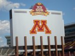
My GF pointed out
...that the logo for TCF Bank Stadium doesn't match the M on the back of the scoreboard.
She said her and all her co-workers were discussing that, which is something I was surprised to here. Then she said they said it looked the M was wearing a construction hat.
http://s636.photobucket.com/albums/uu83/calgopher/
The sun doesn't help, but I thought it was funny.
I think my biggest annoyance is not the color of our field or anything else, but the color of our Nike Jerseys for all sports. Those clearly are going to be the things that stick out the most because of the brown maroon.
Oh well... the seats are not blue, and the things are maroons and golds everywhere.
GoAUpher
Section 246
- Joined
- Nov 12, 2008
- Messages
- 6,256
- Reaction score
- 1
- Points
- 36
That that logo for TCF Bank Stadium doesn't match the M on the back of the scoreboard.
She said her and all her co-workers were discussing that, which is something I was surprised to here. Then she said they said it looked the M was wearing a construction hat.
http://s636.photobucket.com/albums/uu83/calgopher/

Is this the logo you're referring to? If so then the M is the same only on a gold background.
anticallihan
Active member
- Joined
- Nov 12, 2008
- Messages
- 3,521
- Reaction score
- 0
- Points
- 36
Is this the logo you're referring to? If so then the M is the same only on a gold background.
Yes.
She said on the back of the sign, the Logo for TCF (the big one on the scoreboard) did not match the colors of the giant M on the back of the scoreboard.
Look Here...
She thought (and her group) it looked terrible.
GoAUpher
Section 246
- Joined
- Nov 12, 2008
- Messages
- 6,256
- Reaction score
- 1
- Points
- 36
Yes.
She said on the back of the sign, the Logo for TCF (the big one on the scoreboard) did not match the colors of the giant M on the back of the scoreboard.
Look Here...
She thought (and her group) it looked terrible.
Ok, that makes more sense. From your earlier post I thought you were saying that the "M" in the TCF logo was somehow different. It does appear as though you are correct on the color though. See attached for a better picture.
FWIW, I don't think its terrible. It is noticeable though.
Attachments
pharmacygopher
114 Row 11
- Joined
- Mar 4, 2009
- Messages
- 3,470
- Reaction score
- 3,220
- Points
- 113
Could it be because the U and TCF don't have the same colors? Theirs are more maroon/brown (different than ours), yellow/gold, and orangeish. If Pepsi was our sponsor, we wouldn't expect a maroon and gold Pepsi sign, we would expect a red, white, and blue sign. I don't think TCF and the U were trying to match. Even the M on the TCF Bank stadium logo doesn't match the other maroon/brown.